20 Ceramic Mosaic Designs That Bring Bold Color and Pattern to Every Surface
Colorful Tile Patterns | Hand-Painted Ceramic Mosaics | DIY Projects for Pottery Lovers
Ceramic is the classic mosaic material. The ancient Romans used it. Byzantine artists perfected it. Modern crafters continue the tradition.
Unlike glass, ceramic is opaque. Light does not pass through. It bounces off the surface. The color is what you see, not what glows behind.
This makes ceramic ideal for bold patterns. High contrast. Sharp edges. Unapologetic color.
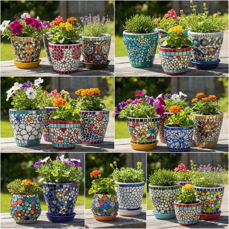
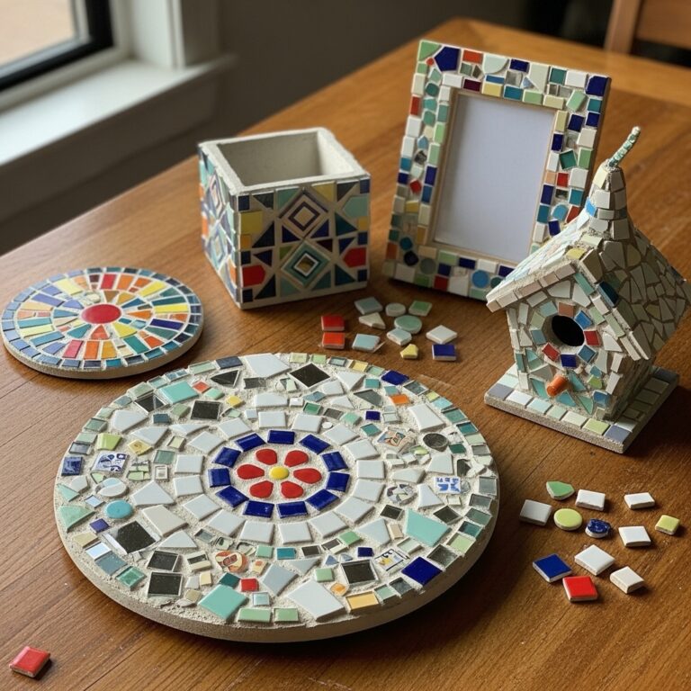
This guide delivers 20 ceramic mosaic designs for every surface. Each design uses ceramic tiles, broken pottery, or hand-painted shards. Each pattern makes a statement.
1. Black and White Harlequin Diamond Pattern
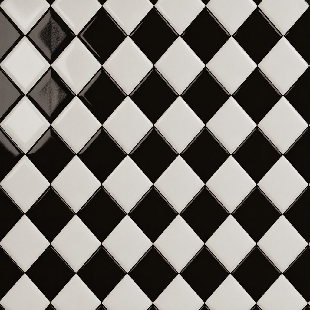
Harlequin diamonds are classic. Black and white are timeless. The contrast is dramatic.
Cut ceramic tiles into diamond shapes. Arrange them in alternating rows. Black, white, black, white. The pattern should repeat across the entire surface.
Pro Tip: Use a template to cut diamonds. Consistent shapes matter.
Mistake to Avoid: Do not use off-white. Pure white provides the sharpest contrast.
2. Greek Key Border for Tabletops
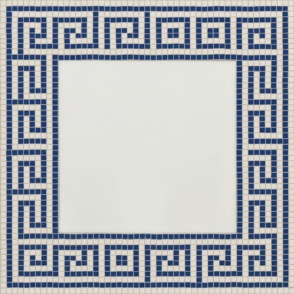
The Greek key is a continuous meander. It represents the eternal flow of life. It looks impressive on any surface.
Create a border of Greek key around the edge of a tabletop. Use dark blue tiles on a white background. The pattern should repeat without interruption.
Pro Tip: Pre-assemble the border on mesh. Transfer the entire strip at once.
Mistake to Avoid: Do not break the pattern at corners. The key should turn seamlessly.
3. Terracotta and Cream Southwestern Diamond
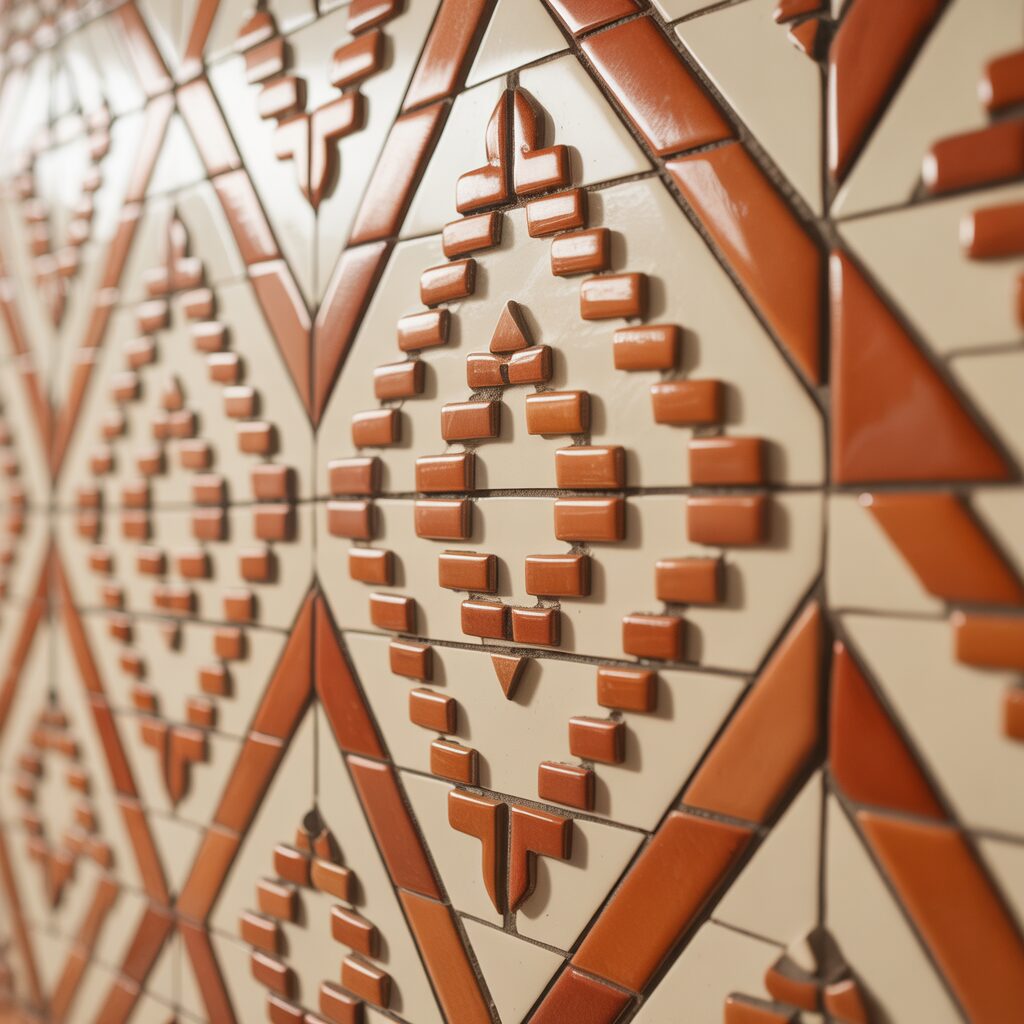
Terracotta is warm. Cream is cool. Together, they evoke desert landscapes.
Arrange terracotta tiles in a diamond pattern. Fill the background with cream tiles. The diamonds should overlap at the points. The effect is a woven blanket.
Pro Tip: Use matte finish tiles for a more authentic southwestern feel.
Mistake to Avoid: Do not use glossy tiles. Glossy finishes look too modern.
4. Blue and White Delft-Inspired Florals
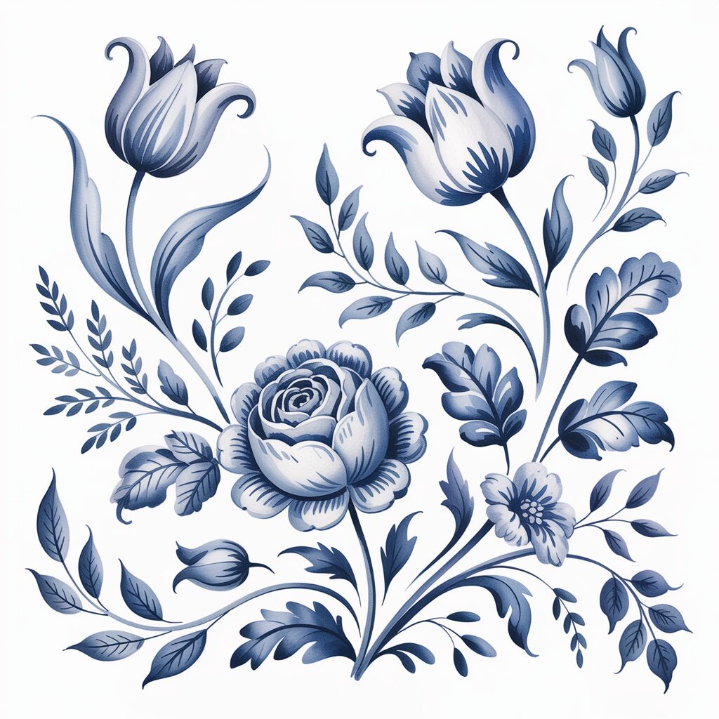
Delftware is Dutch. Blue on white. Flowers and windmills. The pattern is delicate.
Paint white tiles with blue ceramic paint. Freehand small flowers. Each flower can be slightly different. Arrange them in a scattered pattern.
Pro Tip: Use a fine-tip brush for the details. Thick lines look clumsy.
Mistake to Avoid: Do not overcrowd the surface. White space is essential.
5. Aztec Sun with Radiating Triangles
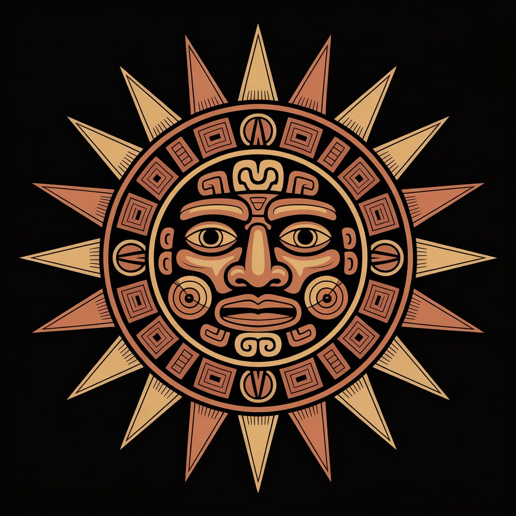
Aztec suns are geometric. Triangles radiate outward. The center is the face.
Create a circle of yellow tiles in the center. Surround it with rings of red, orange, and gold triangles. Each triangle should point outward. The effect is a burst of heat.
Pro Tip: Use a compass to draw the circle. Precision matters.
Mistake to Avoid: Do not make the triangles too large. Small triangles create more detail.
6. Moroccan Fish Scale Pattern
Fish scales are overlapping curves. The pattern looks like a pond surface. It works on floors and walls.
Cut ceramic tiles into crescent shapes. Arrange them in overlapping rows. Each row should be offset from the one below. Use shades of blue for the scales.
Pro Tip: Use a template for the crescents. Consistent shapes are essential.
Mistake to Avoid: Do not use more than three shades of blue. Too many shades look busy.
7. Checkerboard with a Twist of Color
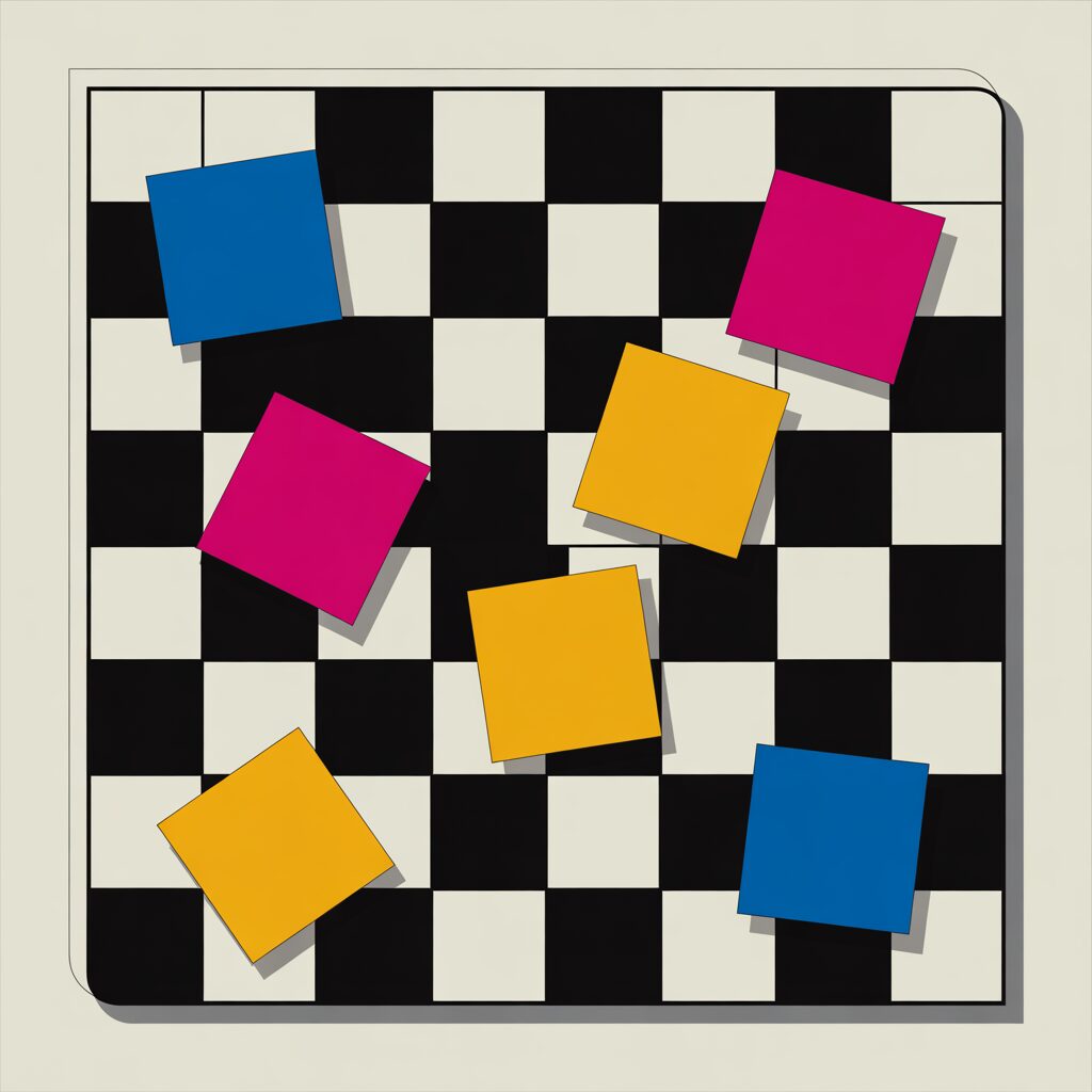
A standard checkerboard is black and white. A twist replaces one square with a bright color. The eye goes to that square.
Create a checkerboard pattern. Choose one square in the center. Make it red or yellow. Leave the rest black and white. The single color becomes the focal point.
Pro Tip: Place the colored square off-center. Off-center is more dynamic.
Mistake to Avoid: Do not use more than one colored square. The singularity is the point.
8. Oyster Shell Texture in Neutral Tones
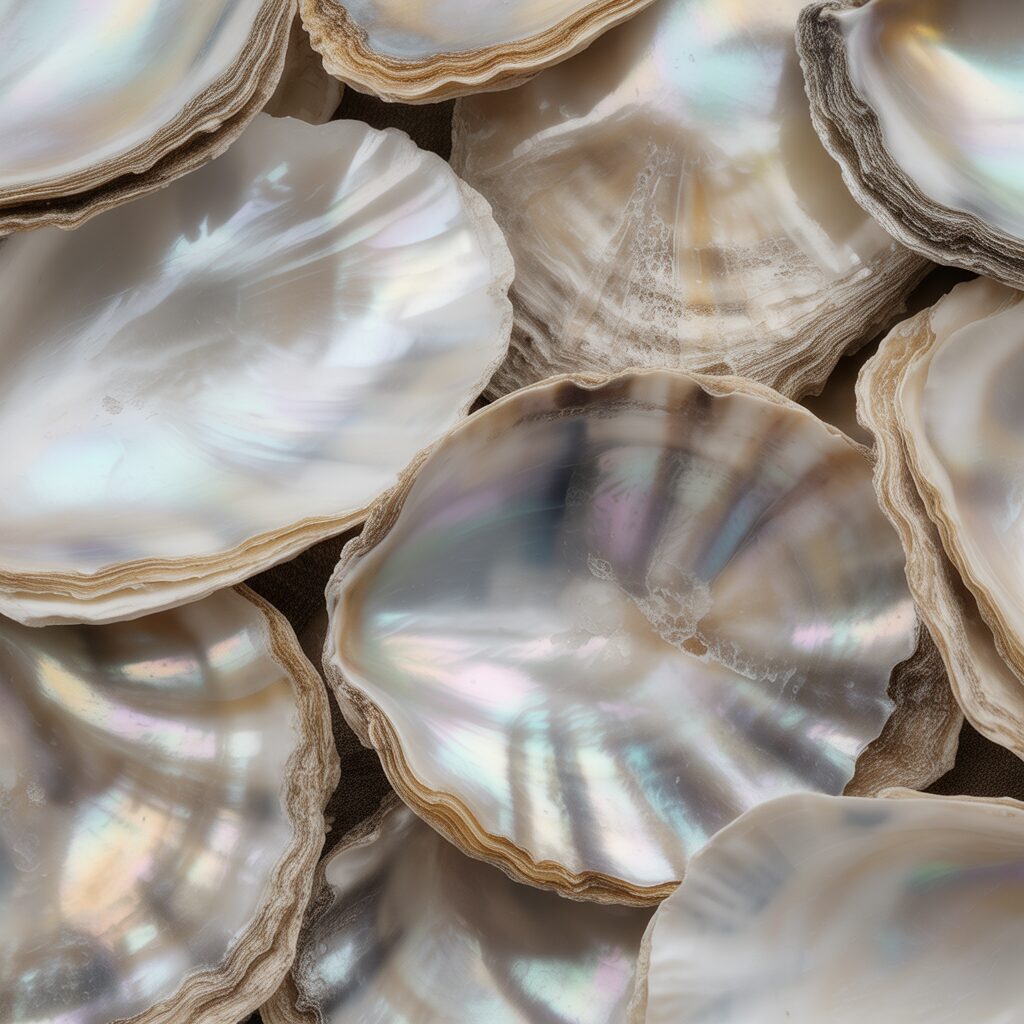
Ceramic can mimic nature. Oyster shells are irregular. They are pale gray and white. They have ridges.
Break ceramic tiles into irregular shards. Do not try to shape them. Let the breaks be random. Arrange them in overlapping layers. Use only white, gray, and cream.
Pro Tip: Use a hammer to break tiles. Wrap them in a cloth first.
Mistake to Avoid: Do not grout between the shards. The gaps should be visible.
9. Paisley Teardrops in Jewel Tones
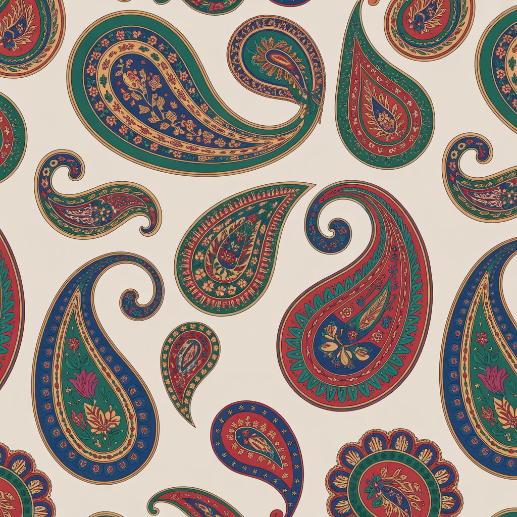
Paisley is a teardrop shape. It curves at the top. It comes to a point at the bottom. It originated in Persia.
Cut ceramic tiles into teardrop shapes. Arrange them in rows. Each row should face the same direction. Use jewel tones: ruby, sapphire, emerald, amethyst.
Pro Tip: Use a template for the teardrops. Consistent shapes create rhythm.
Mistake to Avoid: Do not use too many colors. Four jewel tones are plenty.
10. Bargello Flame Pattern for Walls
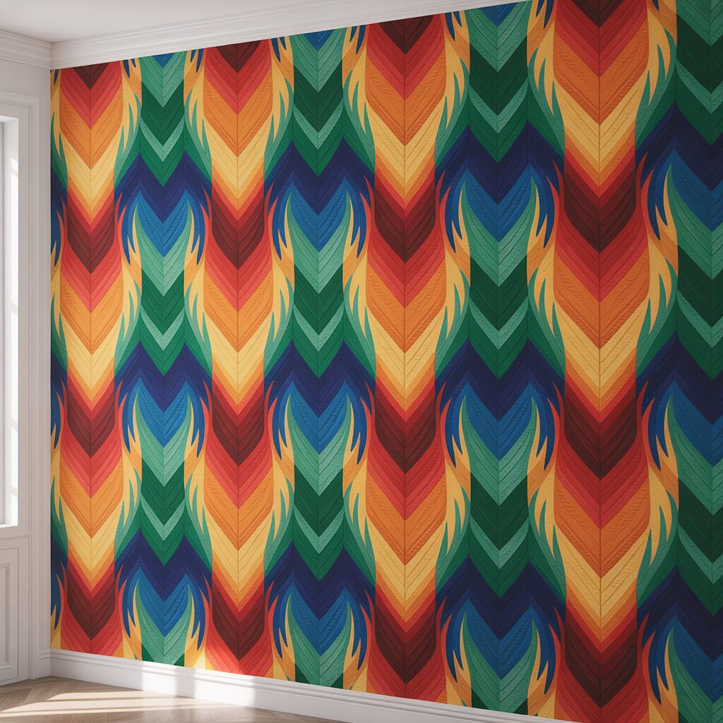
Bargello is a flame. It zigzags. It repeats. It looks like fire.
Arrange tiles in vertical columns. Each column should zigzag left and right. The colors should progress from yellow at the top to red at the bottom. The effect is a wall of flame.
Pro Tip: Use a laser level for the vertical columns. Straight lines matter.
Mistake to Avoid: Do not use more than three colors. Yellow, orange, red are sufficient.
11. Mosaic of Broken Blue Willow China
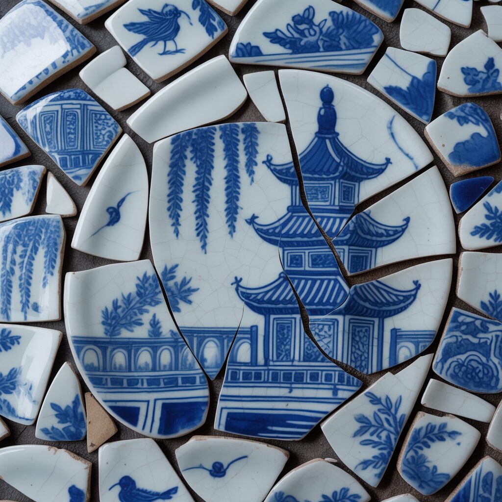
Blue Willow is a classic pattern. It tells a story of lovers and bridges. Broken pieces become a new story.
Collect broken Blue Willow plates. Break them further into shards. Arrange the shards in a random pattern. The original pattern will fragment into abstract shapes.
Pro Tip: Sort shards by the color of the blue. Light blue and dark blue create depth.
Mistake to Avoid: Do not try to reassemble the original pattern. Embrace the fragmentation.
12. Byzantine-Style Gold Leaf and Glass
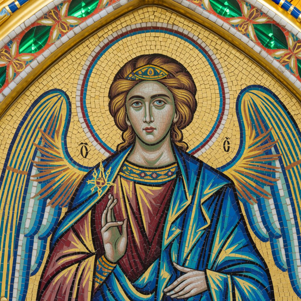
Byzantine mosaics use gold. The gold reflects light. The effect is divine.
Use gold ceramic tiles. Surround them with deep blue and green. Leave small gaps between tiles. The dark background will make the gold glow.
Pro Tip: Use real gold tiles. Faux gold looks flat.
Mistake to Avoid: Do not use too many gold tiles. Gold needs contrast.
13. Cactus Garden in Green and Terracotta
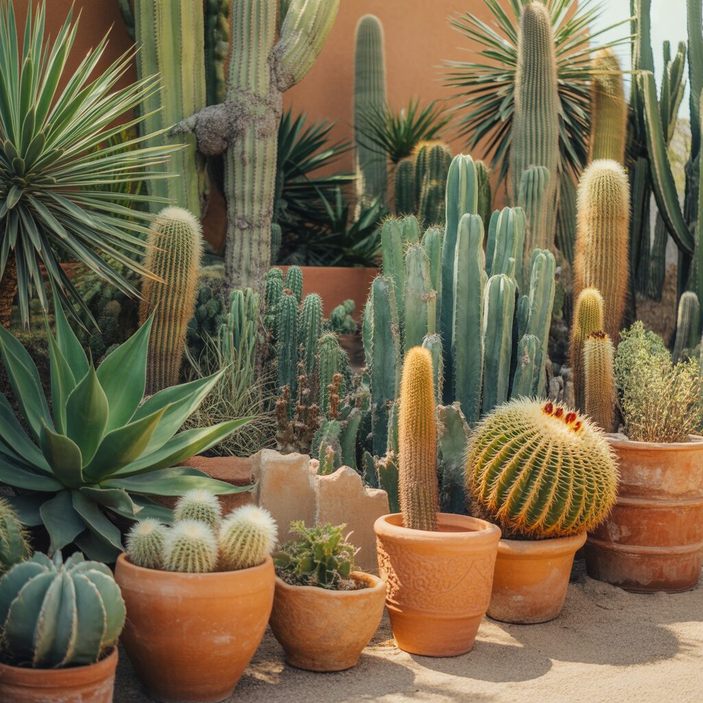
A cactus garden is spiky. It is also geometric. The shapes are simple. The colors are earthy.
Cut tiles into cactus shapes. Saguaro: tall with arms. Prickly pear: flat with oval pads. Arrange them on a terracotta background. Use three shades of green.
Pro Tip: Sketch the cactus shapes on paper first. Transfer the shapes to tile.
Mistake to Avoid: Do not add flowers. Cactus flowers distract from the form.
14. Wave Border for Bathroom Walls
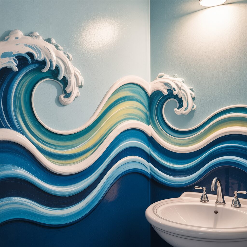
A bathroom needs water. A wave border is water. The blue tiles will calm the room.
Create a wave pattern in a horizontal band around the bathroom. The waves should repeat every few feet. Use three shades of blue. Dark at the bottom. Light at the top.
Pro Tip: Install the border at eye level. The waves should be visible while standing.
Mistake to Avoid: Do not make the border too wide. Six inches is plenty.
15. Mandala on a Round Table
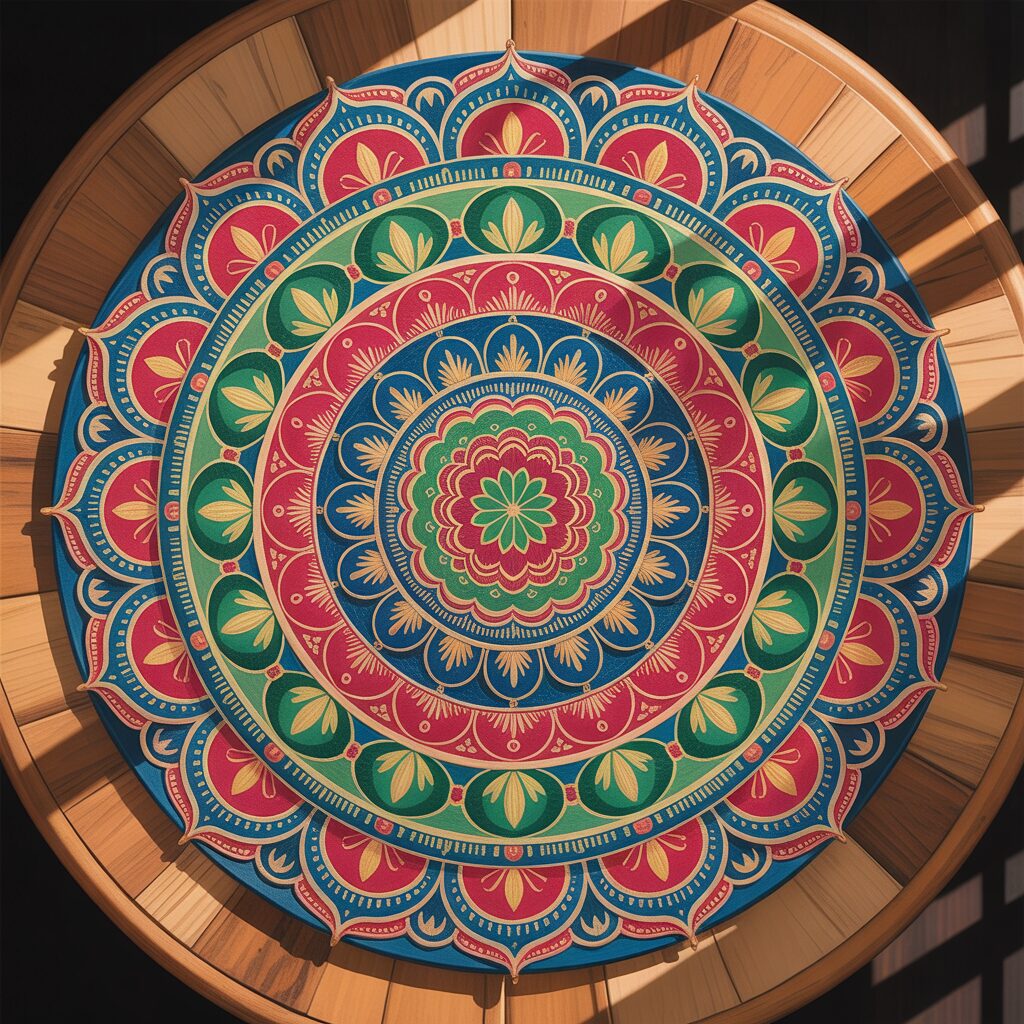
A mandala is a circle. It has repetitive patterns. It draws the eye inward.
Paint a mandala on ceramic tiles. Arrange the tiles in a circle. The center should be the focal point. The rings should radiate outward.
Pro Tip: Use a compass to draw the mandala. Symmetry is essential.
Mistake to Avoid: Do not use too many colors. Three colors plus white is enough.
16. Folk Art Flowers in Primary Colors
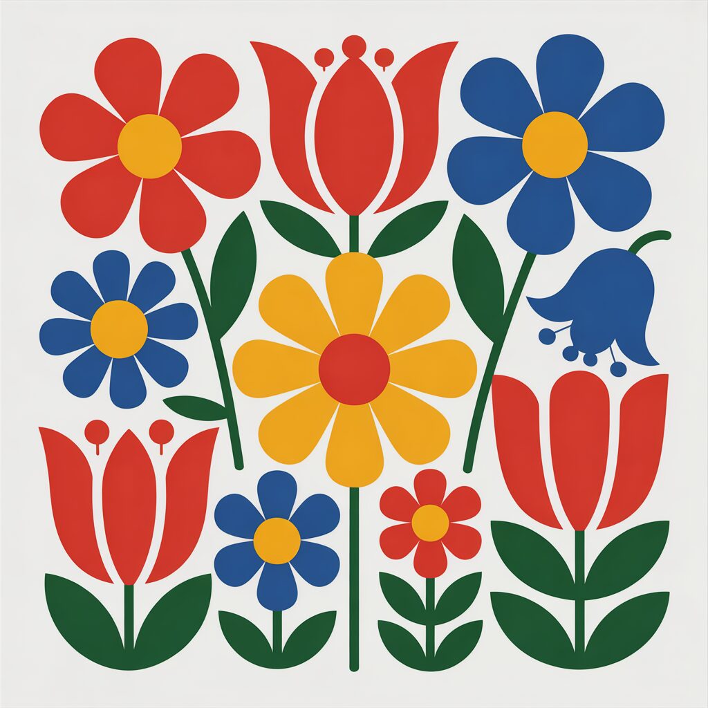
Folk art is simple. The flowers have five petals. The leaves are pointed. The colors are primary: red, yellow, blue.
Paint flower shapes on white tiles. Each flower can be slightly different. Arrange them in a scattered pattern. The white background will make the colors pop.
Pro Tip: Use a stencil for consistent flower shapes. Freehand flowers vary.
Mistake to Avoid: Do not use green leaves. Red, yellow, and blue only.
17. Abstract Expressionist Splatter
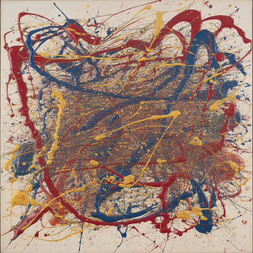
Abstract expressionism is chaotic. It is also intentional. The splatters should feel random but balanced.
Dip a brush in ceramic paint. Flick the bristles over white tiles. The paint will splatter. Let it dry. Fire the tiles. The result is a field of color.
Pro Tip: Use three colors. More than three looks muddy.
Mistake to Avoid: Do not try to control the splatter. Randomness is the point.
18. Herringbone Wood Plank Illusion
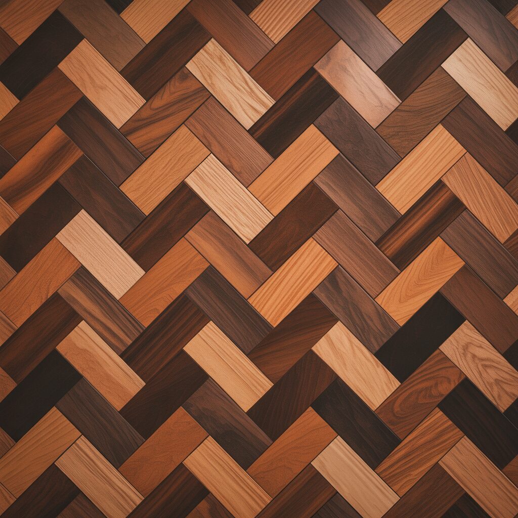
Ceramic can look like wood. Rectangular tiles in brown and tan. Arranged in a herringbone pattern.
Cut tiles into rectangles. Arrange them in a herringbone pattern. Each rectangle should be at a 45-degree angle. The zigzag will mimic wood grain.
Pro Tip: Use matte finish tiles for the wood look. Glossy tiles look like tile.
Mistake to Avoid: Do not use more than two shades of brown. Too many shades look busy.
19. Mosaic of Mismatched Vintage Tiles
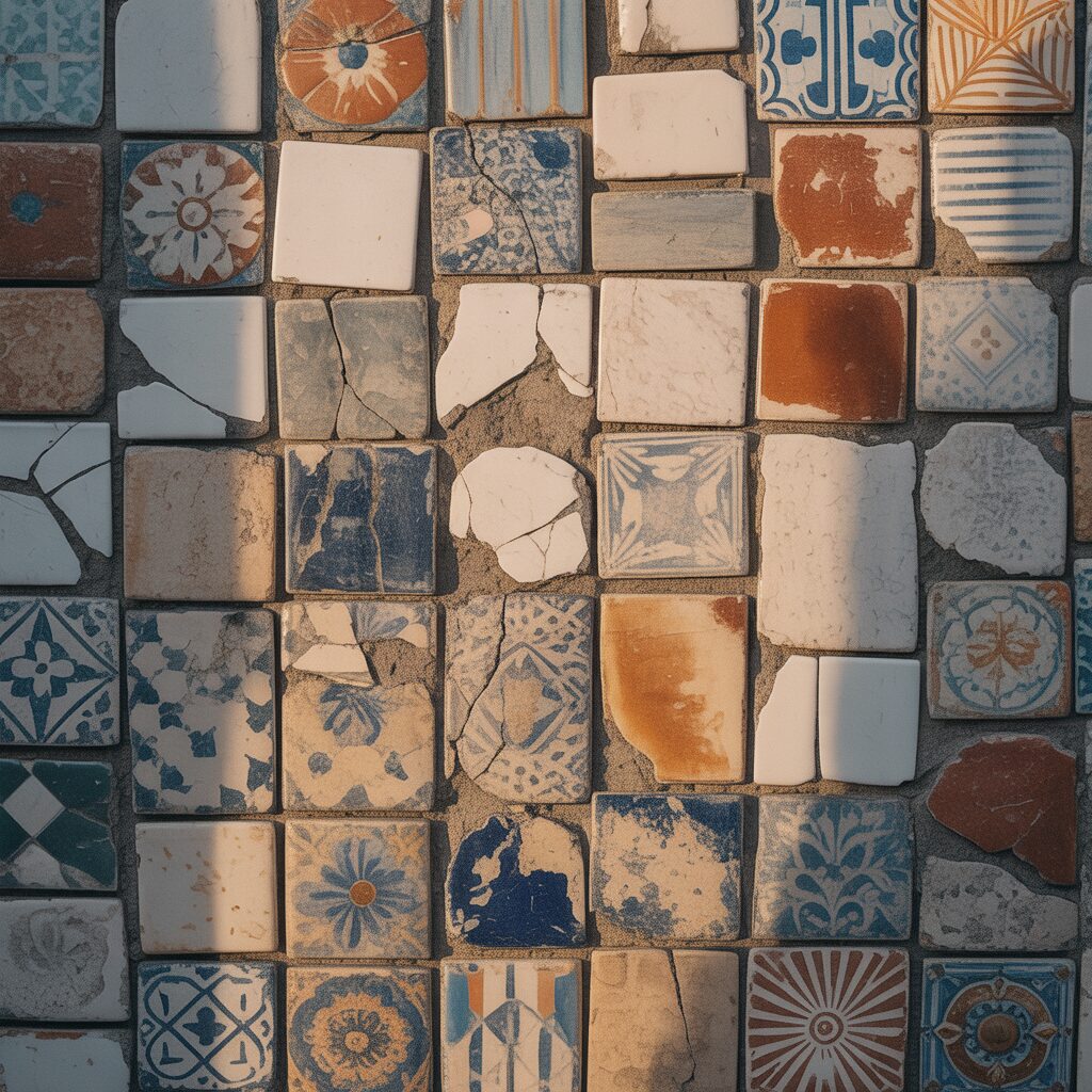
Vintage tiles are already made. They have patina. They have history. They do not need to match.
Collect vintage tiles from salvage yards. Do not sort them by color. Mix them randomly. The variety is the beauty.
Pro Tip: Use a white grout. White grout unifies the mismatched tiles.
Mistake to Avoid: Do not try to create a pattern. Random is the pattern.
20. Single Bold Color on a Feature Wall
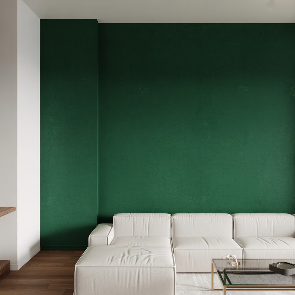
One color is not a pattern. It is a statement. The texture becomes the pattern.
Cover an entire wall with ceramic tiles of the same color. Use a deep color. Navy. Emerald. Charcoal. The repetition of the tiles creates rhythm. The grout lines create texture.
Pro Tip: Use a glossy finish for the tiles. Gloss reflects light.
Mistake to Avoid: Do not use a light color. Light colors do not make a statement.
Frequently Asked Questions
What is the difference between ceramic and porcelain tiles for mosaic?
Ceramic is softer. It cuts more easily. Porcelain is harder. It resists moisture better. Porcelain is better for floors. Ceramic is fine for walls.
How do I cut ceramic tiles without a wet saw?
Use a tile scorer. Score the surface. Snap the tile over a wire. For small pieces, use tile nippers. Nibble away small bites.
Can I paint my own ceramic tiles?
Yes. Use ceramic paint. Apply with a brush. Let dry. Fire in a kiln for permanence. For small projects, use air-dry ceramic paint.
What grout color works best with ceramic tiles?
White grout makes colors pop. Dark grout hides dirt. For colorful mosaics, use white. For high-traffic areas, use dark.
Conclusion
Ceramic mosaic designs are about bold color and sharp contrast. Black and white diamonds. Greek key borders. Southwestern diamonds. Delft blue florals. Aztec suns. Moroccan fish scales. Checkerboard with a twist. Oyster shell texture. Paisley teardrops. Bargello flames. Broken Blue Willow. Byzantine gold. Cactus gardens. Wave borders. Mandalas on tables. Folk art flowers. Abstract splatters. Herringbone wood. Mismatched vintage. One bold color.
Start with one design today. A coaster. A tabletop. A wall. The tiles will hold the color. The pattern will hold the eye. And the piece will last for generations.