17 Bathroom Color Scheme Ideas That Actually Work for Real Spaces
The bathroom color scheme is really important. It is not about how the bathroom looks. The bathroom color scheme also affects how clean the bathroom feels. It affects how spacious the bathroom feels. It even affects how comfortable the bathroom feels.
A lot of bathrooms do not feel right because the colors do not go well with the lighting, in the bathroom. Sometimes the colors are used much or not enough so the bathroom does not look balanced. The bathroom color scheme is a deal because it can make the bathroom feel nice or not nice.
These ideas are built for real-world bathrooms, including compact layouts, shared spaces, and low-light environments. Each scheme includes practical guidance so you can apply it correctly without ending up with a space that feels off or hard to maintain.
1. White and Warm Beige for Small Bathrooms That Need Soft Brightness
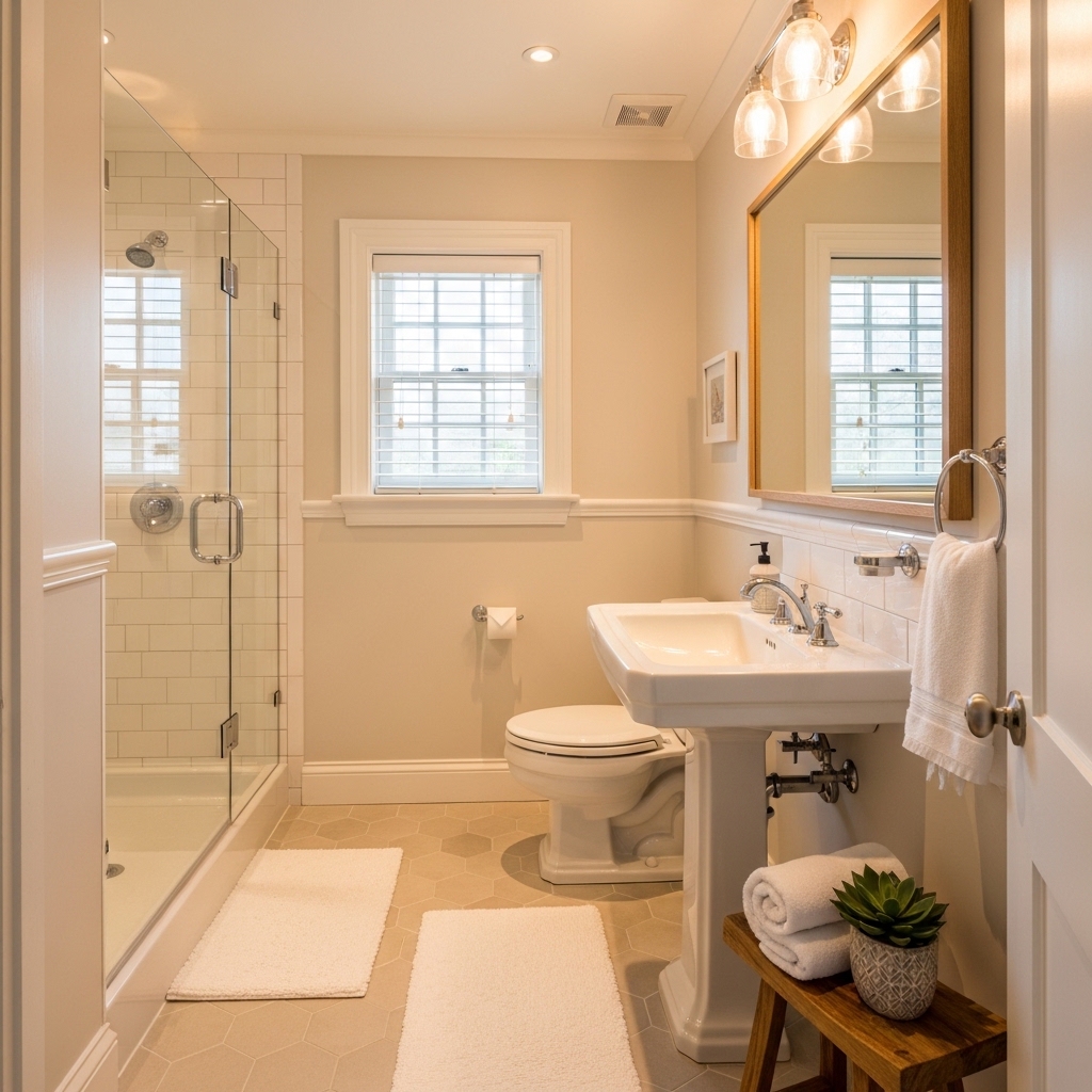
Ideal for: Small bathrooms where pure white feels too harsh but dark colors make the space feel tight.
Use warm beige on walls with white fixtures to maintain brightness while softening the overall look. Keep flooring in a similar tone to avoid visual breaks.
Why it works: It reflects light while adding warmth, making the room feel open but not sterile.
Mistake to avoid: Mixing cool white with warm beige can create an inconsistent tone.
Pro Tip: Use matte finishes to keep the palette subtle and cohesive.
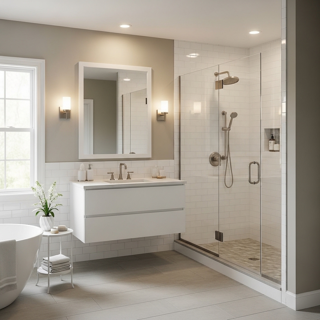
2. Soft Gray and White for Low-Light Bathrooms
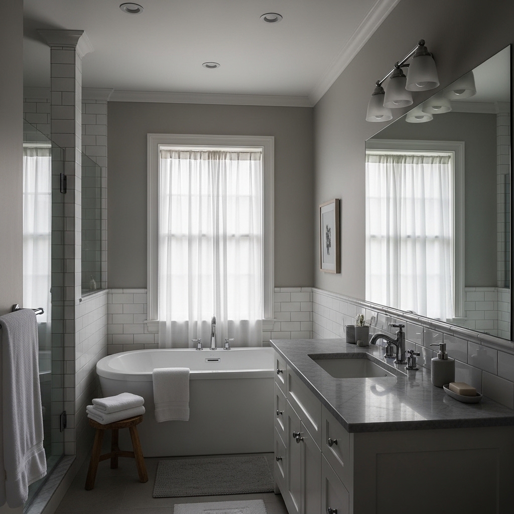
Best for: Bathrooms with limited natural light that need a neutral but not dull scheme.
Choose a warm-toned gray for walls and pair it with white sinks or tubs. Add warm lighting to prevent a cold atmosphere.
Why it works: It balances brightness with depth, avoiding the flat look of plain white.
Mistake to avoid: Cool gray tones can make the space feel lifeless.
Pro Tip: Add a light wood accent to soften the gray.
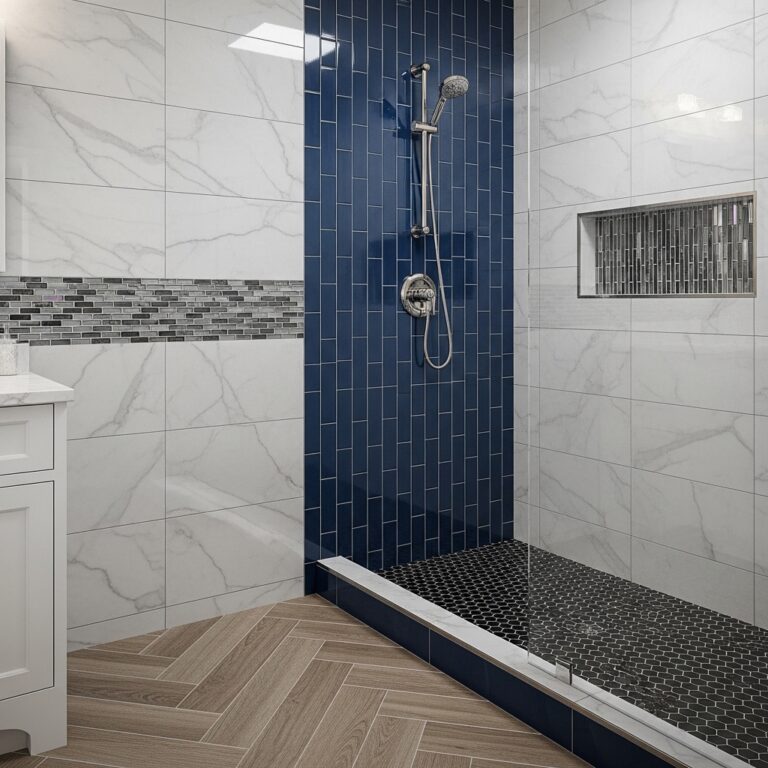
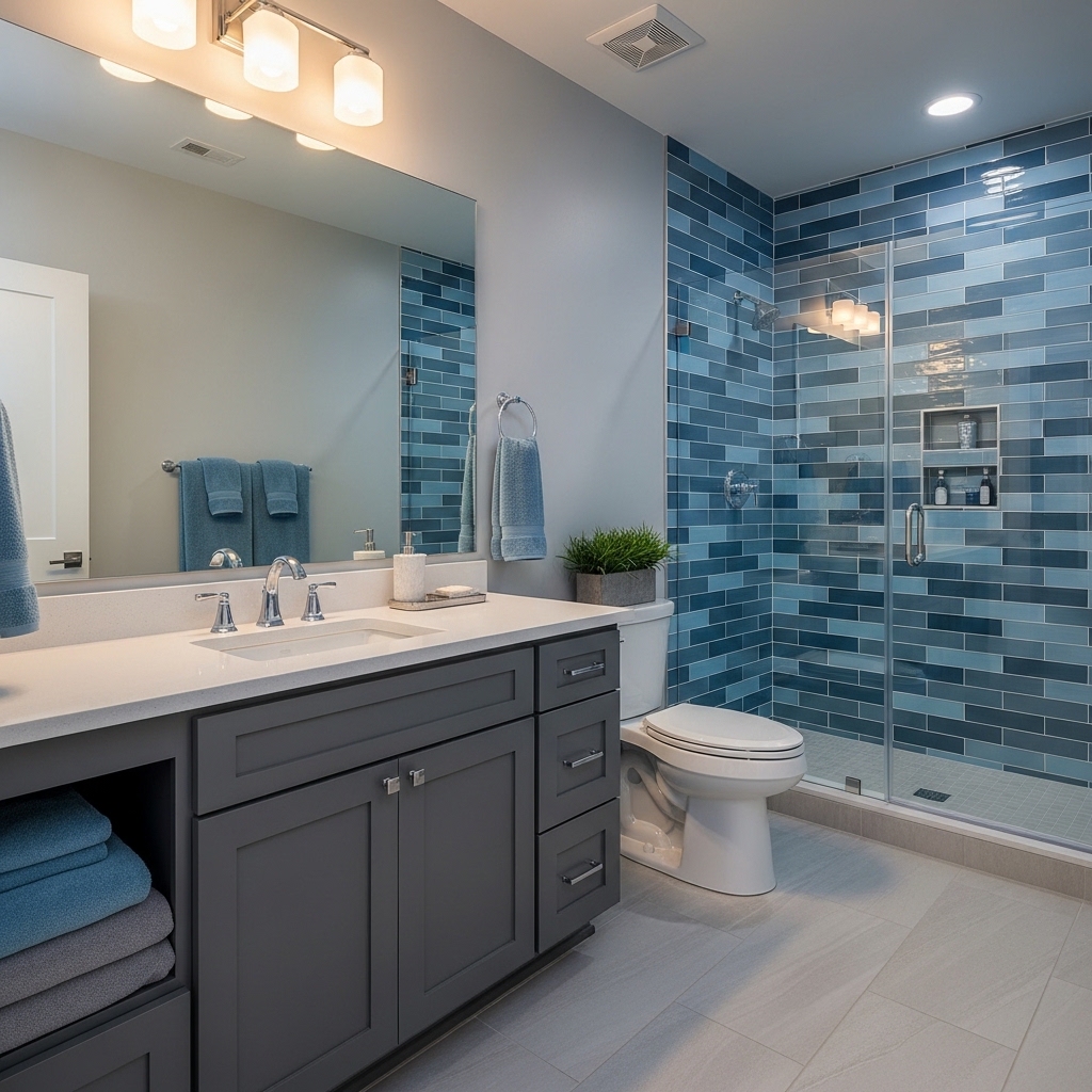
3. Navy Blue and White for Structured Medium Spaces
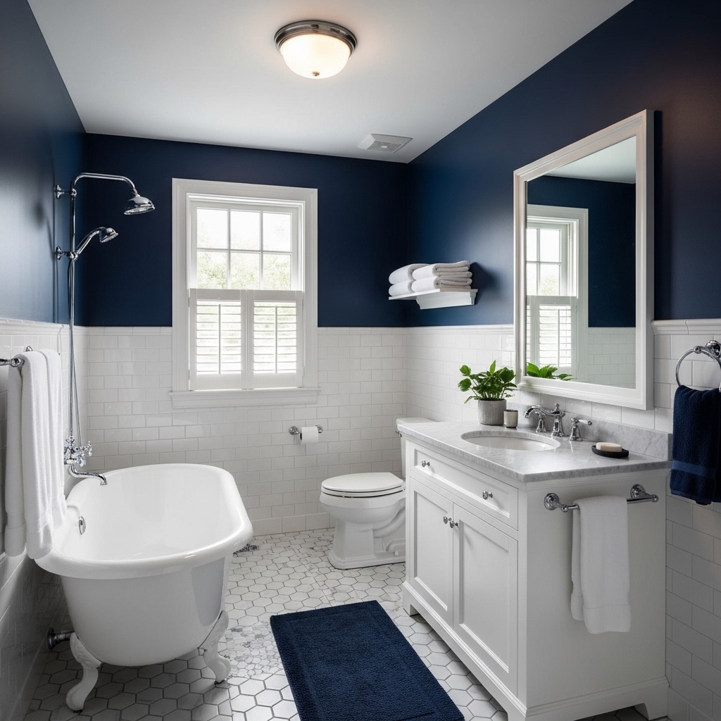
Great for: Medium-sized bathrooms that feel visually unbalanced or lack a focal point.
Use navy on one main wall or vanity area and keep the rest white. This creates contrast without overwhelming the room.
Why it works: Strong contrast defines the layout and adds depth.
Mistake to avoid: Using navy on all walls can make the space feel enclosed.
Pro Tip: Pair with warm lighting to avoid a cold feel.
4. Black and White for Bold Modern Bathrooms
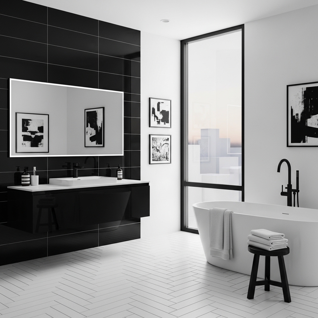
Ideal for: Modern spaces where you want a sharp, defined look.
Use black for fixtures or accent walls and white for the base. Keep lines clean and avoid excessive patterns.
Why it works: High contrast creates a strong visual impact with minimal elements.
Mistake to avoid: Overusing black can make small bathrooms feel cramped.
Pro Tip: Add mirrors to reflect light and balance the contrast.
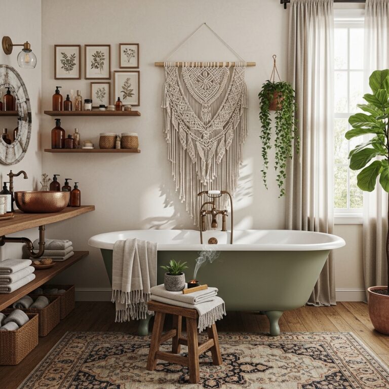
5. Sage Green and White for Relaxed Everyday Use
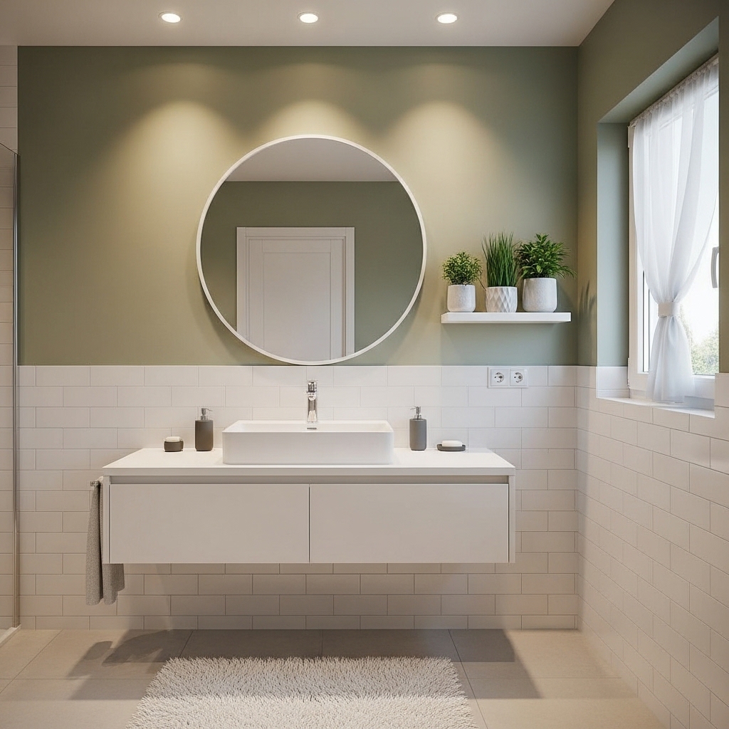
Best for: Bathrooms used daily where a calming atmosphere is important.
Apply sage green on walls and pair with white tiles or fixtures. Add natural textures like wood for balance.
Why it works: Soft green tones are easy on the eyes and reduce visual stress.
Mistake to avoid: Mixing too many green shades can feel uncoordinated.
Pro Tip: Keep decor minimal to maintain a clean look.
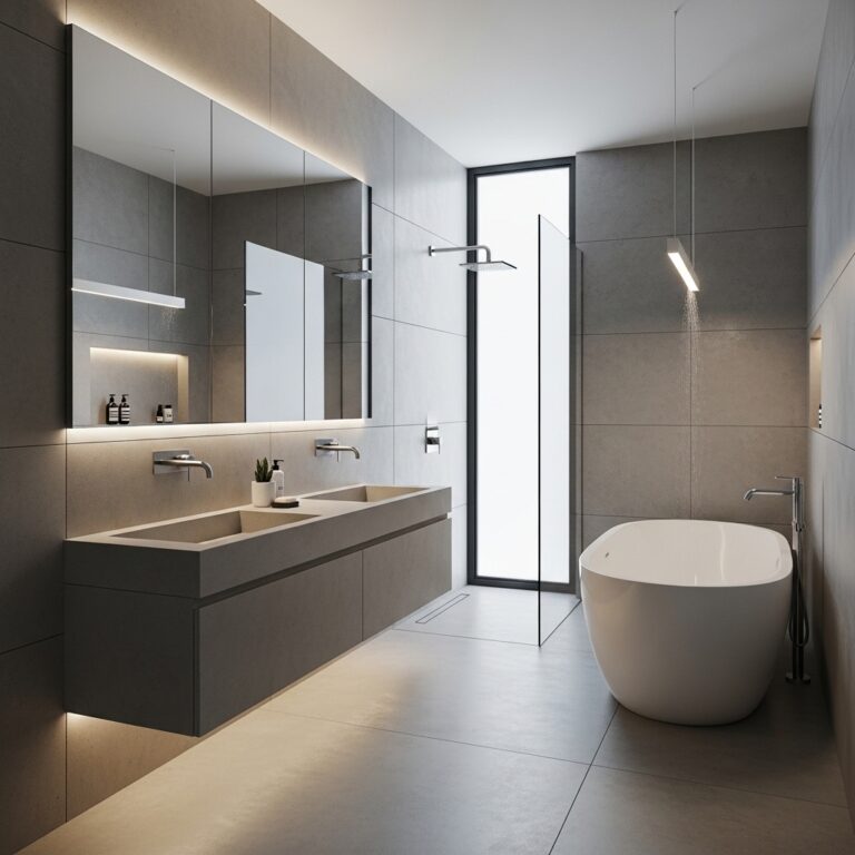
6. Charcoal and Light Gray for Large Bathrooms
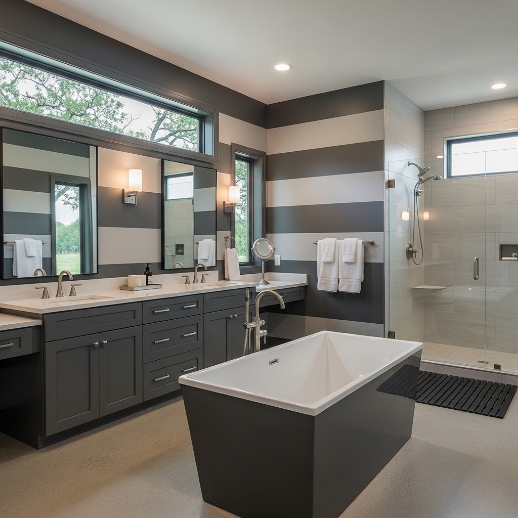
This is great for bathrooms that’re really big and feel kind of empty.
You can use charcoal color on one wall and a lighter gray color on the walls.
The charcoal wall and the lighter gray walls need to be balanced with lighting so the bathroom does not feel dark.
The reason this works is that the dark color makes the bathroom feel more solid while the lighter color keeps it feeling open and nice.
One thing you should not do is have lighting because it can make the bathroom feel heavy and uncomfortable.
One good tip is to use kinds of lighting to get a better balance in the bathroom.
Charcoal and gray colors can really make a bathroom look nice if you do it right.
You can use lighting to make the bathroom feel happy and bright and the charcoal and gray colors will make it feel cozy and nice.
Remember, lighting is very important, in a bathroom so you should think about it carefully when you are designing the bathroom.
7. Cream and Gold for Warm, Elegant Spaces
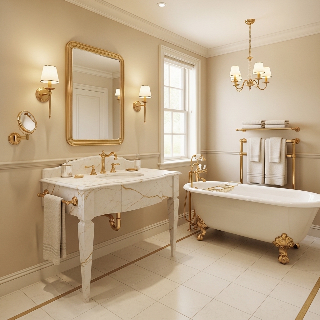
Ideal for: Bathrooms that need a softer, more inviting feel without going too traditional.
Use cream walls with subtle gold accents in fixtures or mirrors. Keep the palette simple to avoid clutter.
Why it works: Warm tones create comfort while metallic accents add refinement.
Mistake to avoid: Too much gold can feel overpowering.
Pro Tip: Stick to small metallic details for balance.
8. Light Blue and White for Bright, Airy Bathrooms
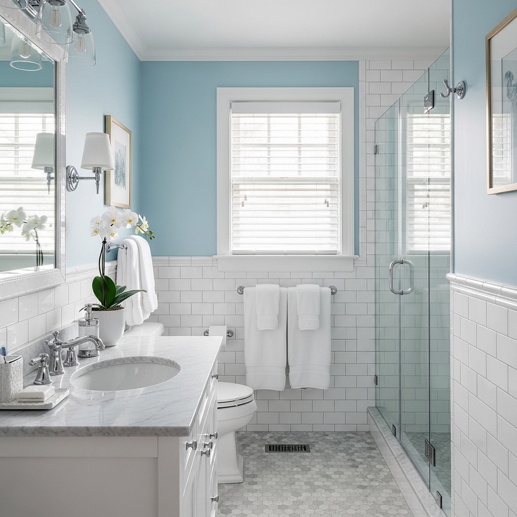
Best for: Bathrooms with strong sunlight that feel too harsh.
Use light blue walls to soften brightness and pair with white for clarity. Keep finishes simple.
Why it works: Blue tones reduce glare and create a calming effect.
Mistake to avoid: Pairing with cool lighting can make it feel cold.
Pro Tip: Use warm bulbs to balance the tone.
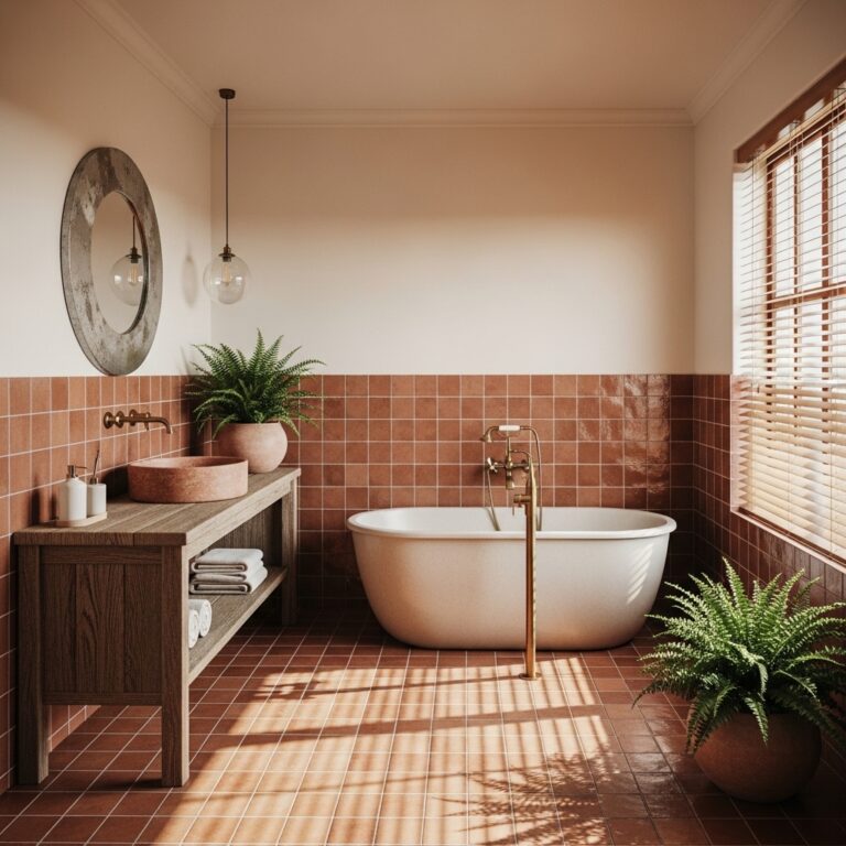
9. Terracotta and White for Cozy, Grounded Spaces
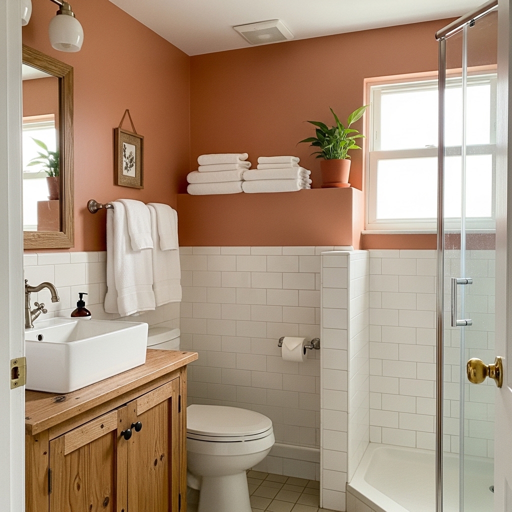
Great for: Bathrooms that feel too plain or lack personality.
Use terracotta as an accent on walls or tiles and keep the rest white. Add natural textures for balance.
Why it works: It introduces warmth and depth without overwhelming the space.
Mistake to avoid: Overusing terracotta in small rooms can feel heavy.
Pro Tip: Use it as a feature rather than a full-room color.
10. Greige and White for Flexible Design
Ideal for: Bathrooms where you want easy coordination with changing decor.
Greige sits between gray and beige, making it adaptable for different styles. Use it as a base color.
Why it works: It balances warm and cool tones, preventing clashes.
Mistake to avoid: Choosing a shade that leans too gray can feel cold.
Pro Tip: Test samples in your lighting before finalizing.
11. Dark Green and Brass for Rich Contrast
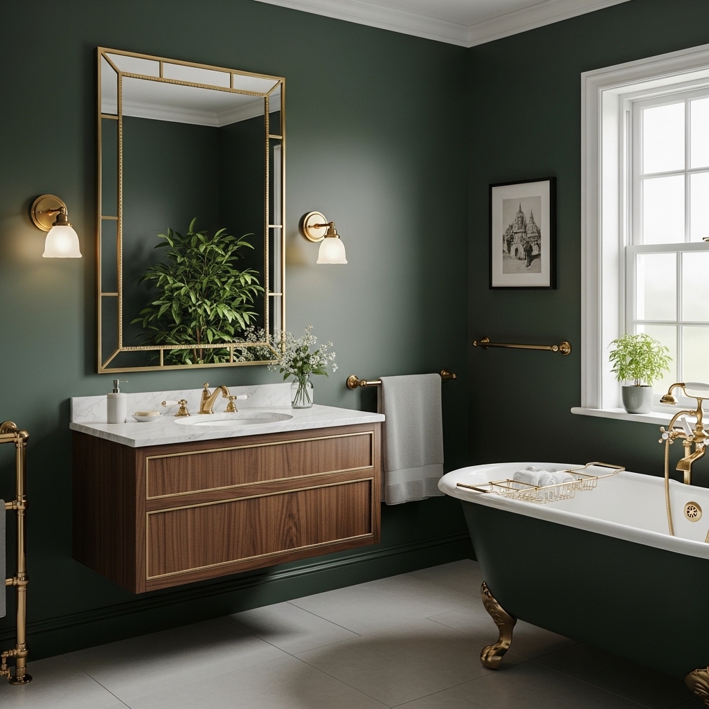
Best for: Bathrooms where you want a bold but controlled color scheme.
Use deep green on walls or vanity and add brass fixtures for contrast. Keep other elements neutral.
Why it works: Strong color paired with warm metal creates depth and focus.
Mistake to avoid: Too many bold elements can feel overwhelming.
Pro Tip: Limit the palette to 2–3 main colors.
12. Pale Pink and White for Soft Modern Style
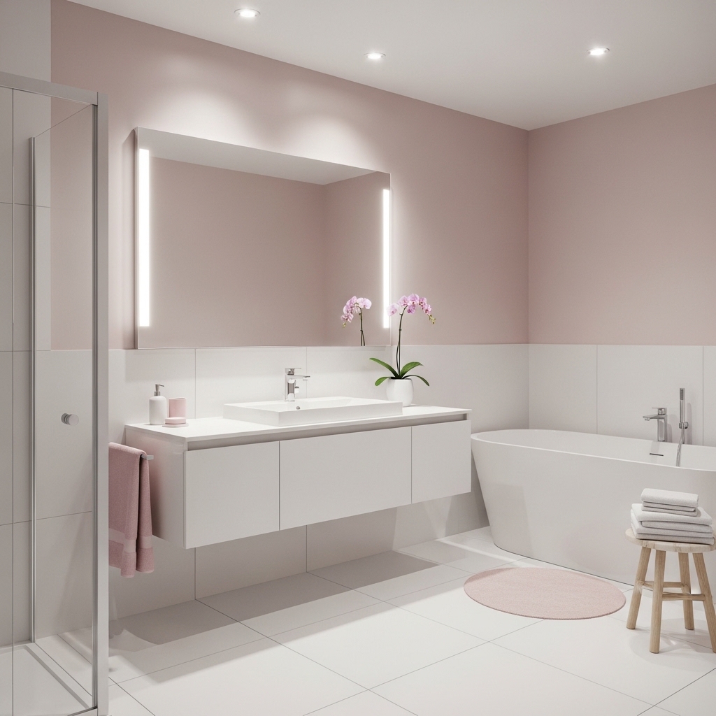
Great for: Bathrooms needing a subtle color without strong contrast.
Use pale pink on walls or accents and pair with white for balance. Keep finishes minimal.
Why it works: It adds warmth without dominating the space.
Mistake to avoid: Bright pink tones can feel too intense.
Pro Tip: Stick to muted shades for a modern look.
13. Brown and Beige for Warm Natural Feel
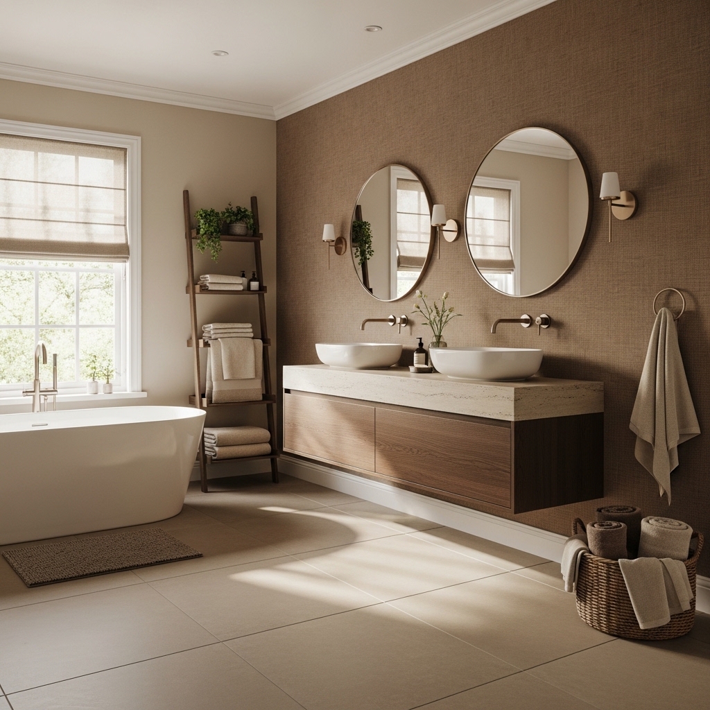
Ideal for: Bathrooms aiming for a grounded, earthy look.
Combine beige walls with brown tiles or wood elements. Keep lighting warm for consistency.
Why it works: Earth tones create a cohesive and relaxing environment.
Mistake to avoid: Too much dark brown can feel heavy.
Pro Tip: Balance with lighter tones to keep the space open.
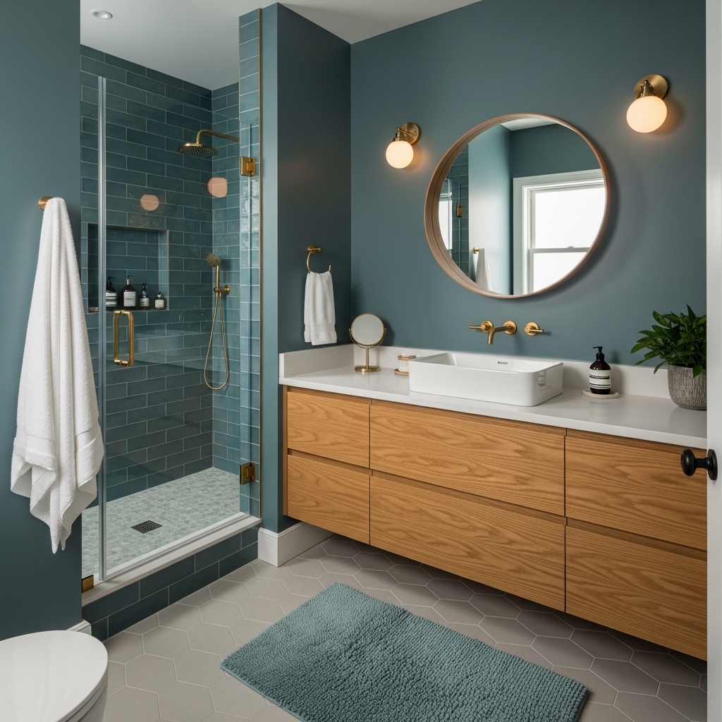
14. Blue and Gray for Balanced Cool Tones
Best for: Bathrooms where you want a cool palette without feeling cold.
Use soft blue with warm gray tones to maintain balance. Add warm lighting to soften the look.
Why it works: It blends cool colors with subtle warmth for comfort.
Mistake to avoid: Using only cool tones can feel sterile.
Pro Tip: Add wood accents for warmth.
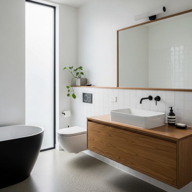
15. White and Wood for Modern Organic Style
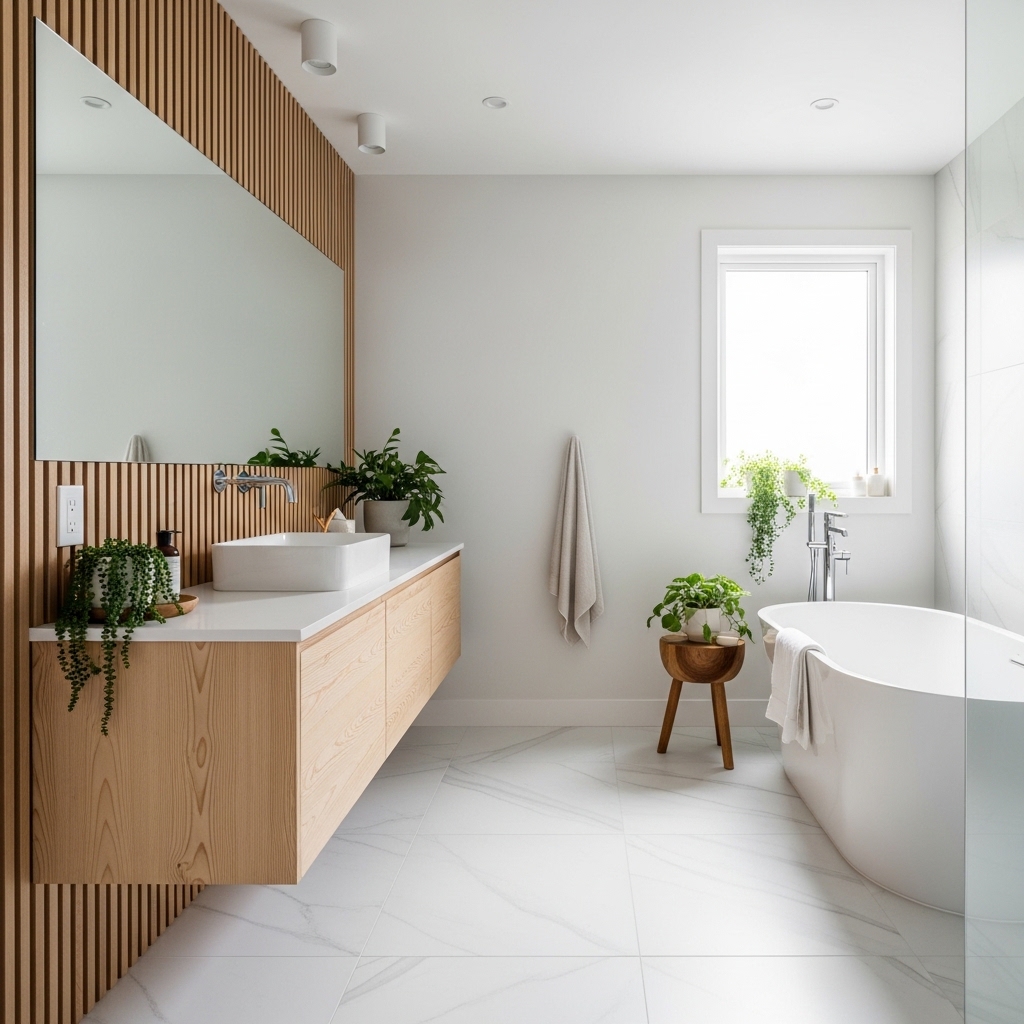
Great for: Minimal bathrooms that feel too plain.
Use white as the base and introduce wood through vanities or shelves. Keep lines clean.
Why it works: It adds warmth while maintaining simplicity.
Mistake to avoid: Dark wood in small spaces can feel heavy.
Pro Tip: Choose light or medium wood tones.
16. Black and Wood for Strong Modern Contrast
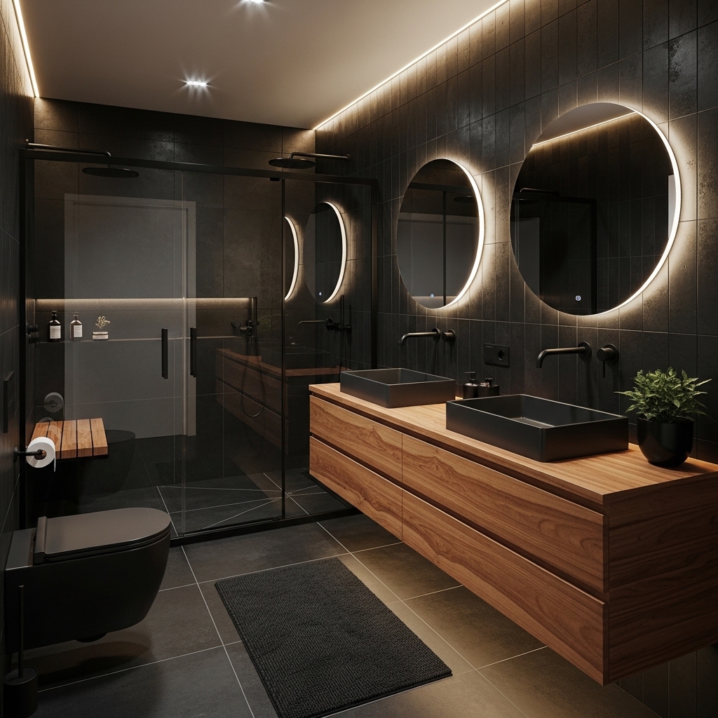
Ideal for: Bathrooms that need bold structure without complexity.
Use black elements with wood finishes to create contrast. Keep the rest of the palette minimal.
Why it works: It combines warmth and strength for a balanced modern look.
Mistake to avoid: Overusing black reduces brightness.
Pro Tip: Add mirrors to reflect light.
17. Soft Yellow and White for Low-Light Warmth
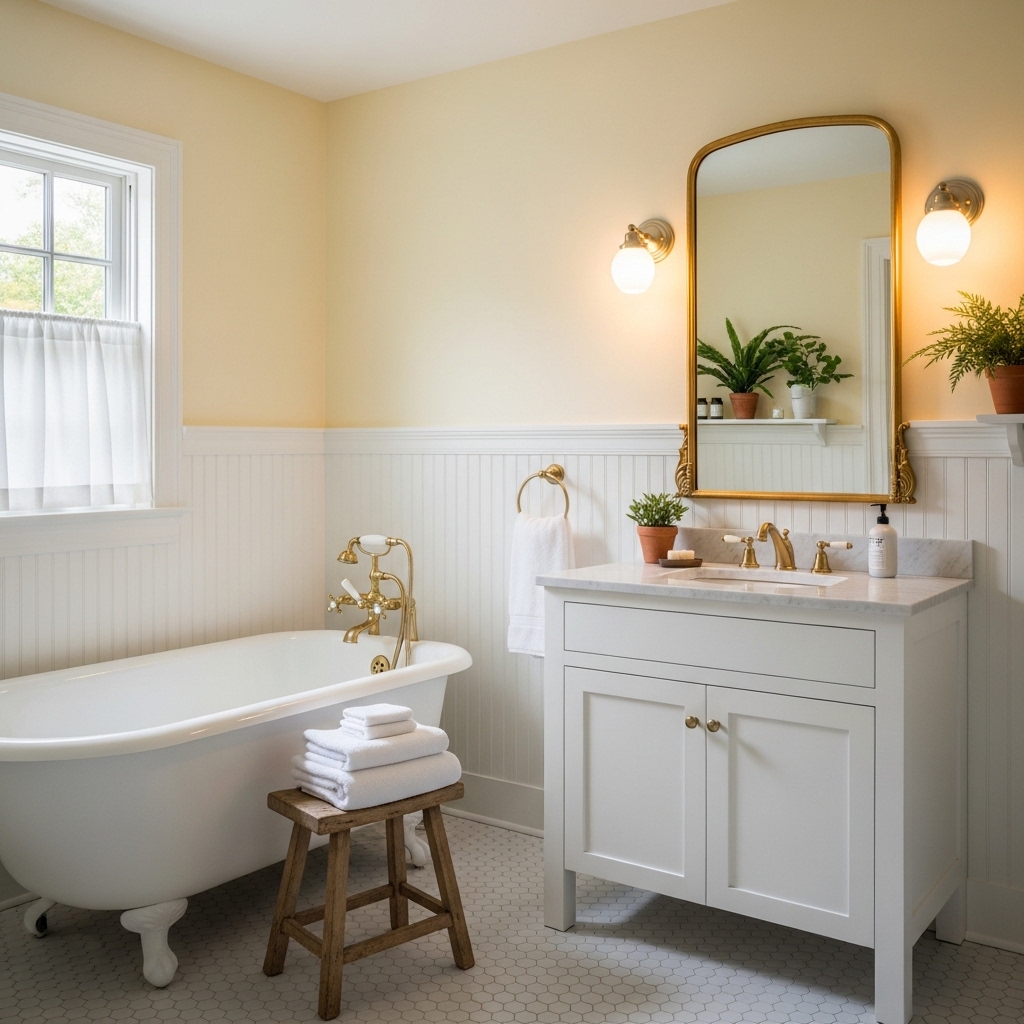
Best for: Bathrooms that feel dark or lack natural light.
Use soft yellow tones to brighten the space and pair with white for clarity. Keep finishes simple.
Why it works: Warm tones reflect artificial light better than cool shades.
Mistake to avoid: Bright yellow can feel overwhelming.
Pro Tip: Stick to muted tones for subtle warmth.
Conclusion: Choose a Color Scheme Based on Real Bathroom Conditions
The right bathroom color scheme should fix a problem. This problem could be lack of light much empty space or poor balance.
Choosing colors based on what the bathroom will be used for works than following current trends.
First figure out the issue, with your bathroom. Then pick a color scheme that makes it better.
Here are 17 bathroom color scheme ideas. They can help you create a bathroom that feels balanced, practical and easy to clean.