20 Beige Gray Flower Wall Art Ideas That Elevate Modern Spaces With Soft, Timeless Style
Beige gray flower wall art has become a go-to choice for homeowners who want a balanced aesthetic—something that feels calm without being boring, and stylish without overwhelming the room. The neutral palette works across modern, minimalist, boho, and even transitional interiors, making it one of the most versatile decor directions today.
The real difference between average wall decor and high-impact styling is placement, scale, layering, and how the artwork interacts with furniture and lighting. These ideas are designed to help you style beige gray floral wall art with intention, whether you’re decorating a small apartment, upgrading a living room, or creating a cohesive bedroom look.
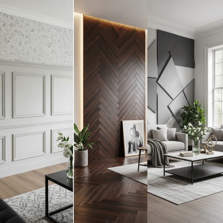
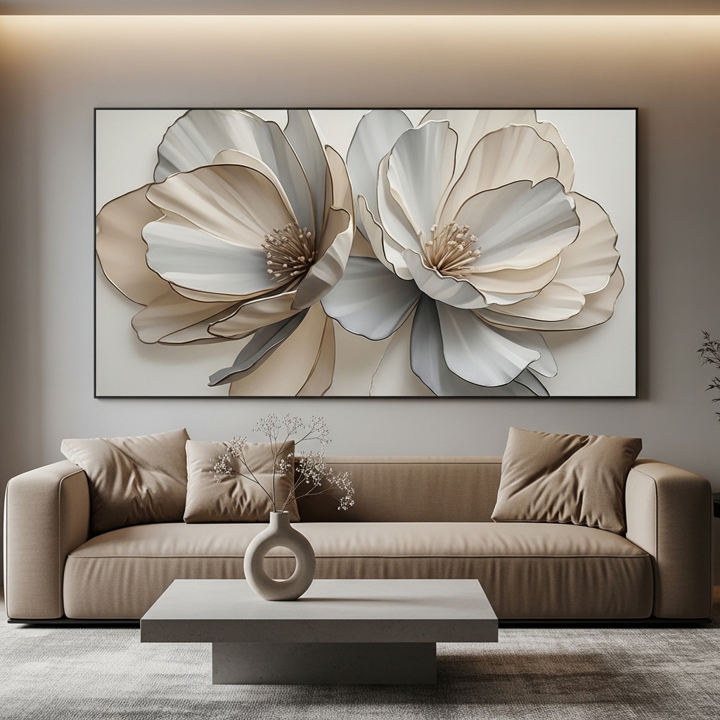
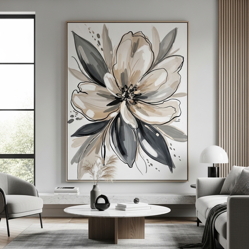
1. Oversized Beige Gray Floral Canvas as a Living Room Focal Point
Ideal for: Large blank walls behind sofas or sectionals in modern living rooms.
Use one oversized canvas featuring soft beige and gray florals to anchor your seating area. Position it centrally above the sofa, ensuring the artwork width covers at least two-thirds of the furniture below. Keep surrounding decor minimal so the artwork becomes the visual focal point.
This works because oversized art simplifies styling while creating immediate visual impact. Instead of filling walls with multiple small pieces, one large canvas provides cohesion and reduces clutter. Many homeowners make the mistake of choosing art that’s too small, which gets lost on wide walls.
Pro Tip: Choose textured or hand-painted styles for added depth.
Mistake to Avoid: Don’t hang it too high—keep it at eye level for balance.
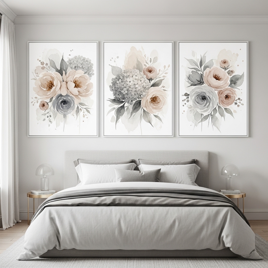
2. Triptych Floral Panels for Balanced Symmetry
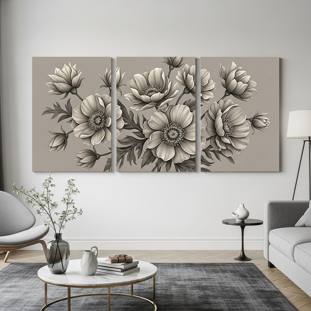
Best for: Medium to large walls needing structure without heaviness.
Use a three-panel (triptych) beige gray floral set arranged evenly with consistent spacing. Align the panels horizontally above furniture like beds, consoles, or sofas to create a structured look.
This works because symmetry naturally creates balance and visual calm, especially in neutral color schemes. It also allows the design to feel expansive without being overwhelming. A common mistake is uneven spacing, which disrupts the flow.
Pro Tip: Keep 2–3 inches between panels for clean alignment.
Mistake to Avoid: Don’t mix unrelated artwork styles within the set.
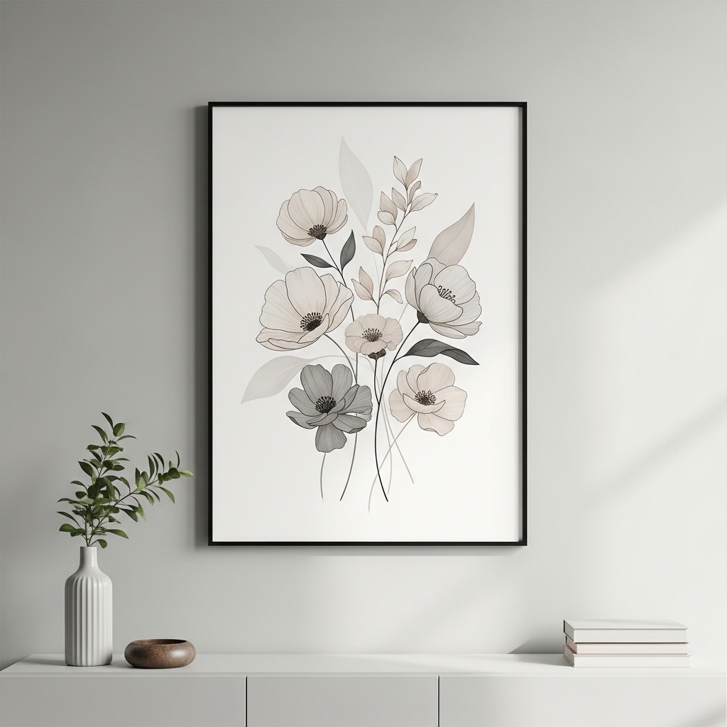
3. Minimalist Botanical Line Art in Neutral Tones
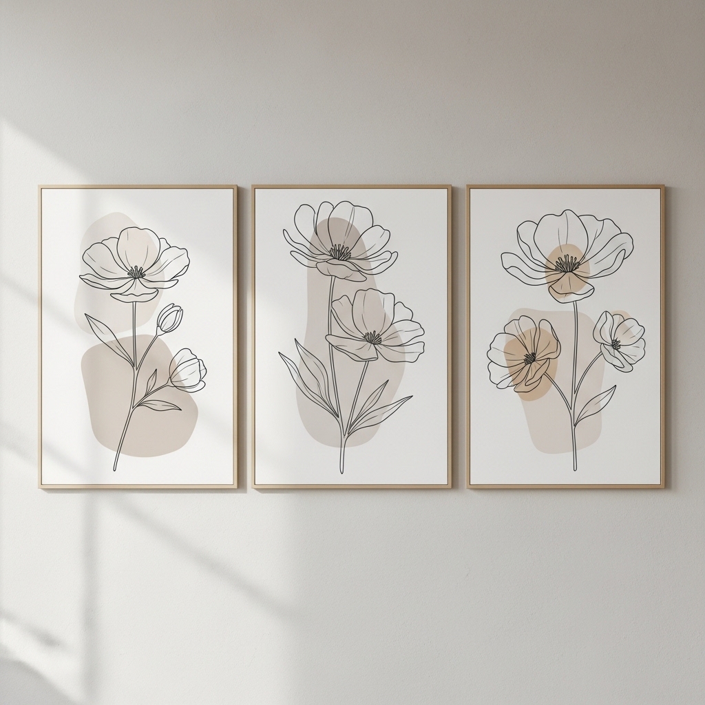
Ideal for: Small apartments or minimalist interiors.
Choose simple floral line drawings in beige and gray tones with lots of white space. Use thin frames or frameless prints to maintain a clean look.
This works because minimal designs reduce visual clutter and make small spaces feel open. It’s especially effective in rooms where too much decor can feel overwhelming.
Pro Tip: Pair with light-colored walls for a seamless look.
Mistake to Avoid: Don’t overcrowd the wall with multiple small pieces.
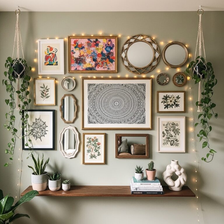
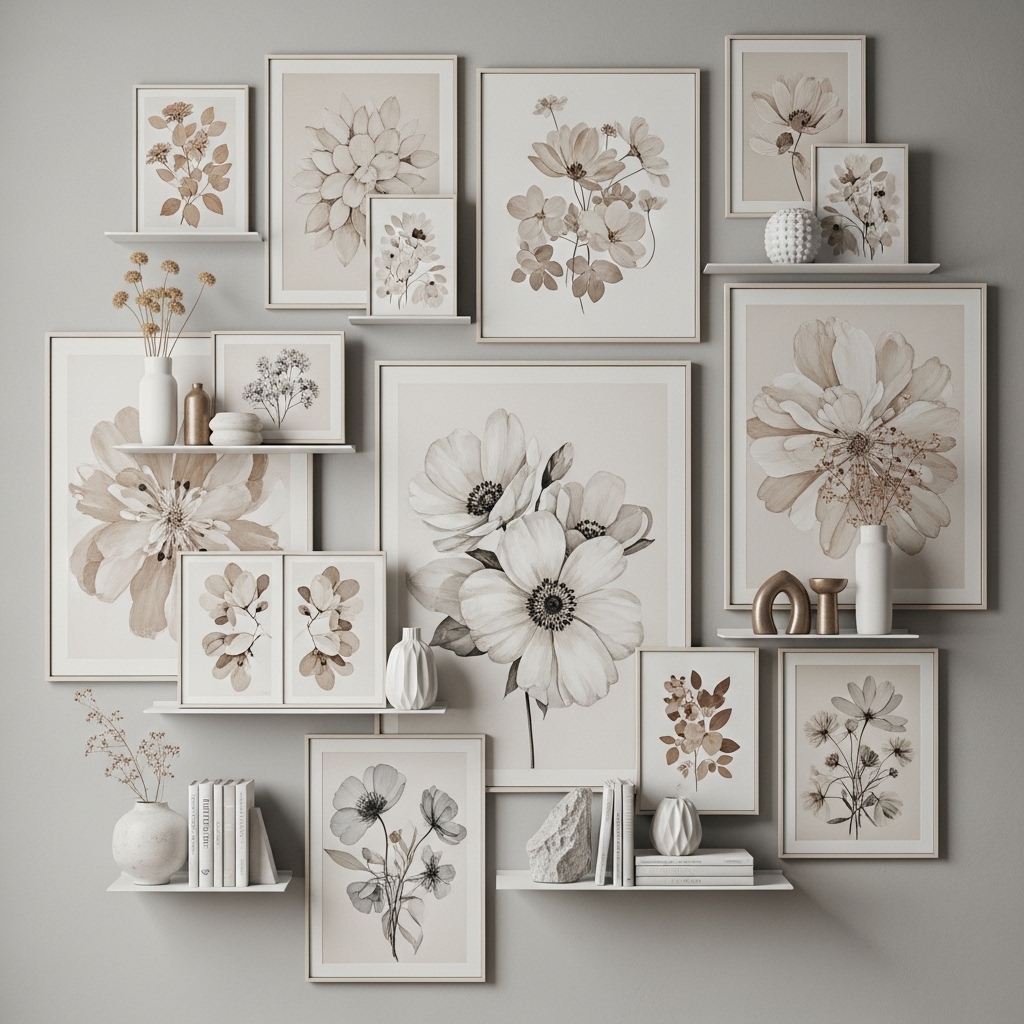
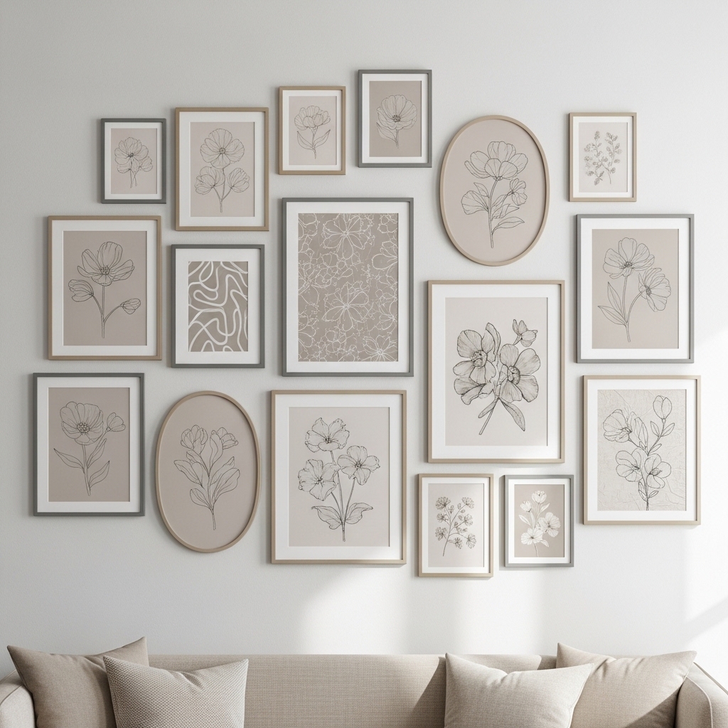
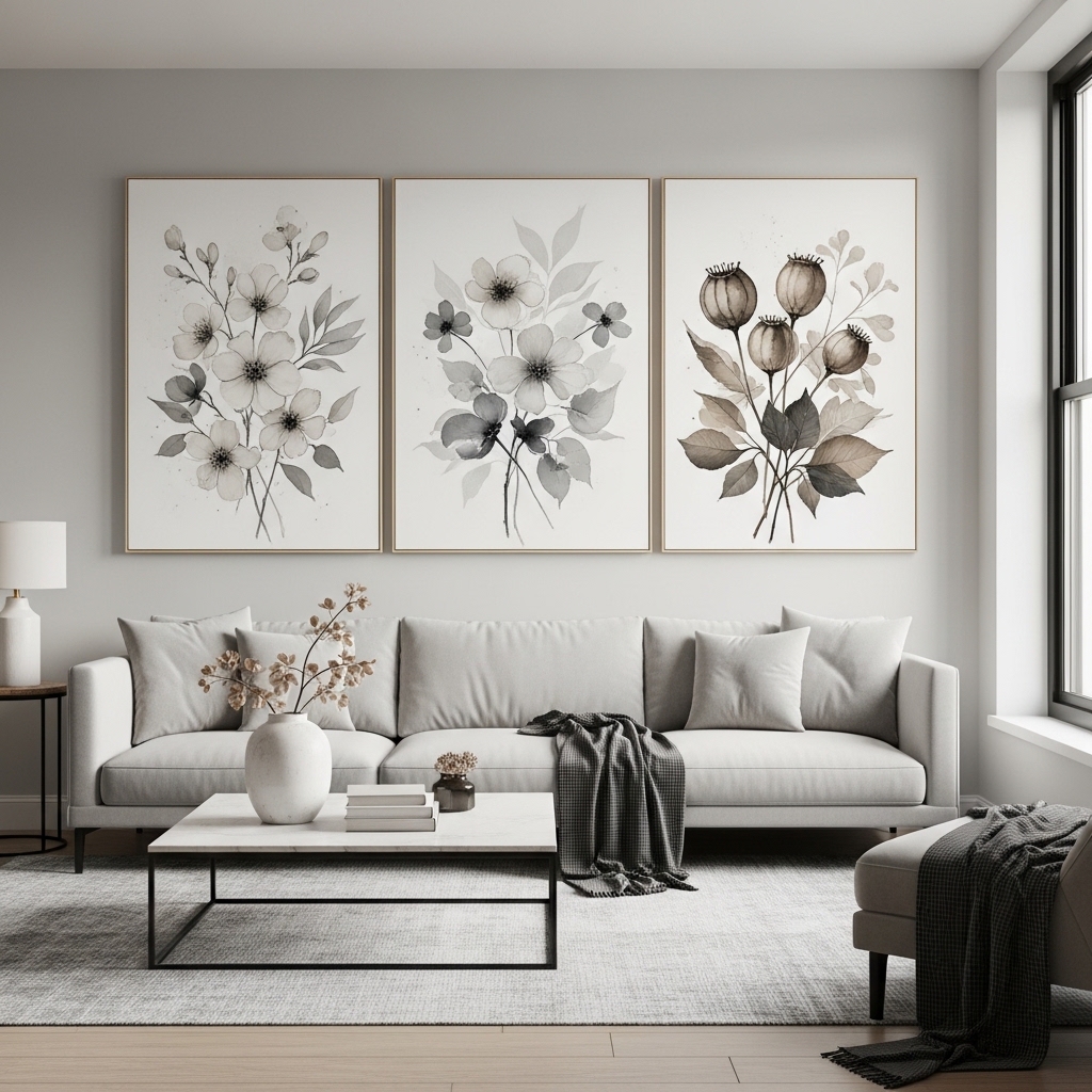
4. Framed Floral Gallery Wall With Soft Neutrals
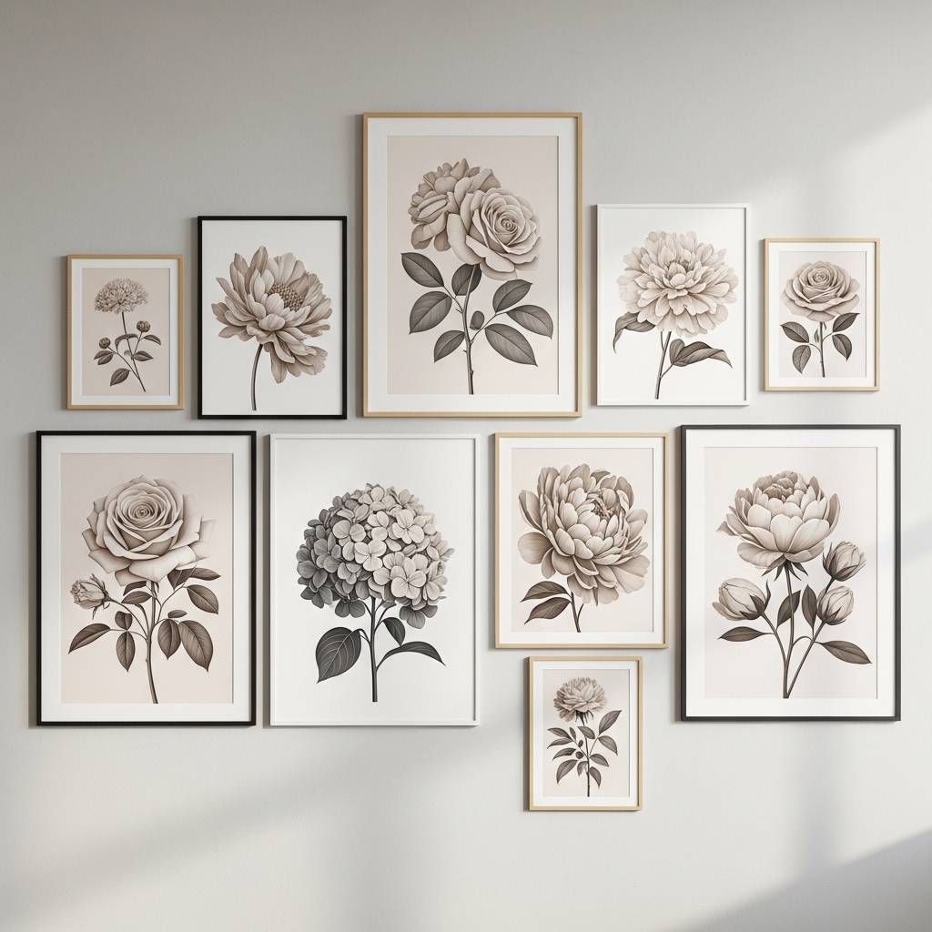
Best for: Personalizing living rooms or hallways.
Create a gallery wall using multiple beige gray floral prints in different sizes but consistent color tones. Arrange them in a balanced layout around a central piece.
This works because repetition of color creates cohesion even when frame sizes vary. It adds personality while maintaining a calm, curated look.
Pro Tip: Lay out the arrangement on the floor before hanging.
Mistake to Avoid: Don’t mix too many color palettes—it breaks harmony.
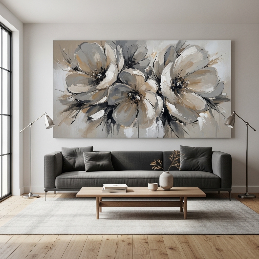
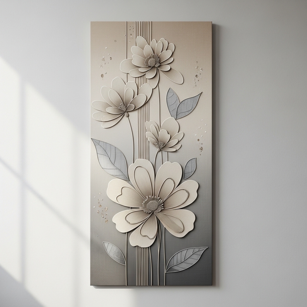
5. Textured Canvas Art for Added Depth
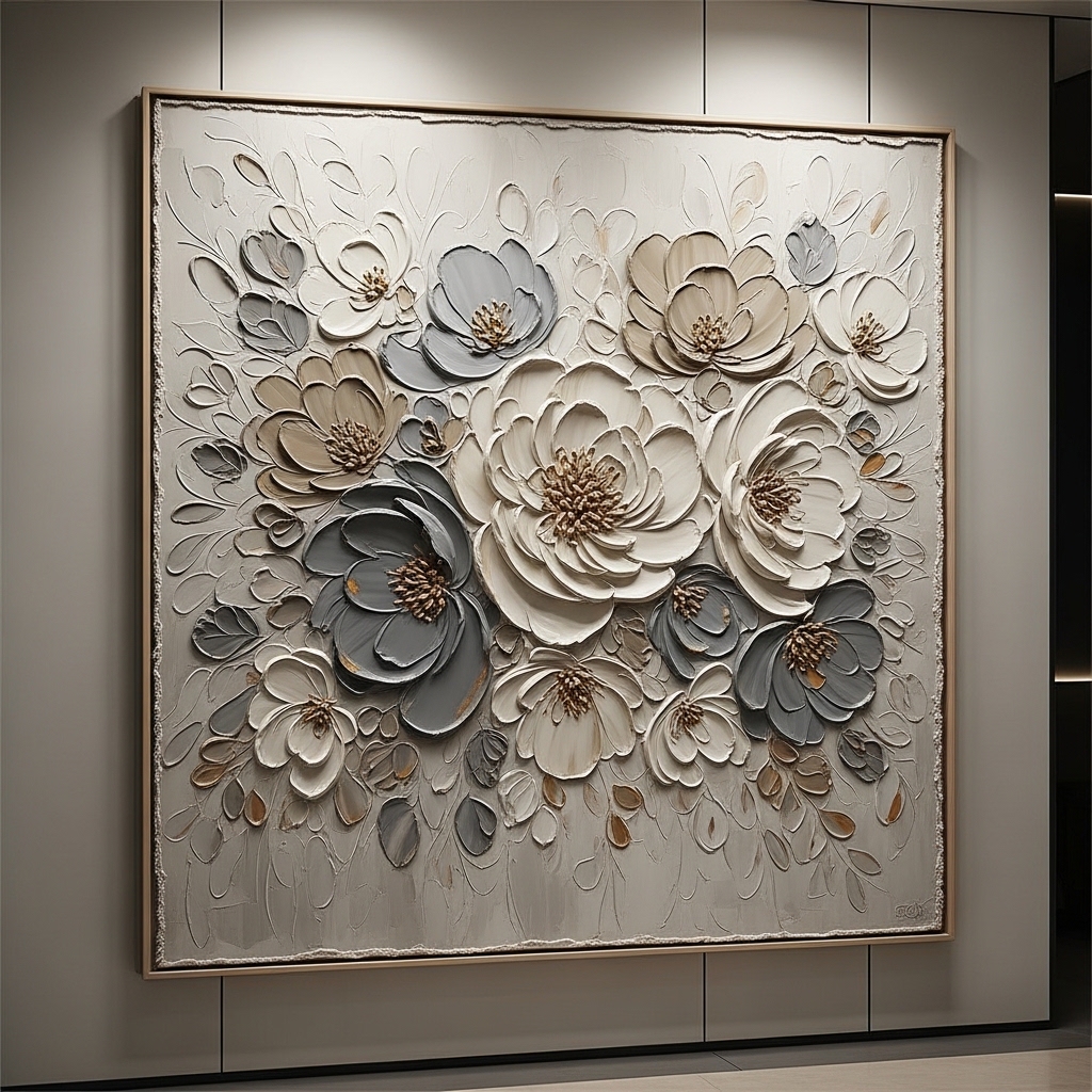
Ideal for: Modern or luxury-inspired interiors.
Choose floral wall art with raised textures or layered paint techniques. Place it where light can hit the surface to highlight details.
This works because texture adds dimension, making neutral tones feel rich instead of flat.
Pro Tip: Use spot lighting to enhance texture visibility.
Mistake to Avoid: Don’t pair with overly busy decor.
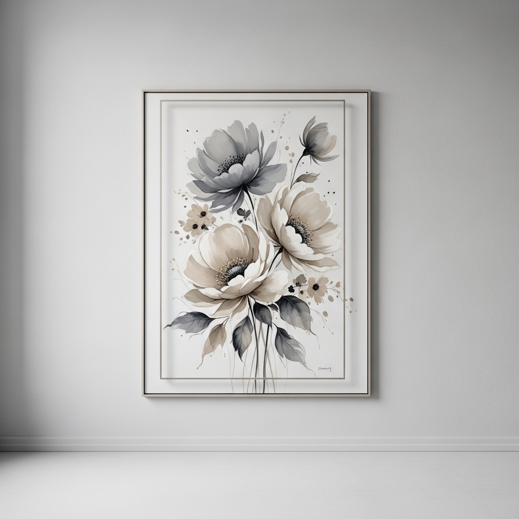
6. Soft Watercolor Floral Prints for Bedrooms
Best for: Creating a calm and relaxing bedroom environment.
Use watercolor-style beige gray floral art above the bed or dresser. Keep frames light and minimal to maintain softness.
This works because watercolor designs create a gentle, soothing effect that supports relaxation.
Pro Tip: Match bedding tones with artwork for cohesion.
Mistake to Avoid: Don’t use harsh lighting above soft artwork.
7. Vertical Floral Art for Narrow Walls
Ideal for: Hallways or tight spaces.
Use tall, vertical beige gray floral prints to fill narrow wall areas.
This works because vertical orientation enhances height perception.
Pro Tip: Use slim frames to maintain clean lines.
Mistake to Avoid: Don’t use wide artwork in narrow spaces.
8. Floating Frame Floral Art for Modern Style
Best for: Contemporary interiors.
Use floating frames to give artwork a “lifted” appearance.
This works because it adds a modern edge without clutter.
Pro Tip: Choose subtle frame colors.
Mistake to Avoid: Don’t use bulky frames.
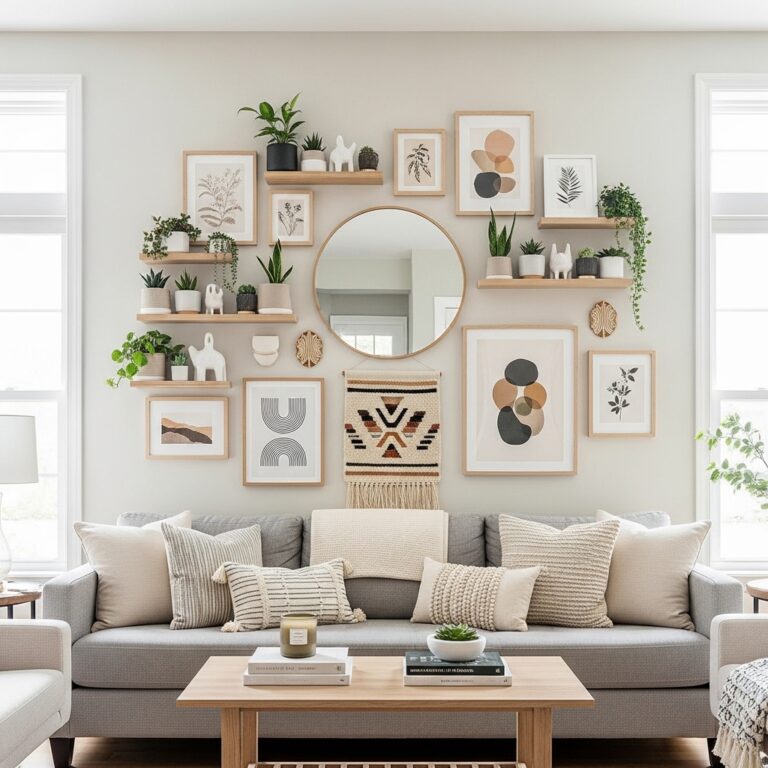
9. Layered Wall Art With Shelves
Ideal for: Flexible decor setups.
Place floral prints on floating shelves and layer smaller decor items.
This works because layering adds depth and flexibility.
Pro Tip: Use odd-number groupings.
Mistake to Avoid: Don’t overcrowd shelves.
10. Abstract Floral Art for Modern Homes
Best for: Contemporary styling.
Choose abstract interpretations of beige gray florals.
This works because it blends artistic expression with neutral tones.
Pro Tip: Pair with minimalist furniture.
Mistake to Avoid: Don’t mix too many abstract styles.
11. Black Frame Contrast With Neutral Florals
Ideal for: Adding contrast in light-colored rooms.
Use black frames around beige gray floral prints to create definition. Position them on white or light-toned walls so the contrast feels intentional rather than heavy. Keep spacing even and layouts simple to avoid visual noise.
This works because contrast sharpens the overall design, preventing neutral palettes from feeling washed out. It also helps highlight the artwork without introducing bold colors. A common mistake is using too many contrasting elements, which can overpower the softness of floral themes.
Pro Tip: Stick to one frame color across all pieces for cohesion.
Mistake to Avoid: Don’t mix black frames with multiple other finishes.
12. Canvas Pairing Above Bed for Balanced Symmetry
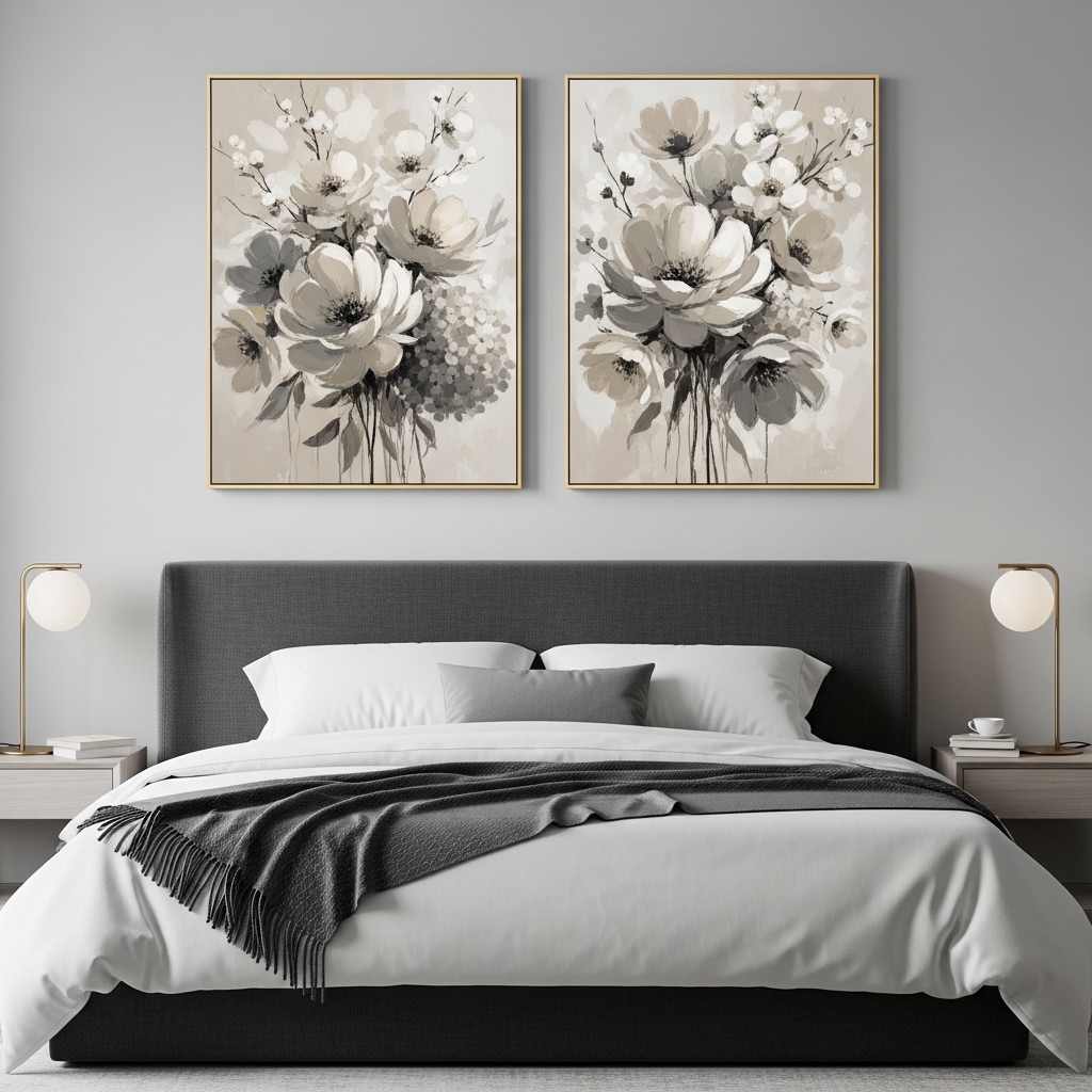
Best for: Bedrooms needing a calm focal point.
Use two medium-sized beige gray floral canvases placed evenly above the bed. Align them with the width of the headboard and keep equal spacing between them. This creates a balanced, hotel-like aesthetic.
This works because symmetry promotes relaxation and visual order, which is ideal for sleeping spaces. Many people hang art too wide or too high, breaking the balance of the bed area.
Pro Tip: Keep artwork centered at eye level when standing.
Mistake to Avoid: Don’t use mismatched sizes or styles.
13. Soft Boho Floral Art With Neutral Accents
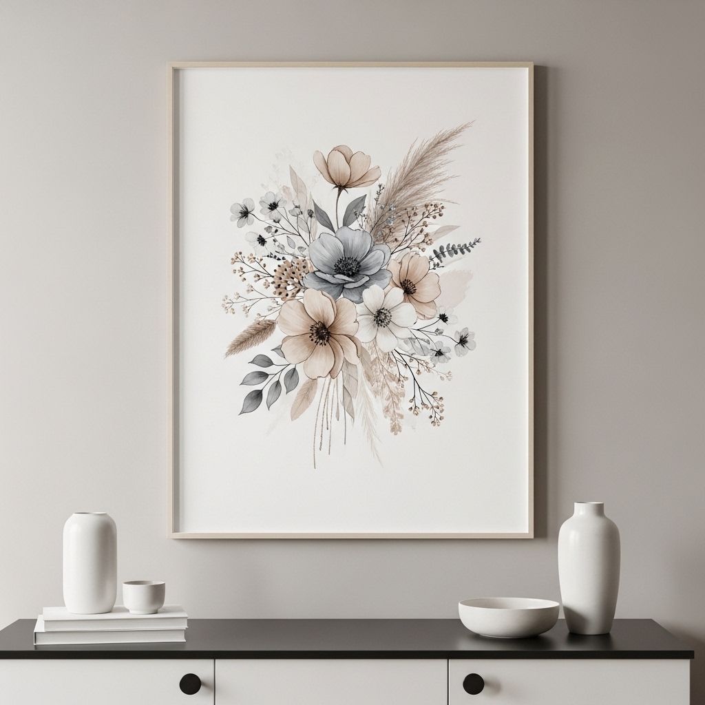
Ideal for: Boho-inspired interiors with warm textures.
Choose beige gray floral prints combined with subtle earthy tones like taupe or soft brown. Pair them with rattan, wood, or linen elements to enhance the boho feel.
This works because it blends softness with texture, creating a relaxed yet styled look.
Pro Tip: Add woven decor elements nearby for depth.
Mistake to Avoid: Don’t add overly bright boho colors.
14. Entryway Floral Statement for First Impressions
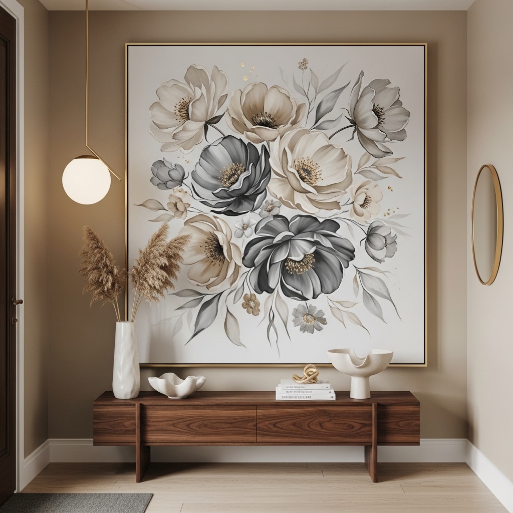
Best for: Creating a welcoming entrance.
Place a medium-sized floral artwork in the entryway above a console table. Keep decor minimal around it.
This works because first impressions matter, and a calm neutral artwork sets the tone.
Pro Tip: Add a mirror nearby for light reflection.
Mistake to Avoid: Don’t overcrowd entry walls.
15. Large Neutral Floral Mural for Accent Walls
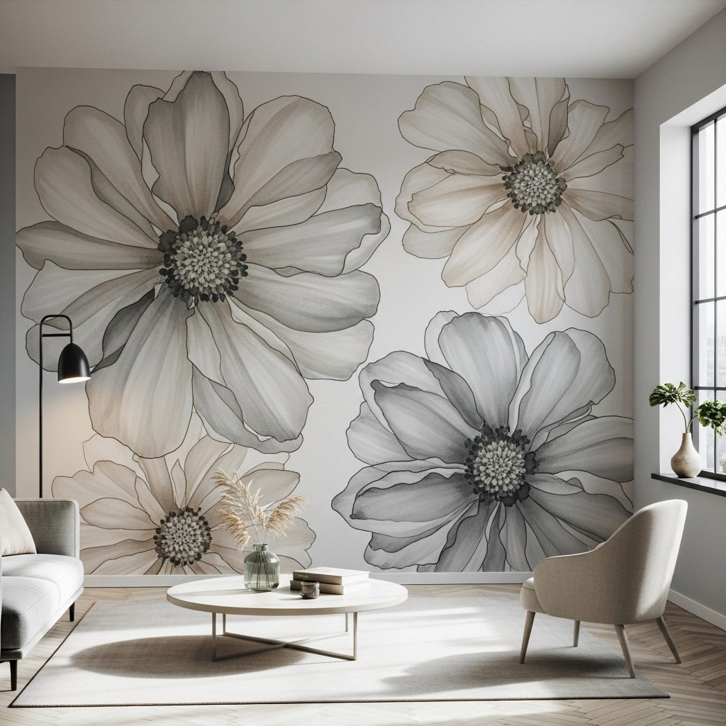
Ideal for: Statement walls in living or dining areas.
Use a large-scale beige gray floral mural or wallpaper to cover an entire wall. Keep furniture simple to let the design stand out.
This works because large patterns create dramatic impact without bold colors.
Pro Tip: Use one accent wall only.
Mistake to Avoid: Don’t apply on multiple walls.
16. Mixed Frame Gallery With Uniform Color Theme
Best for: Creative yet cohesive styling.
Mix frame styles but keep all artwork within the beige gray palette.
This works because color consistency ties different frames together.
Pro Tip: Maintain equal spacing.
Mistake to Avoid: Don’t mix too many frame finishes.
17. Subtle Floral Prints for Bathroom Decor
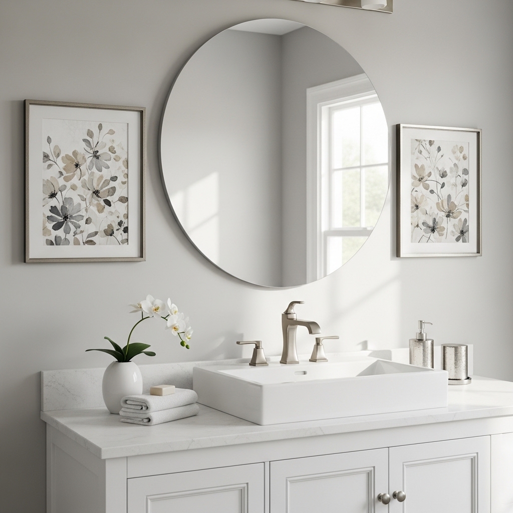
Ideal for: Adding softness to bathrooms.
Use small framed floral prints to enhance neutral bathroom designs.
This works because it adds warmth without overwhelming small spaces.
Pro Tip: Use moisture-resistant frames.
Mistake to Avoid: Don’t place near direct water exposure.
18. Office Wall Art for Calm Productivity
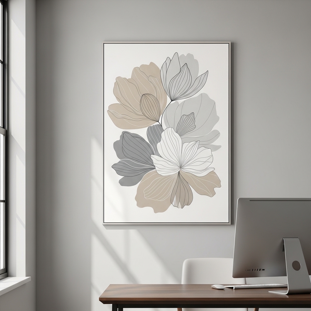
Best for: Work-from-home setups.
Add beige gray floral prints to create a calm workspace.
This works because soft visuals reduce stress.
Pro Tip: Keep desk area uncluttered.
Mistake to Avoid: Don’t overcrowd walls.
19. Layered Neutral Art With Mirrors
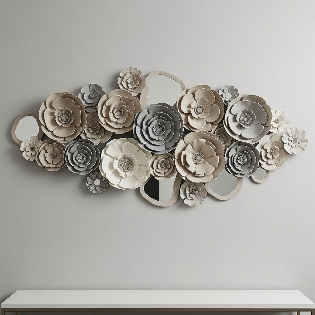
Ideal for: Small spaces needing depth.
Combine floral art with mirrors to reflect light.
This works because mirrors expand visual space.
Pro Tip: Position near natural light.
Mistake to Avoid: Don’t create cluttered reflections.
20. Seasonal Styling With Neutral Floral Swaps
Best for: Keeping decor fresh year-round.
Rotate floral prints slightly based on seasons while keeping the same neutral palette.
This works because subtle changes maintain interest without redesigning the space.
Pro Tip: Store off-season art safely.
Mistake to Avoid: Don’t switch to completely different color schemes.
Conclusion
Beige gray flower wall art works because it balances calmness, flexibility, and timeless style. When styled correctly—with the right scale, placement, and supporting decor—it can transform any space into a cohesive and visually pleasing environment.