20 Aesthetic Wall Decor Ideas That Elevate Any Room Without Feeling Overstyled
Aesthetic decor gets a bad reputation. People assume it means generic prints from fast-fashion home brands or rooms that look like everyone else’s. But true aesthetic design is not about following trends—it is about creating visual harmony through intentional choices.
The best aesthetic walls feel collected, not purchased. They balance color, texture, and negative space. They reflect the people who live in the room without screaming for attention.
This guide delivers 20 aesthetic wall decor ideas that work in any room. No generic mass-produced art required. Just thoughtful, layered design.
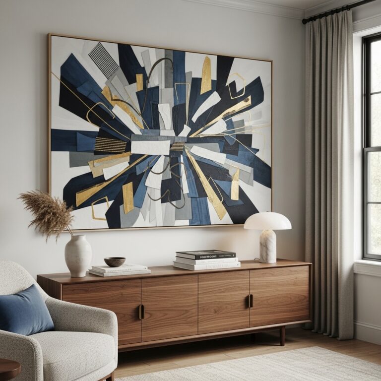
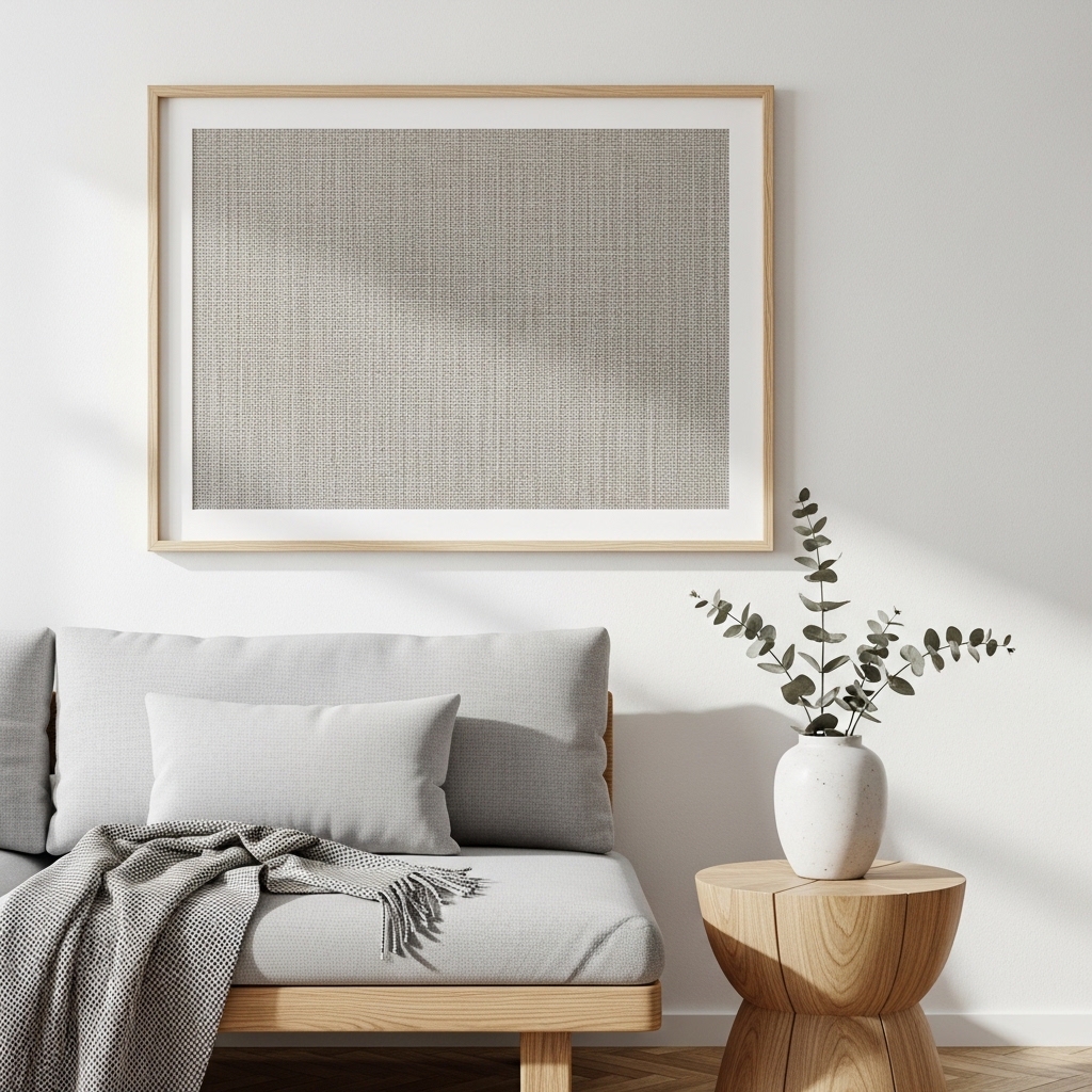
1. Oversized Canvas With Soft, Muted Tones
A large canvas in muted colors anchors a room without overwhelming it. Choose shades that already appear in your furniture or textiles.
The canvas should fill about two-thirds of the wall space below it. A piece that is too small looks lost. A piece that is too large feels heavy.
Pro Tip: Commission a local artist for a unique piece. The cost is often comparable to mass-produced art.
Mistake to Avoid: Do not choose bright, saturated colors. Muted tones age better and feel calmer.
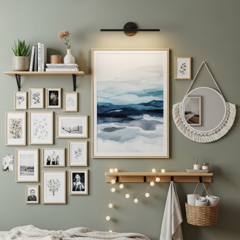
2. Grid of Matching Black and White Photographs
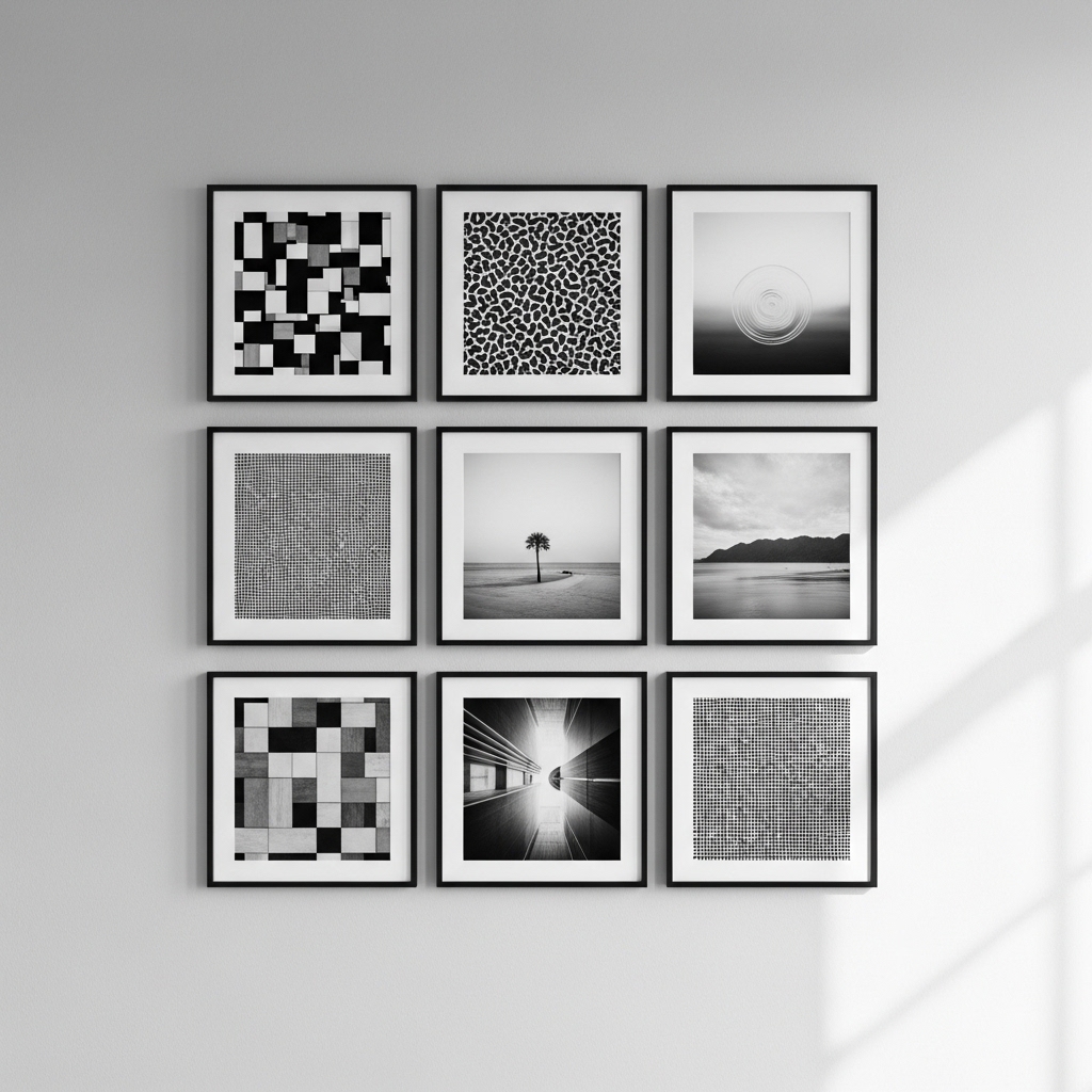
Black and white photography eliminates color noise. The eye focuses on composition, light, and shadow. A grid of matching frames creates order.
Use 4, 6, or 9 identical frames. Arrange them in a perfect square or rectangle. The uniformity is the aesthetic.
Pro Tip: Print your own photos. A grid of personal images is more meaningful than stock photography.
Mistake to Avoid: Do not mix frame styles. Every frame must match exactly.
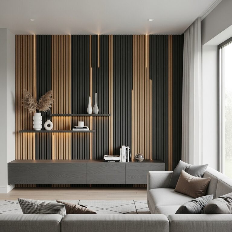
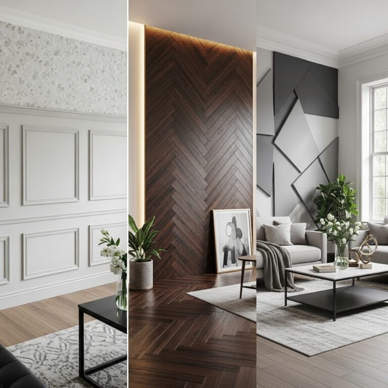
3. Textured Wall Panels Behind the Bed or Sofa
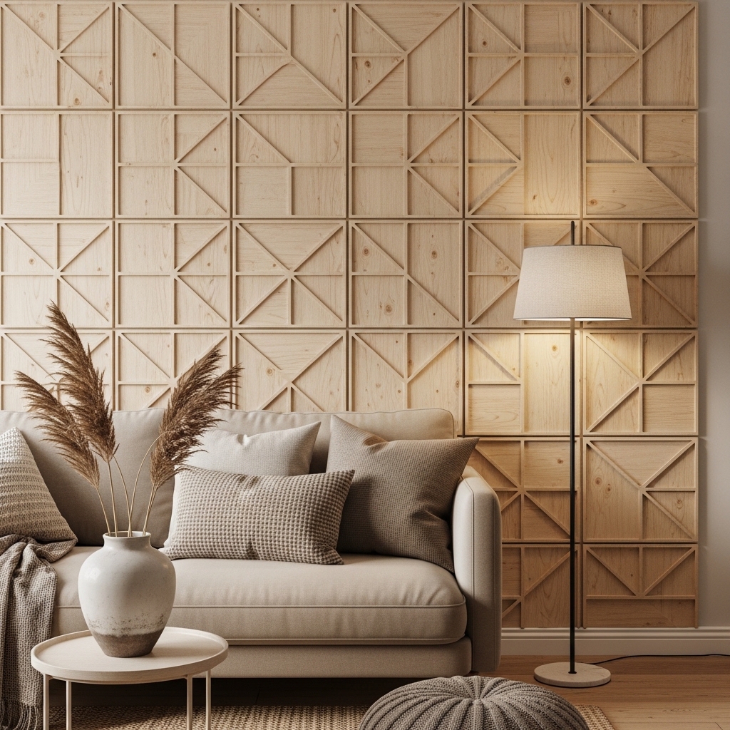
Paint is flat. Texture adds dimension. Wall panels in wood, fabric, or 3D plaster create depth without adding clutter.
Install panels on one wall only. The contrast between the textured wall and smooth surrounding walls creates the aesthetic.
Pro Tip: Use acoustic panels for sound absorption. They look beautiful and improve room acoustics.
Mistake to Avoid: Do not use busy patterns. Simple, repeating textures are more calming.
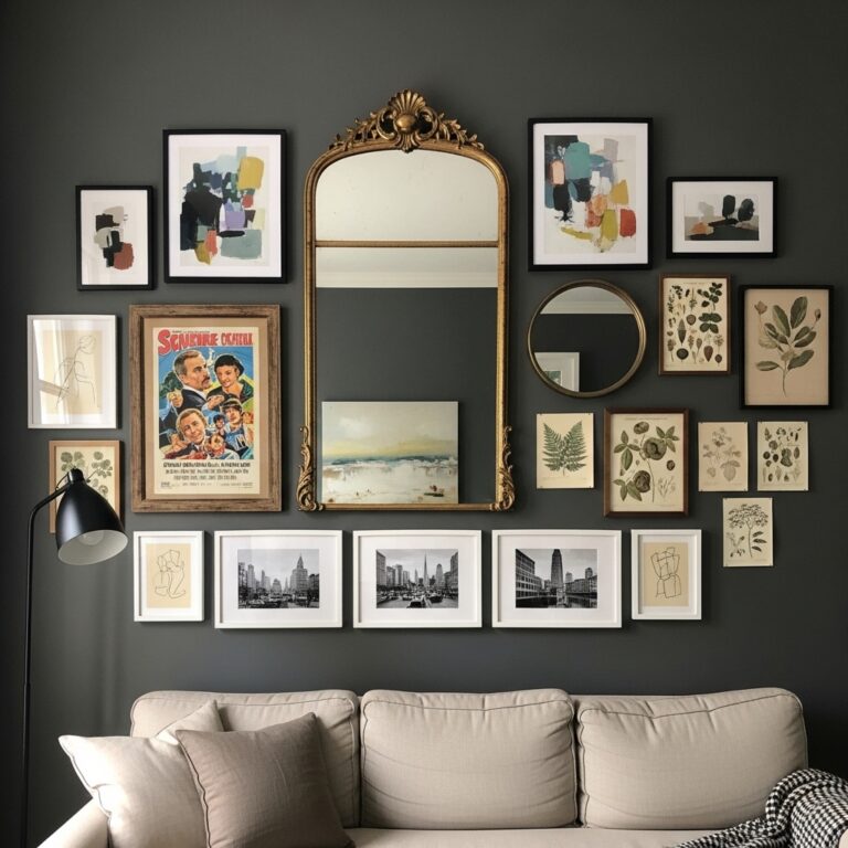
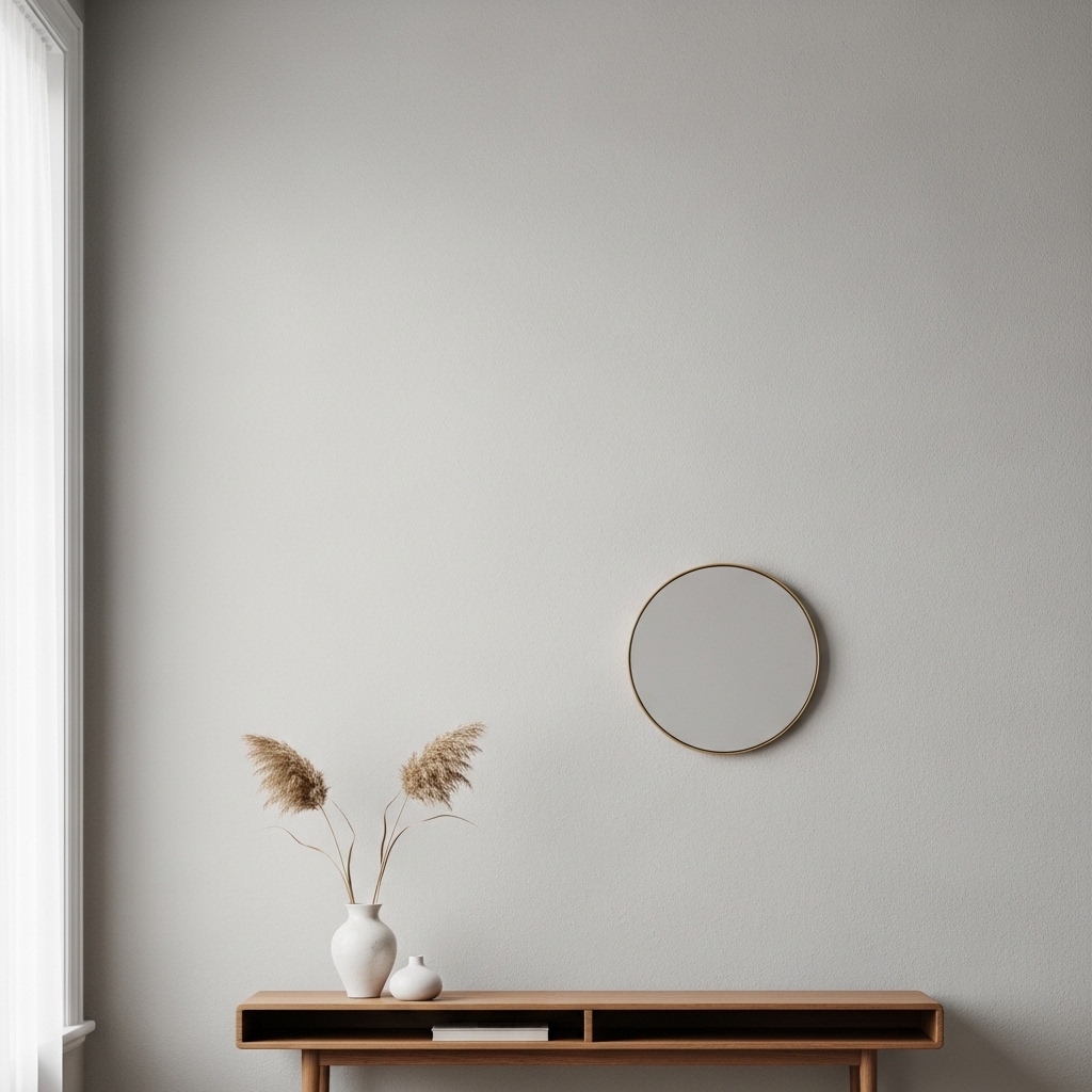
4. Single Large Mirror With an Unusual Shape
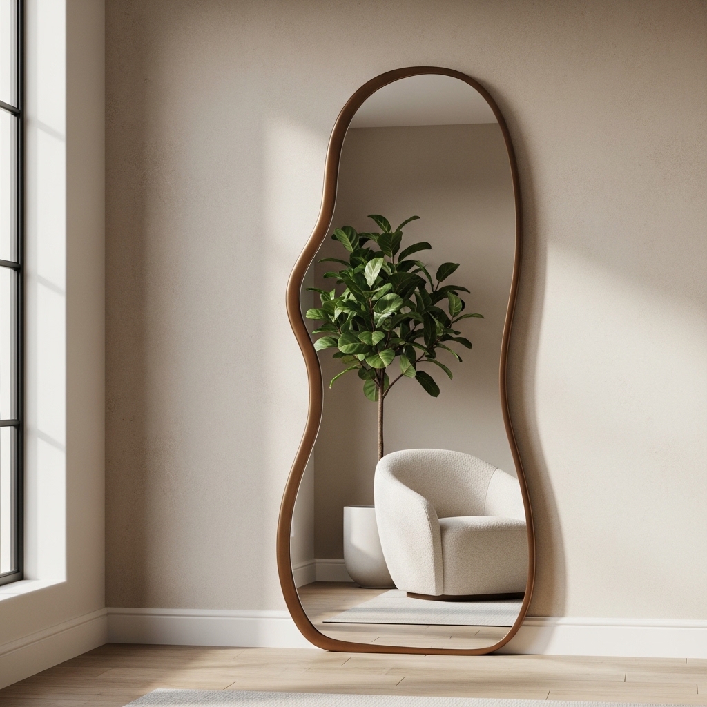
Standard rectangular mirrors are predictable. A mirror in an arch, circle, or organic shape becomes art. It also adds light and depth.
Place the mirror where it reflects something beautiful—a window, a plant, a piece of furniture. Avoid reflecting blank walls or clutter.
Pro Tip: Lean the mirror against the wall instead of hanging it. Leaning feels more casual and collected.
Mistake to Avoid: Do not choose a mirror with an ornate frame. Simple frames are more versatile.
5. Floating Shelves With Curated Objects Only
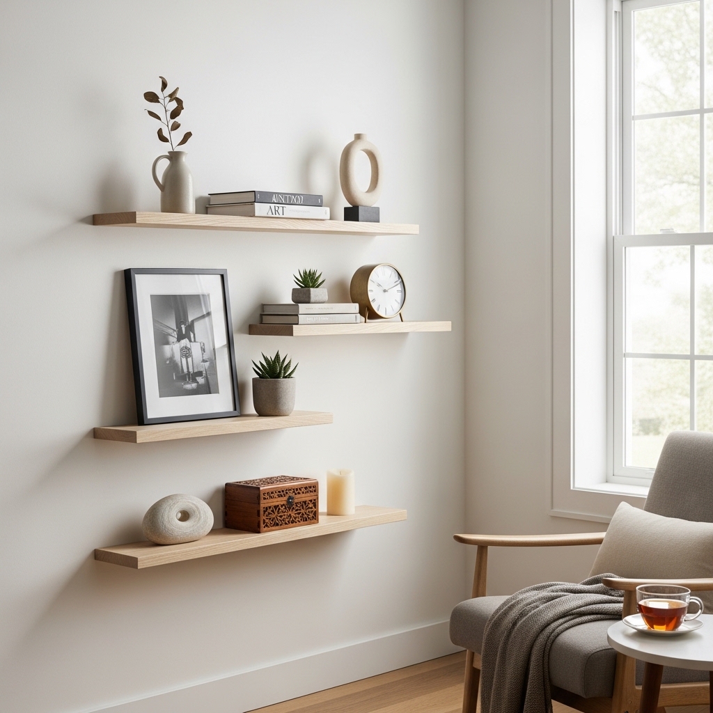
Floating shelves are not for storage. They are for display. Every item on an aesthetic shelf earns its place.
Use the rule of three. Three objects per shelf. Vary heights and textures. Leave empty space between groups.
Pro Tip: Use the same color palette across all objects. Repetition creates cohesion.
Mistake to Avoid: Do not put books on aesthetic shelves. Books belong on bookcases.
6. Woven Wall Hanging in Natural Fibers
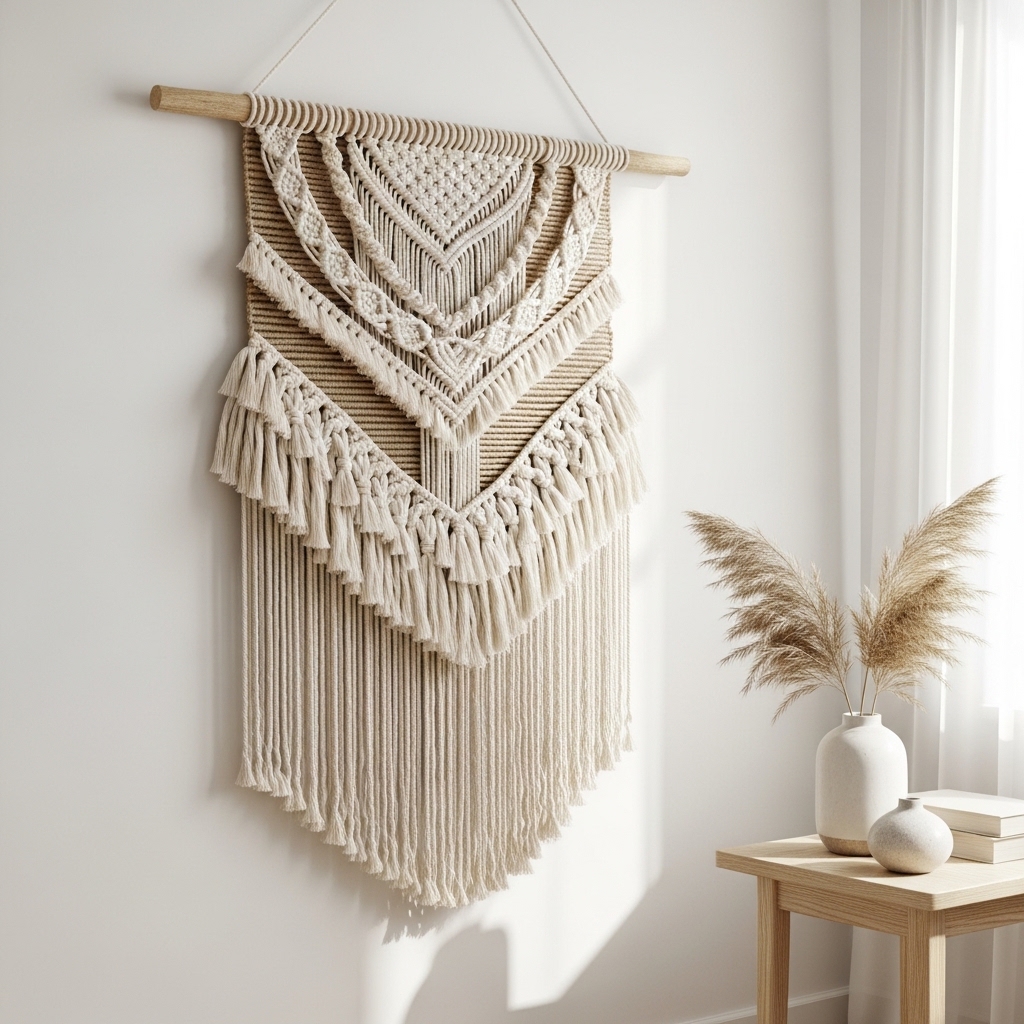
Macrame, woven cotton, or wool wall hangings add organic texture. They soften rooms with hard surfaces—wood floors, leather sofas, glass tables.
Choose a piece with simple lines. Avoid overly complex patterns. Natural undyed fibers work in any room.
Pro Tip: Hang the piece at eye level. The center should be 57-60 inches from the floor.
Mistake to Avoid: Do not hang a woven piece in a bathroom. Humidity will damage natural fibers.
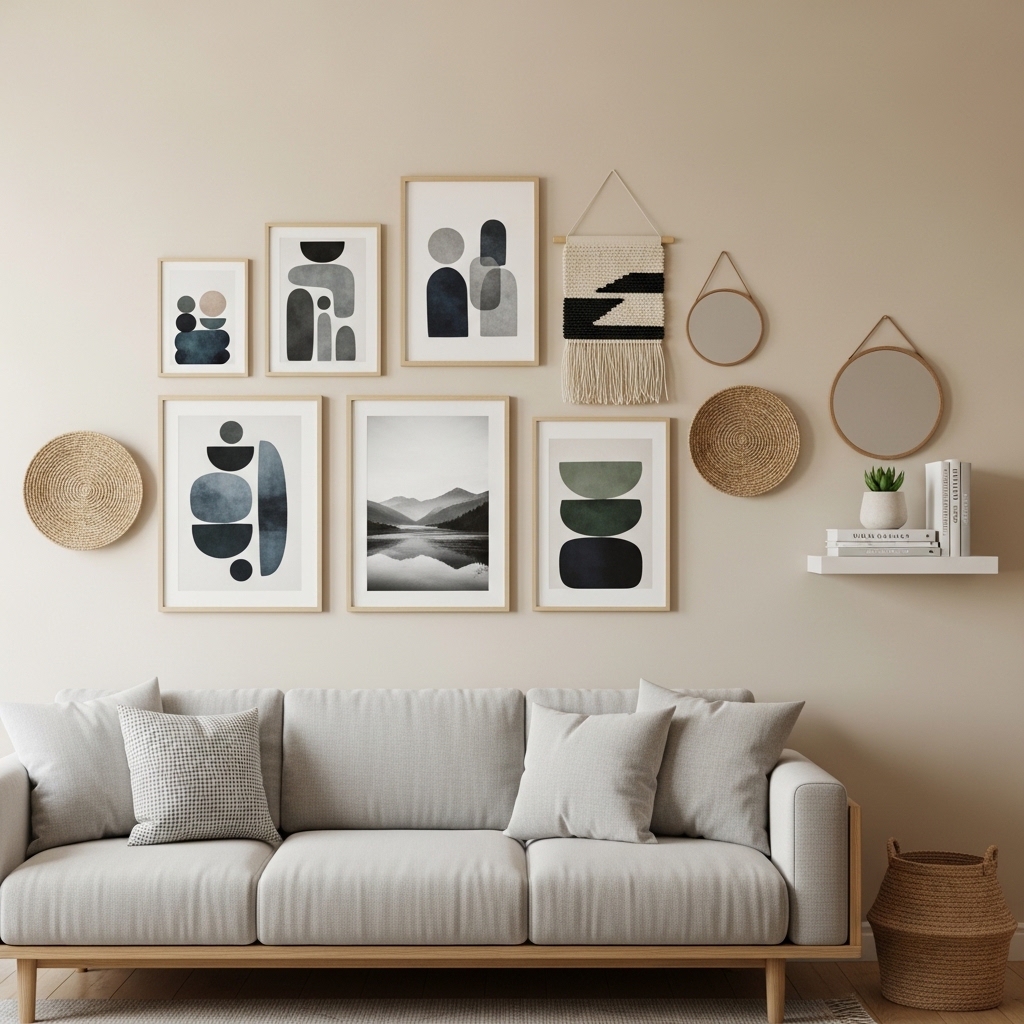
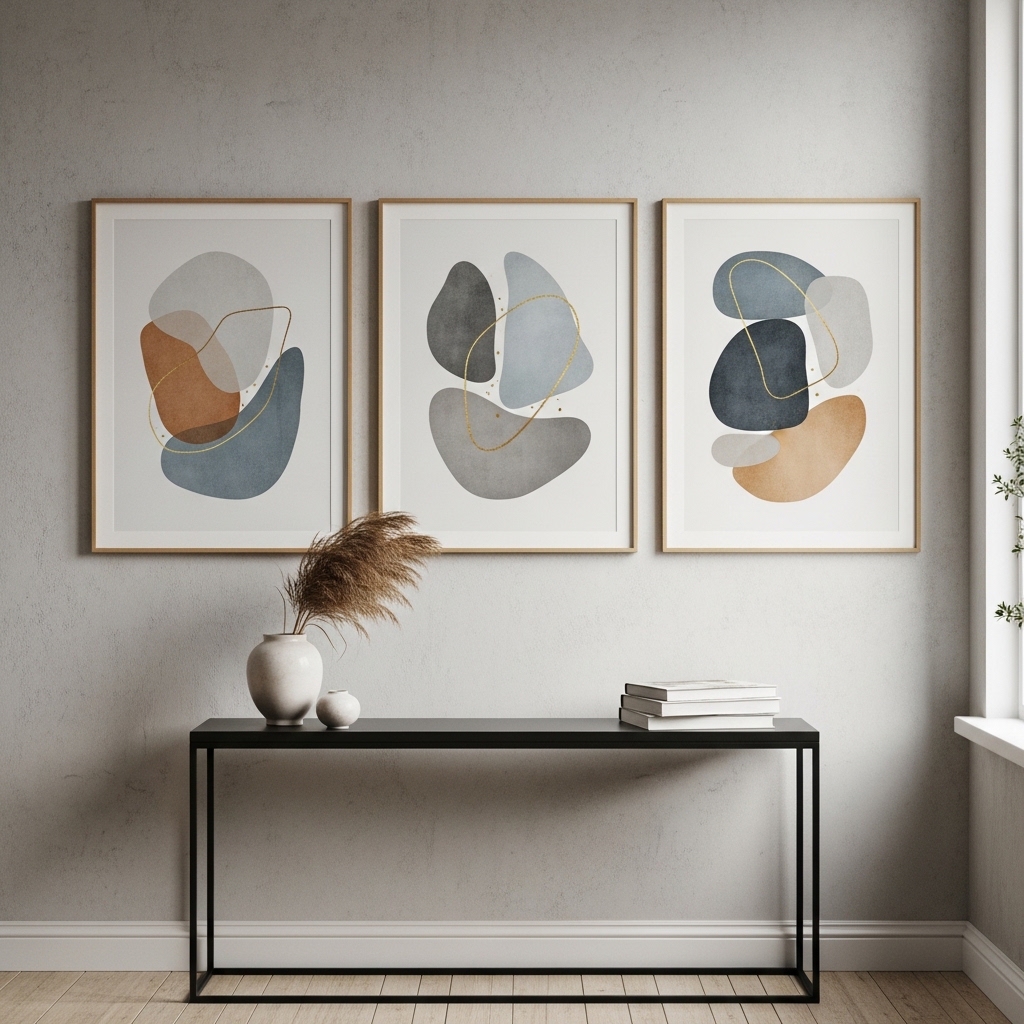
7. Gallery Wall With a Consistent Color Palette
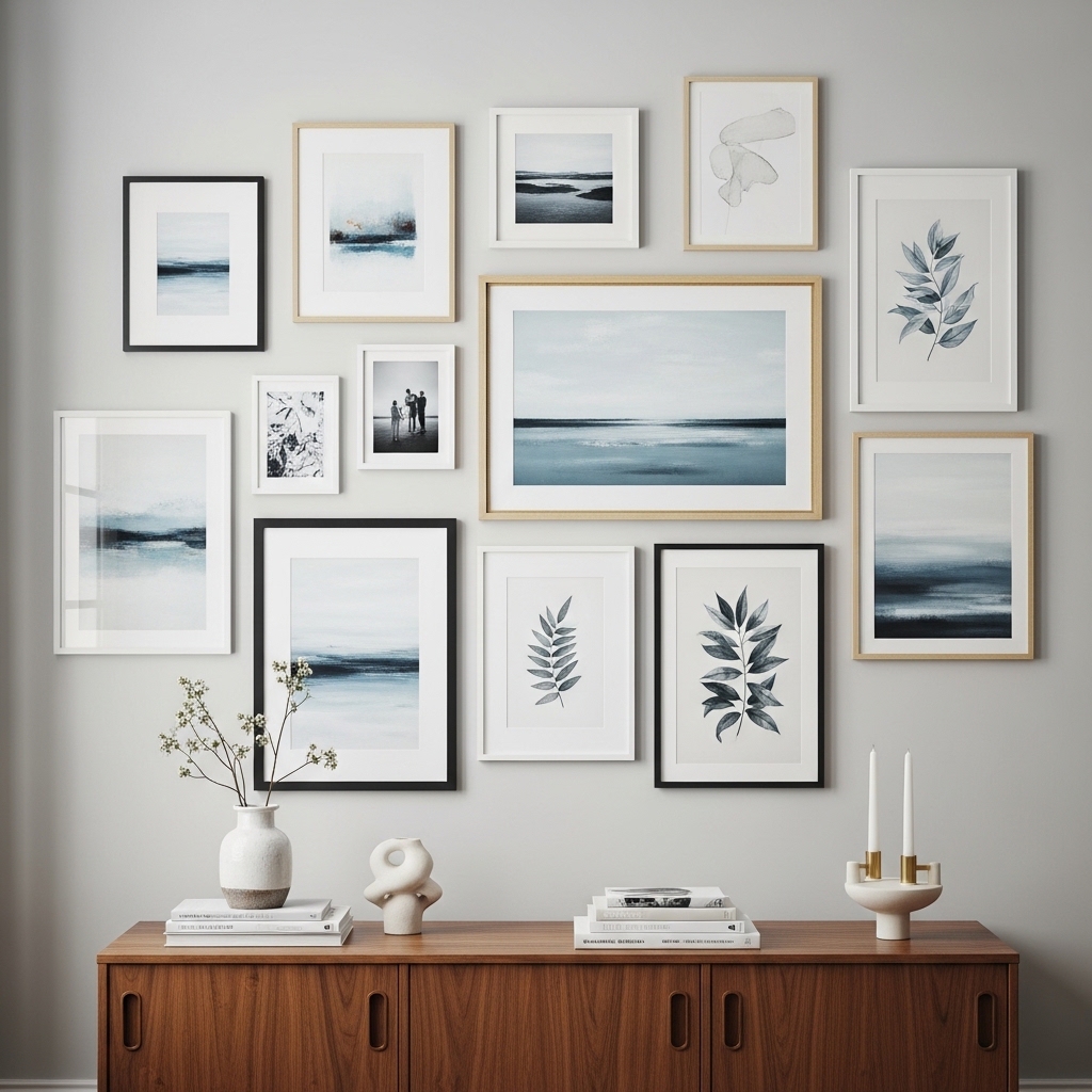
A gallery wall becomes aesthetic when the colors work together. Choose art that shares a palette—all neutrals, all blues, all earth tones.
Arrange the frames on the floor first. Take a photo. Adjust until the composition feels balanced.
Pro Tip: Use the same frame color throughout. The frames unify disparate pieces.
Mistake to Avoid: Do not mix too many art styles. Stick to illustrations, photography, or abstracts—not all three.
8. Single Statement Sconce on an Empty Wall
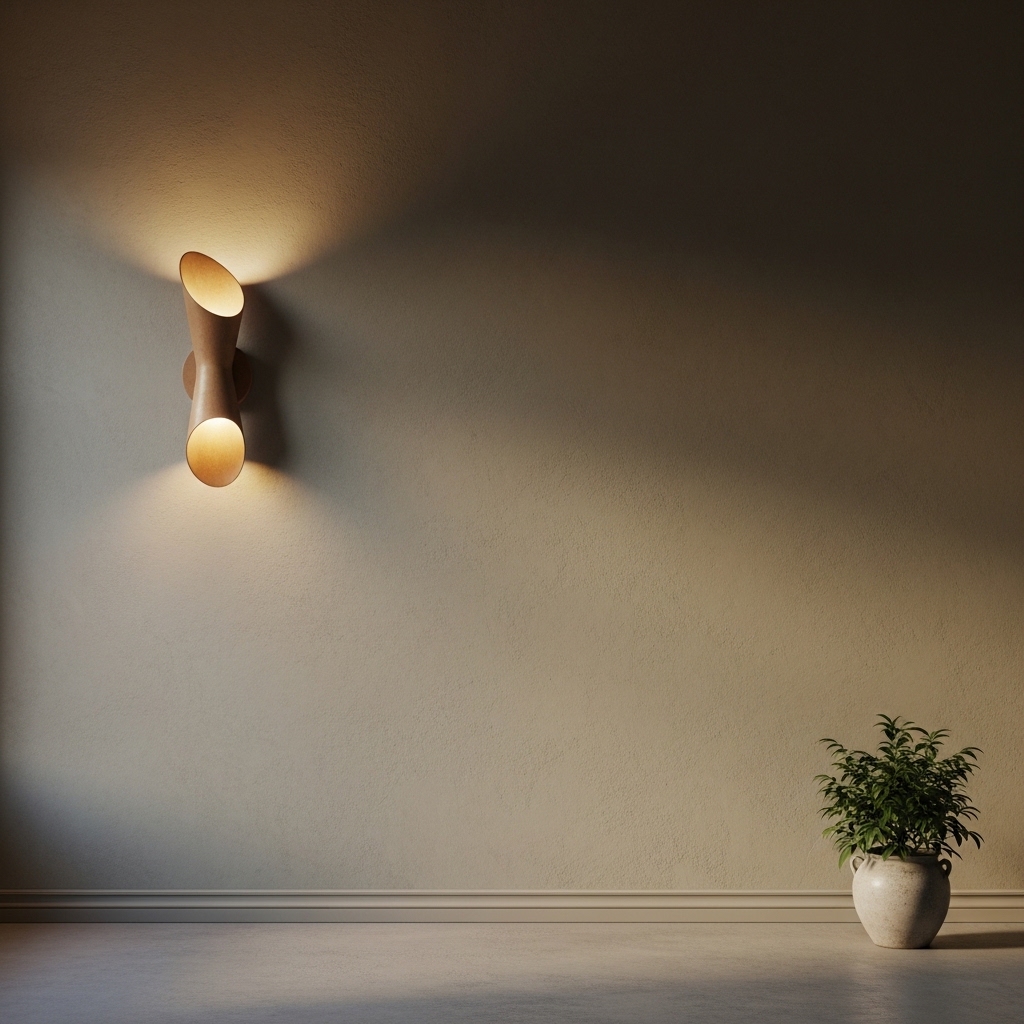
One sconce on a blank wall is unexpected. It is also functional. The asymmetry feels modern and intentional.
Choose a sconce with a sculptural quality. The fixture itself should be beautiful, even when unlit.
Pro Tip: Use a plug-in sconce in rentals. No electrician required. Hide the cord with a cord cover.
Mistake to Avoid: Do not hang the sconce too high. The center should be at 60 inches from the floor.
9. Paper Art in Simple Frames
Paper is underrated. A single sheet of handmade paper. A page from a vintage book. A botanical print on matte paper.
The key is simplicity. No glossy finishes. No bold colors. The texture of the paper is the aesthetic.
Pro Tip: Use a floating frame. The space between the paper and the glass highlights the texture.
Mistake to Avoid: Do not use white paper on a white wall. The piece will disappear.
10. Collection of Small Ceramic Objects on a Ledge
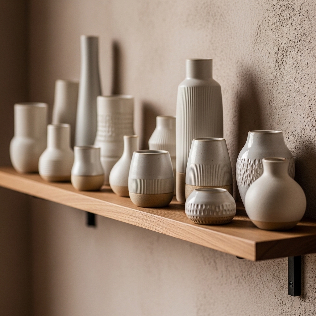
A picture ledge holds more than art. Small ceramic vases, bowls, and sculptures become a still life.
Arrange objects in odd numbers. Three, five, or seven. Vary heights and widths. Leave space between each piece.
Pro Tip: Use objects in the same color family. Cream, beige, and terracotta work well together.
Mistake to Avoid: Do not overcrowd the ledge. Five objects on a four-foot ledge is plenty.
11. Architectural Drawing or Blueprint
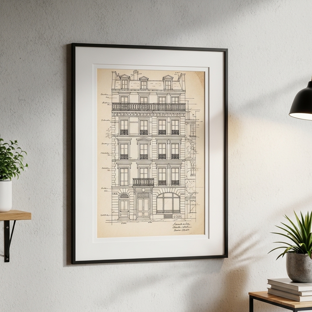
Architectural drawings have clean lines and minimal color. They appeal to the eye without demanding attention.
Frame a vintage blueprint or a modern architectural sketch. The subject does not matter. The lines are the aesthetic.
Pro Tip: Look for architectural drawings at estate sales. Old home blueprints are often sold for very little.
Mistake to Avoid: Do not choose drawings with too much detail. Simpler is better.
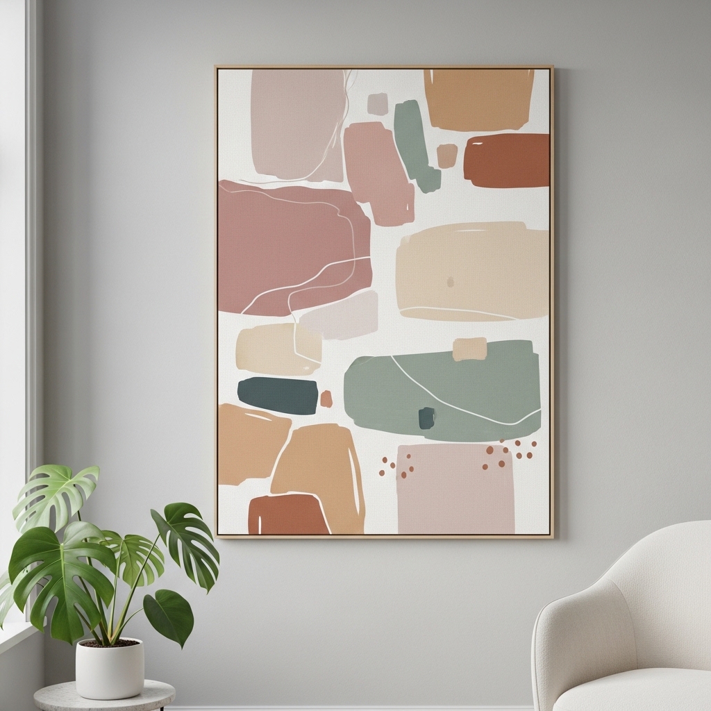
12. Large-Scale Abstract With Minimal Color
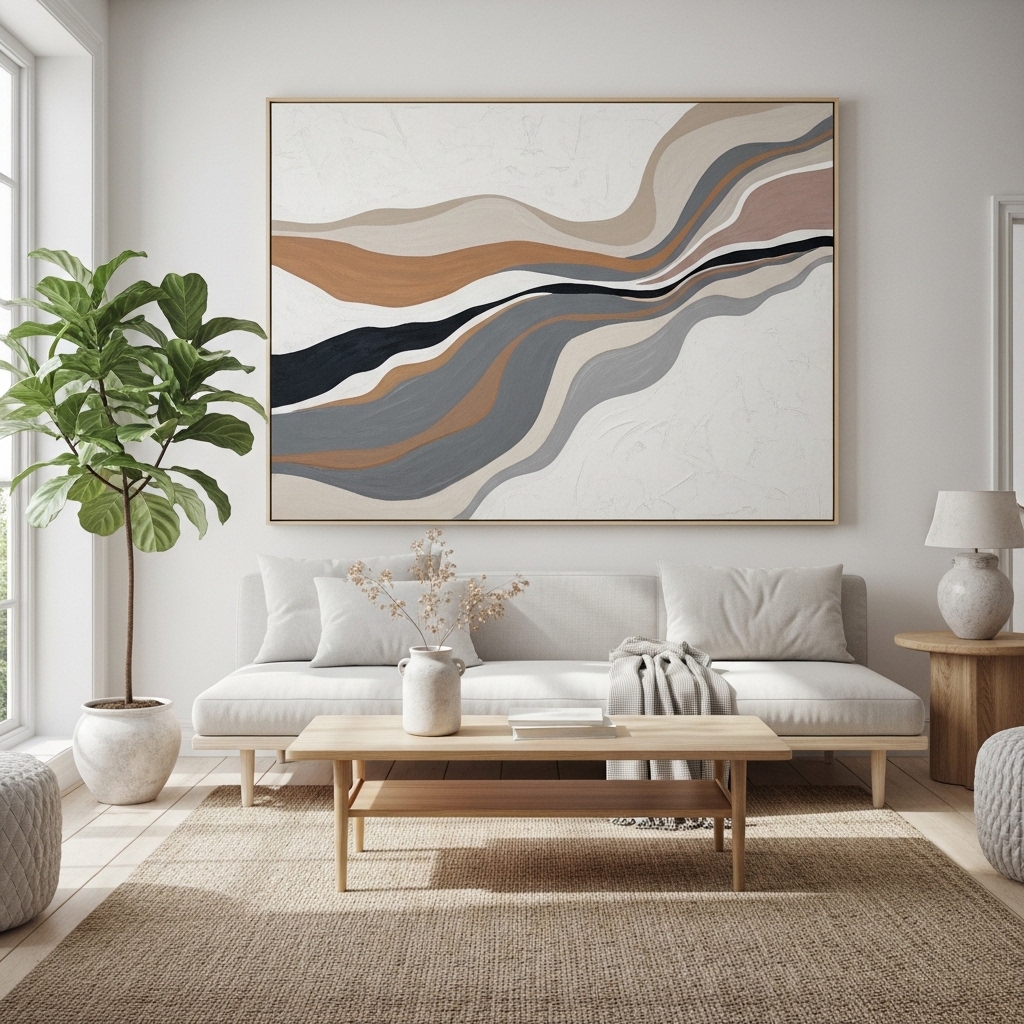
Abstract art works best when it restrains itself. Two colors plus white. Three colors maximum. The limited palette is the aesthetic.
Choose a piece with soft edges and organic shapes. Avoid geometric patterns. Hard lines feel rigid.
Pro Tip: Paint your own abstract canvas. You do not need skill. Intuition is enough.
Mistake to Avoid: Do not choose an abstract with too much contrast. Soft transitions are more calming.
13. Hanging Mobile With Organic Shapes
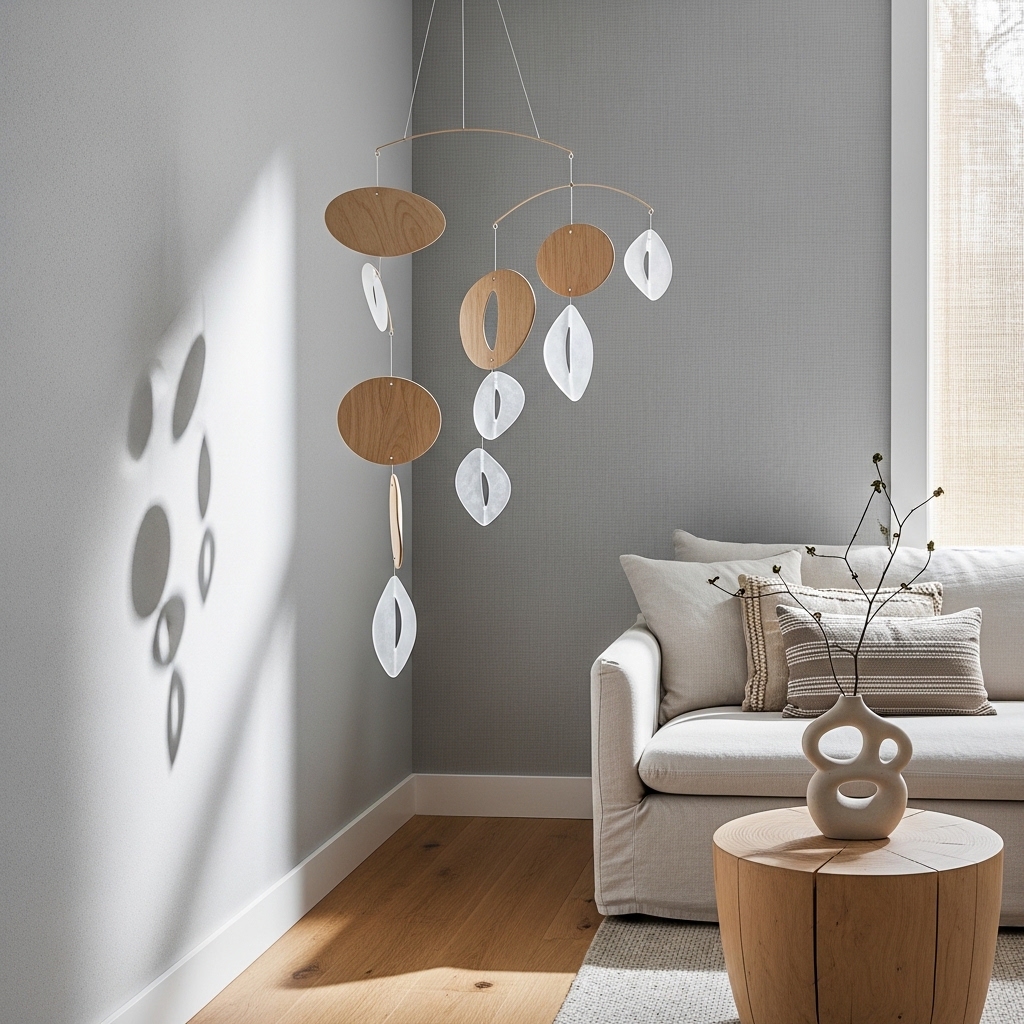
Mobiles are not just for nurseries. A large mobile on a blank wall adds movement and sculpture.
Choose a mobile with natural materials—wood, felt, or metal. The shapes should be simple. The movement should be subtle.
Pro Tip: Hang the mobile where a breeze will move it. Near a window or vent.
Mistake to Avoid: Do not hang a mobile too low. People should not bump their heads.
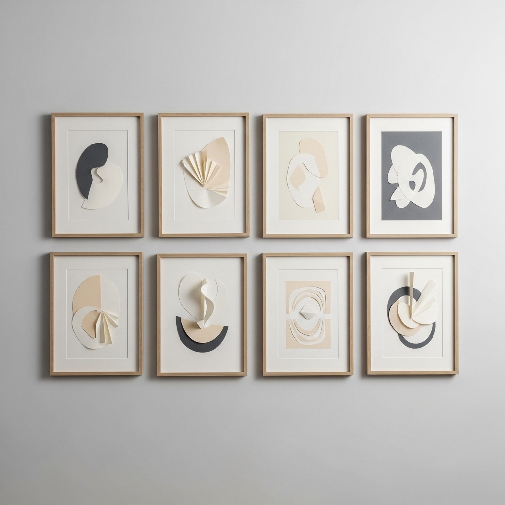
14. Triptych of Matching Abstract Prints
A triptych is three pieces designed to hang together. The repetition creates rhythm. The separation creates interest.
Choose prints that share a color palette and style. Hang them with equal spacing. The group should read as one piece.
Pro Tip: Use the same frames for all three pieces. Uniformity is essential.
Mistake to Avoid: Do not space them too far apart. Two inches between frames is standard.
15. Vintage Map of a Meaningful Place
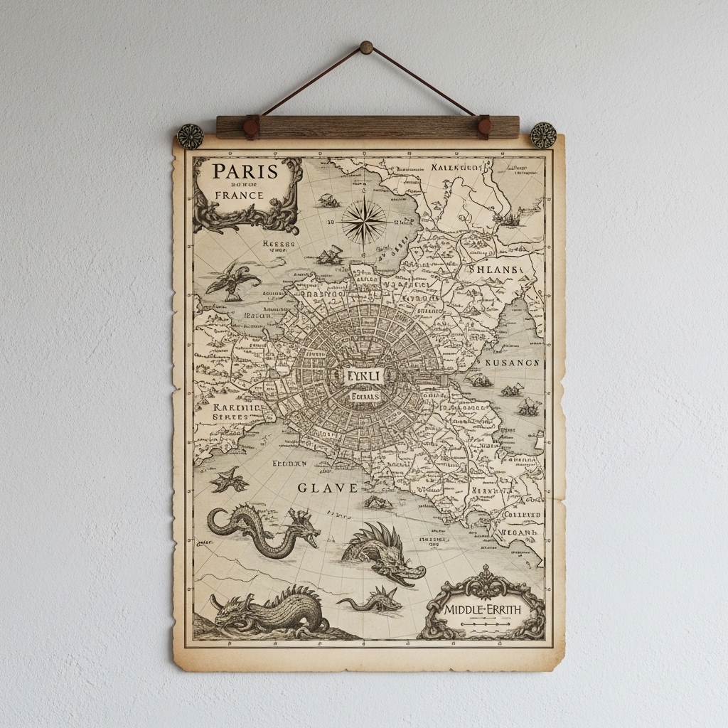
A map of a city you love. A topographical map of a mountain you climbed. A nautical chart of a coast you sailed.
The personal connection makes the piece meaningful. The vintage quality adds texture and age.
Pro Tip: Frame the map without a mat. The edges of the paper add character.
Mistake to Avoid: Do not use a modern map. Vintage maps have better color and texture.
16. Monochromatic Botanical Prints
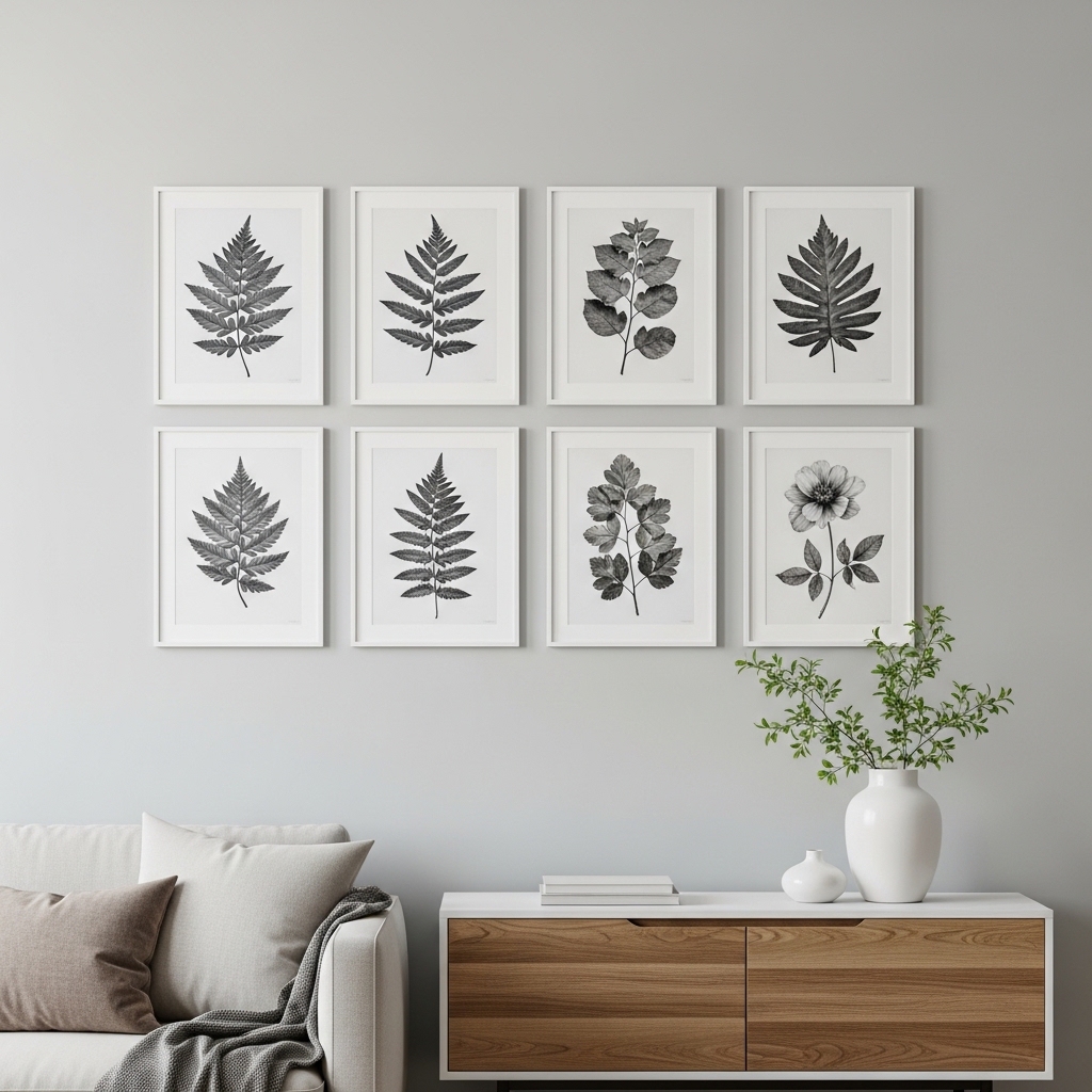
Colorful botanicals can feel busy. Monochromatic prints—all green, all gray, all sepia—are more restrained.
Choose prints of the same plant or different plants in the same style. The repetition of color creates cohesion.
Pro Tip: Use a green-toned print on a green wall. The monochromatic look is sophisticated.
Mistake to Avoid: Do not use white mats. Cream or off-white mats are softer.
17. Single Large Tapestry in Neutral Tones
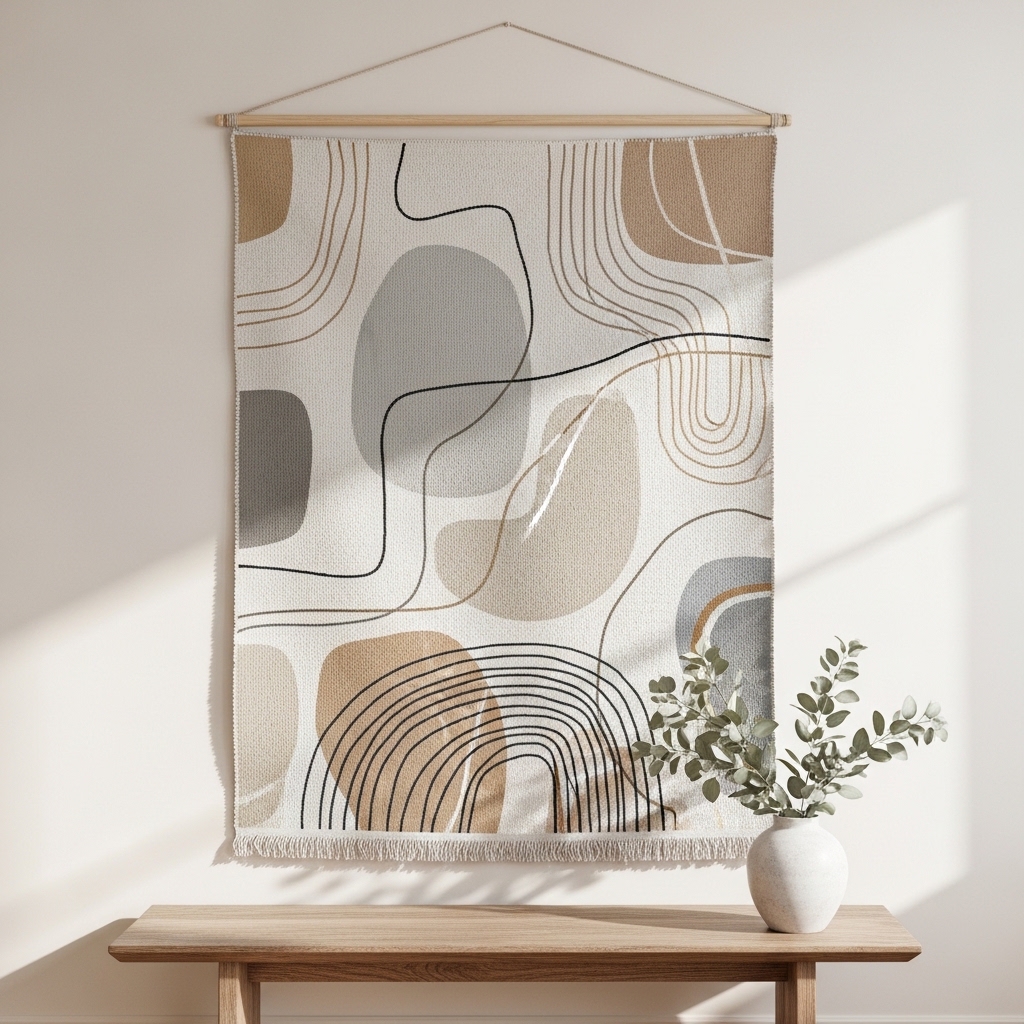
A tapestry adds softness that framed art cannot. It absorbs sound. It warms up cold rooms.
Choose a tapestry in undyed wool or linen. The natural fibers are the aesthetic. Avoid bold patterns or bright colors.
Pro Tip: Hang the tapestry from a wooden dowel. The dowel adds structure and makes hanging easy.
Mistake to Avoid: Do not hang a tapestry in direct sunlight. UV rays will fade the fibers.
18. Grid of Small Mirrors
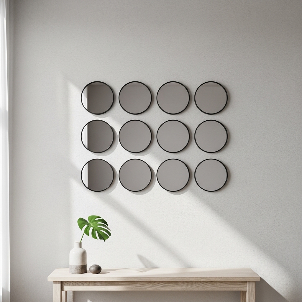
One large mirror is expected. A grid of small mirrors is unexpected. The repetition creates pattern.
Use 4, 6, or 9 identical mirrors. Arrange them in a perfect square or rectangle. The frames should match exactly.
Pro Tip: Use mirrors with thin metal frames. Wood frames add too much visual weight.
Mistake to Avoid: Do not use mirrors with beveled edges. Flat edges look more modern.
19. Framed Fabric Swatch
A beautiful fabric deserves to be seen. Frame a swatch of linen, velvet, or handwoven cotton.
The texture of the fabric is the aesthetic. Choose a solid color or a subtle pattern. Avoid bold prints.
Pro Tip: Stretch the fabric over a canvas frame. The fabric becomes the art. No glass needed.
Mistake to Avoid: Do not use synthetic fabric. Natural fibers look and age better.
20. Intentional Empty Wall
The most aesthetic choice is sometimes nothing. A blank wall can be peaceful. It can highlight the furniture below it.
Not every wall needs decor. An empty wall in a room with many windows or architectural details is often best left alone.
Pro Tip: Live with the empty wall for a month. If it still feels unfinished, add something. If it feels peaceful, leave it.
Mistake to Avoid: Do not add something just because you think you should. Add something because the room needs it.
Frequently Asked Questions
What does “aesthetic” mean in wall decor?
Aesthetic means visually harmonious. It does not mean trendy or popular. An aesthetic wall has balance, restraint, and intentionality. Every piece belongs.
How do I make my wall decor look aesthetic?
Limit your color palette. Use negative space. Repeat shapes or colors. Avoid clutter. Choose quality over quantity. Aesthetic design is about what you leave out, not what you put in.
Can I have aesthetic decor on a budget?
Yes. Thrift stores are full of frames, mirrors, and art. Paint mismatched frames the same color. Print free art from museum archives. Aesthetic is about curation, not cost.
What is the most common mistake in aesthetic wall decor?
Too many small pieces. A wall of tiny frames, postcards, and trinkets looks cluttered, not curated. Use fewer, larger pieces. Leave empty space.
Conclusion
Aesthetic wall decor is not about following trends. It is about restraint, harmony, and intentionality. Every piece earns its place. Empty space is not wasted space.
Start with one wall. Choose a large piece. Add one or two supporting pieces. Leave the rest empty. The room will feel calmer, more intentional, and more personal.