20 Modern Wall Decor Ideas That Redefine Contemporary Interiors With Depth, Texture, and Minimal Elegance
Modern wall decor has evolved into a design language focused on structure, restraint, and intentional visual balance. Instead of filling walls with random decor, today’s interiors rely on layered texture, architectural detail, lighting integration, and spatial harmony to create impact.
Each idea below is designed for real homes where walls are not just decoration surfaces, but functional design elements that shape mood, flow, and perception of space.
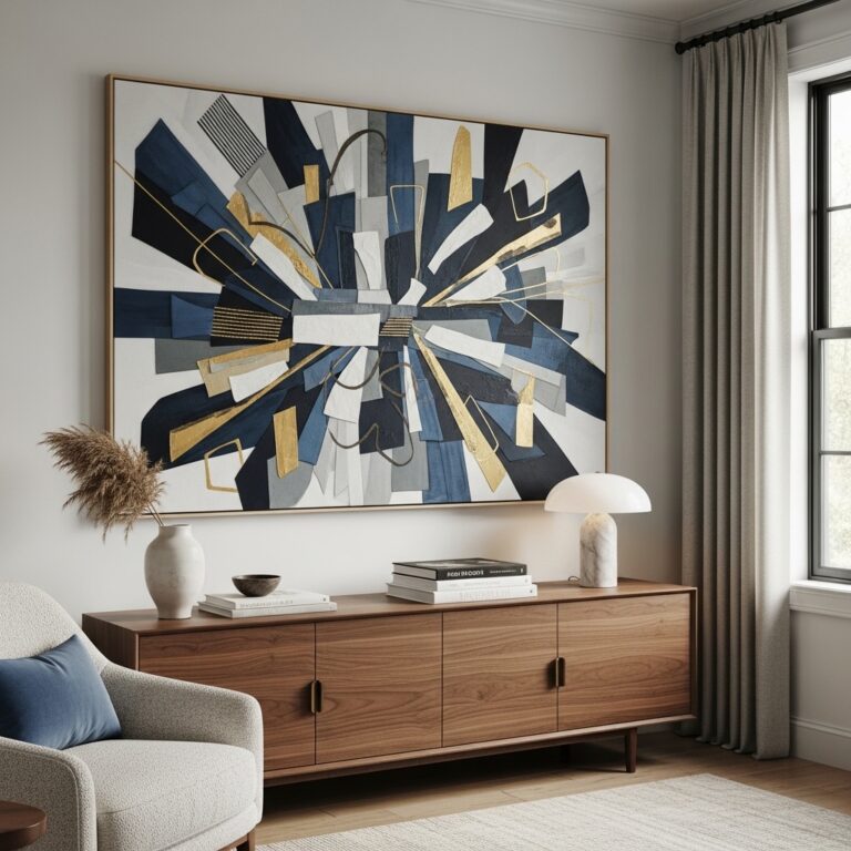
1. Floating Illusion Wall Frames for Minimal Depth Styling
Ideal for: Modern living rooms and minimalist bedrooms needing subtle visual interest.
Floating illusion frames are mounted slightly away from the wall to create a soft shadow gap that gives the impression of levitation. Keep frames thin, neutral, and evenly spaced for a clean aesthetic. Use monochrome or soft abstract prints to maintain minimalism.
This works because the shadow gap introduces depth without adding clutter. It creates visual separation between wall and artwork, making the space feel more layered yet controlled. Poor spacing or heavy frames can break the illusion and make the wall feel inconsistent.
Pro Tip: Use hidden mounting brackets for a seamless floating effect.
Mistake to Avoid: Don’t mix heavy frames with floating designs.
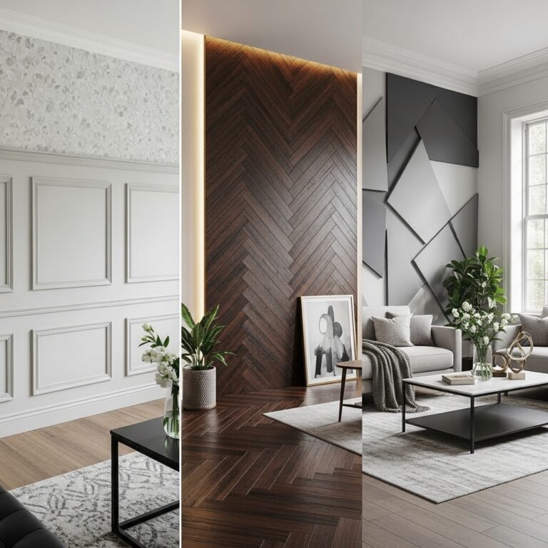
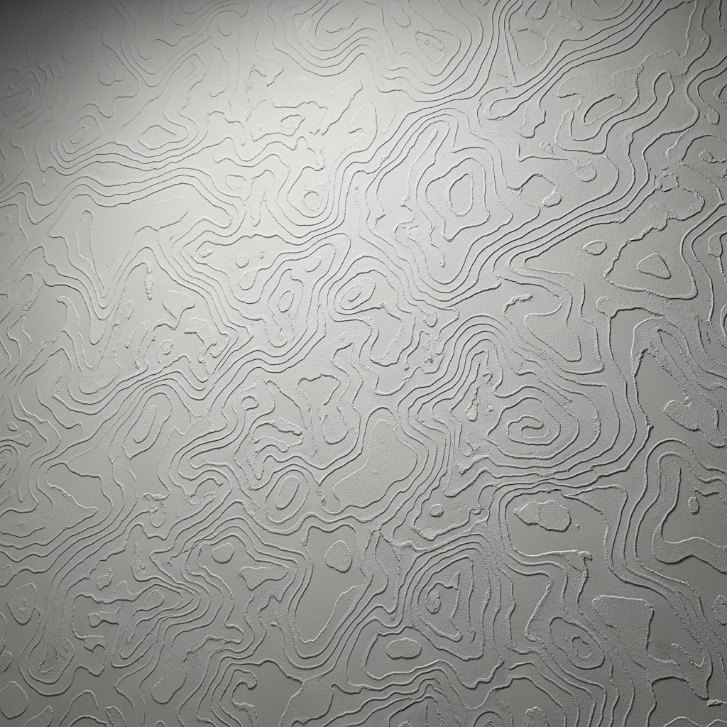
2. Sculpted Plaster Relief Wall Design for Subtle Luxury Texture
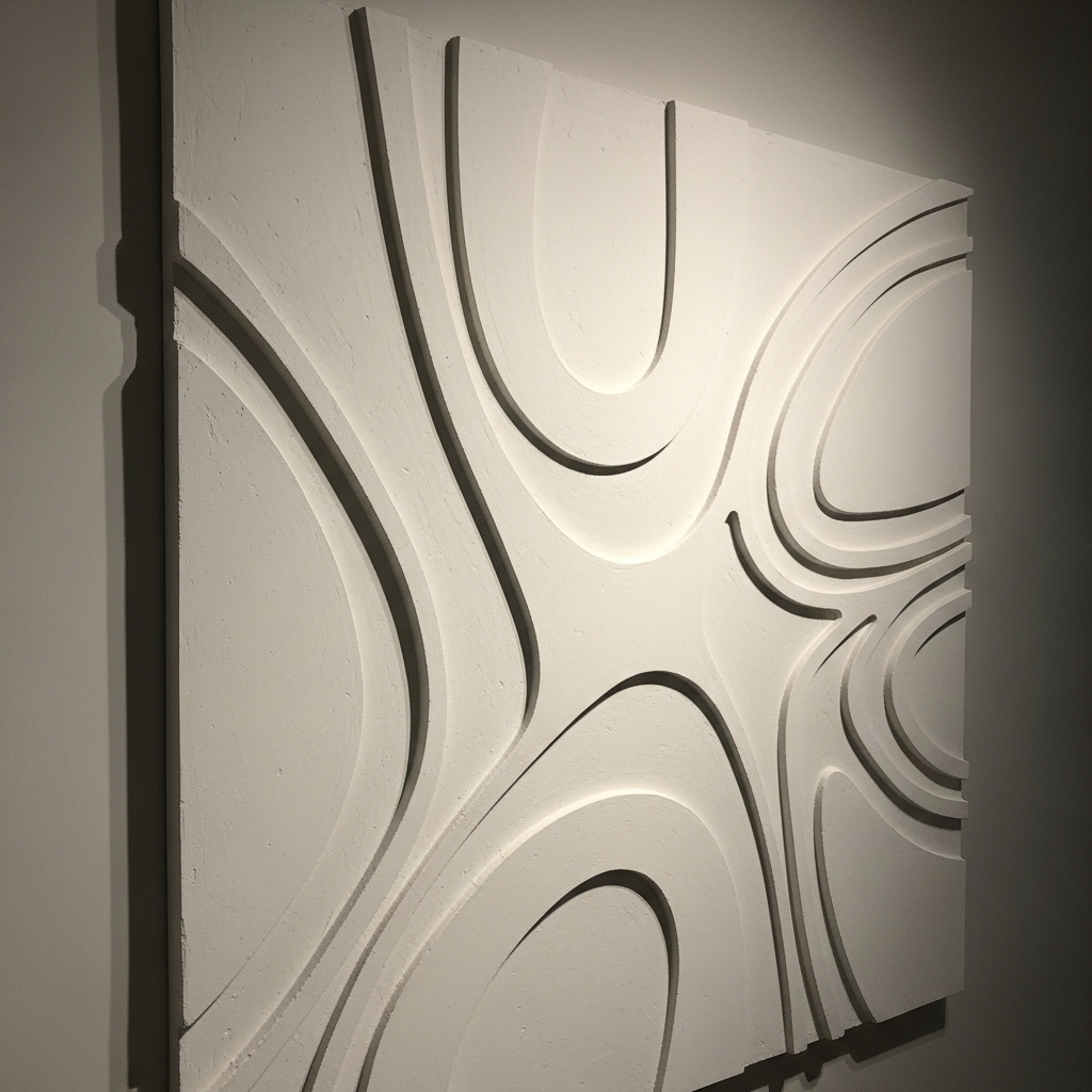
Ideal for: High-end modern interiors and feature walls.
Apply hand-sculpted or molded plaster designs directly onto the wall to create soft raised patterns. Keep shapes organic or geometric depending on interior style. Stick to neutral tones like white, beige, or soft gray.
This works because physical texture interacts with natural light, creating dynamic shadows throughout the day. It adds luxury without relying on color or decor items. Over-detailing can make the wall feel busy instead of refined.
Pro Tip: Use directional lighting to highlight surface depth.
Mistake to Avoid: Don’t over-texture the entire room.
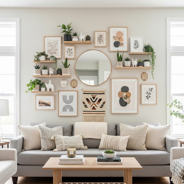
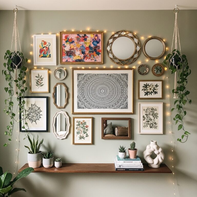
3. Invisible Floating Shelf Art Stacking Concept for Clean Layers
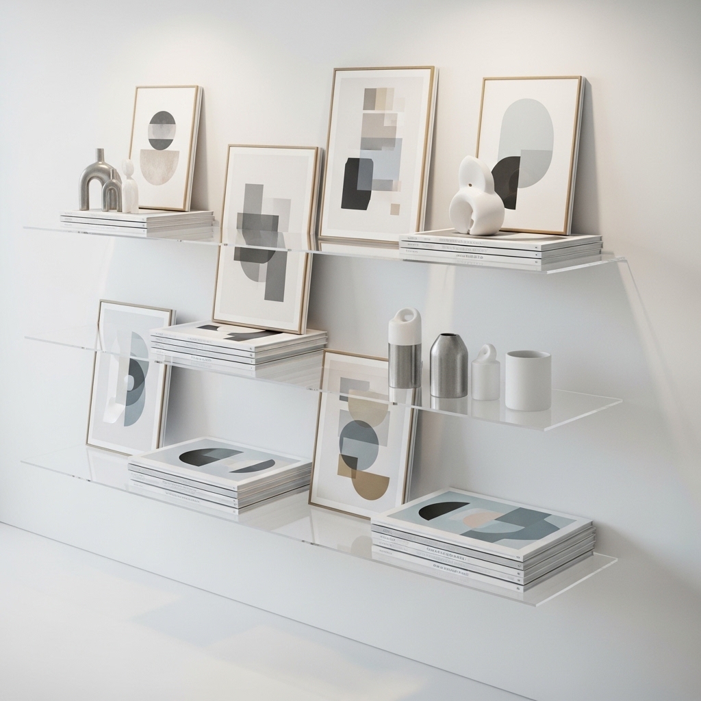
Ideal for: Renters and flexible modern interiors.
Install ultra-thin floating shelves and lean framed art instead of hanging it. Layer multiple frames with slight overlap while keeping negative space visible.
This works because layering adds depth while allowing easy updates without damaging walls. It blends storage and decor into one flexible system. Overcrowding shelves reduces clarity and modern appeal.
Pro Tip: Mix horizontal and vertical frame orientations.
Mistake to Avoid: Don’t pack shelves tightly.
4. Gradient Color Wash Wall Finish for Soft Visual Transition
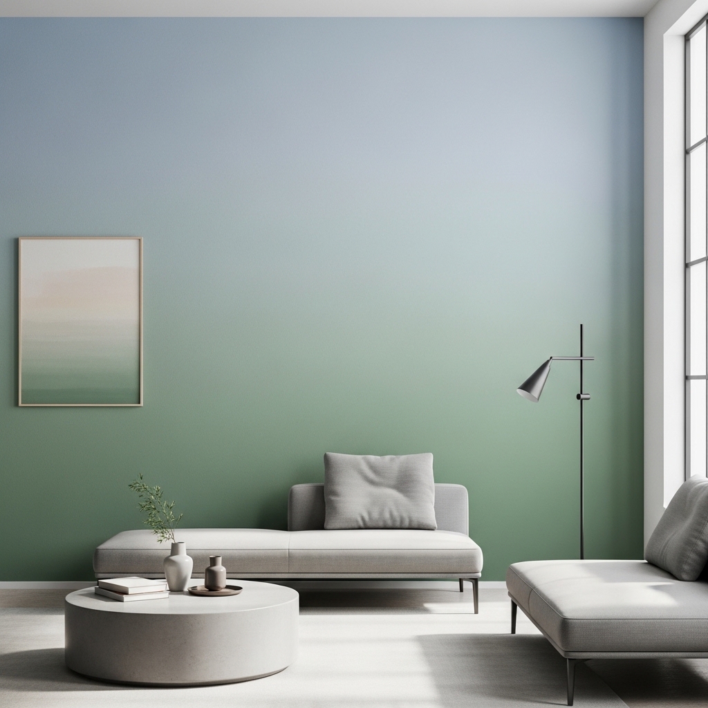
Ideal for: Bedrooms and calm living spaces.
Create a soft gradient wall using blended paint tones that transition vertically or horizontally. Keep tones within the same color family for smooth blending.
This works because gradual color transitions reduce harsh visual breaks and create a calming atmosphere. It adds artistic depth without requiring physical decor elements. Sharp transitions break the visual flow.
Pro Tip: Blend using a dry sponge technique for softness.
Mistake to Avoid: Don’t use contrasting colors in gradients.
5. Architectural Shadow Line Wall Panels for Structured Depth
Ideal for: Modern and luxury-inspired interiors.
Install wall panels with recessed shadow lines between sections. Keep spacing consistent and geometry clean.
This works because shadow lines create natural separation and depth without additional decor. It enhances architectural structure and sophistication. Uneven spacing reduces precision.
Pro Tip: Use matte finishes for clean shadows.
Mistake to Avoid: Don’t vary panel dimensions randomly.
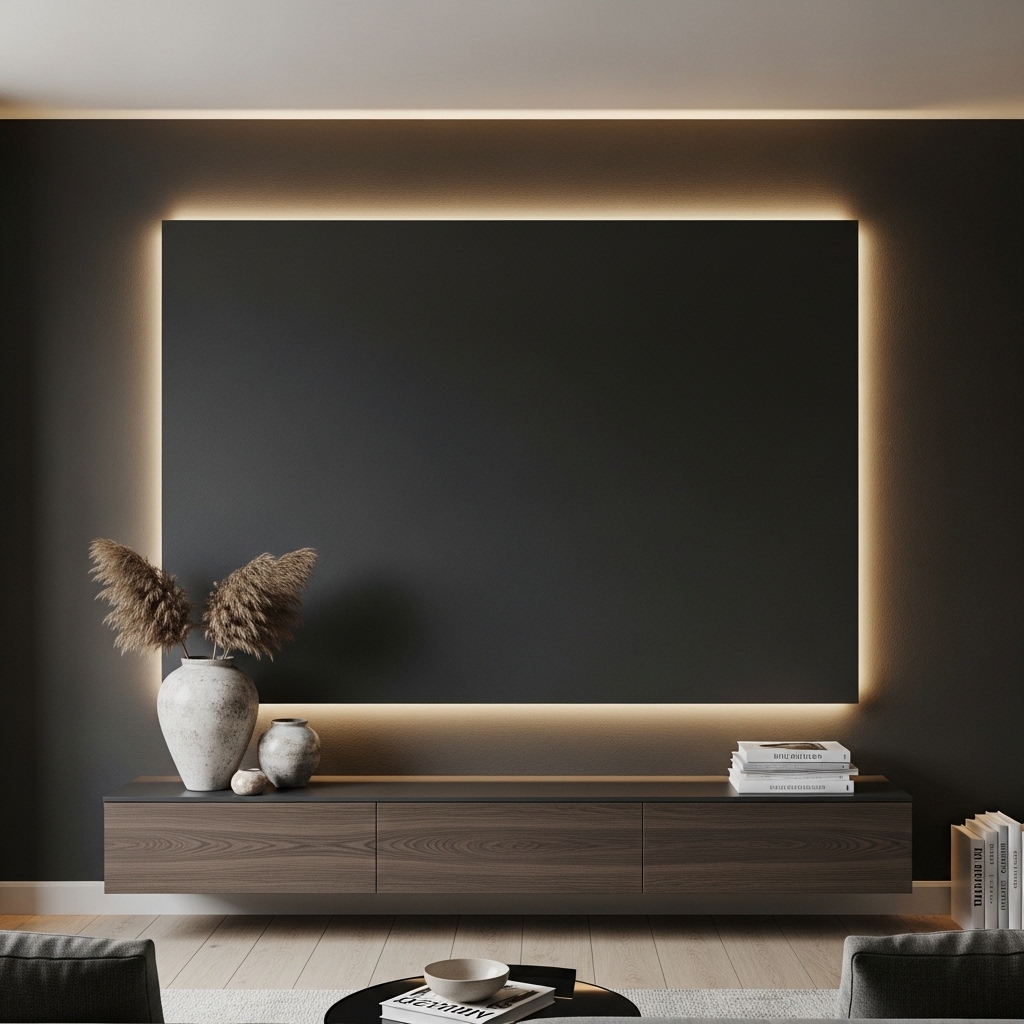
6. Backlit Fabric Wall Panels for Soft Ambient Glow
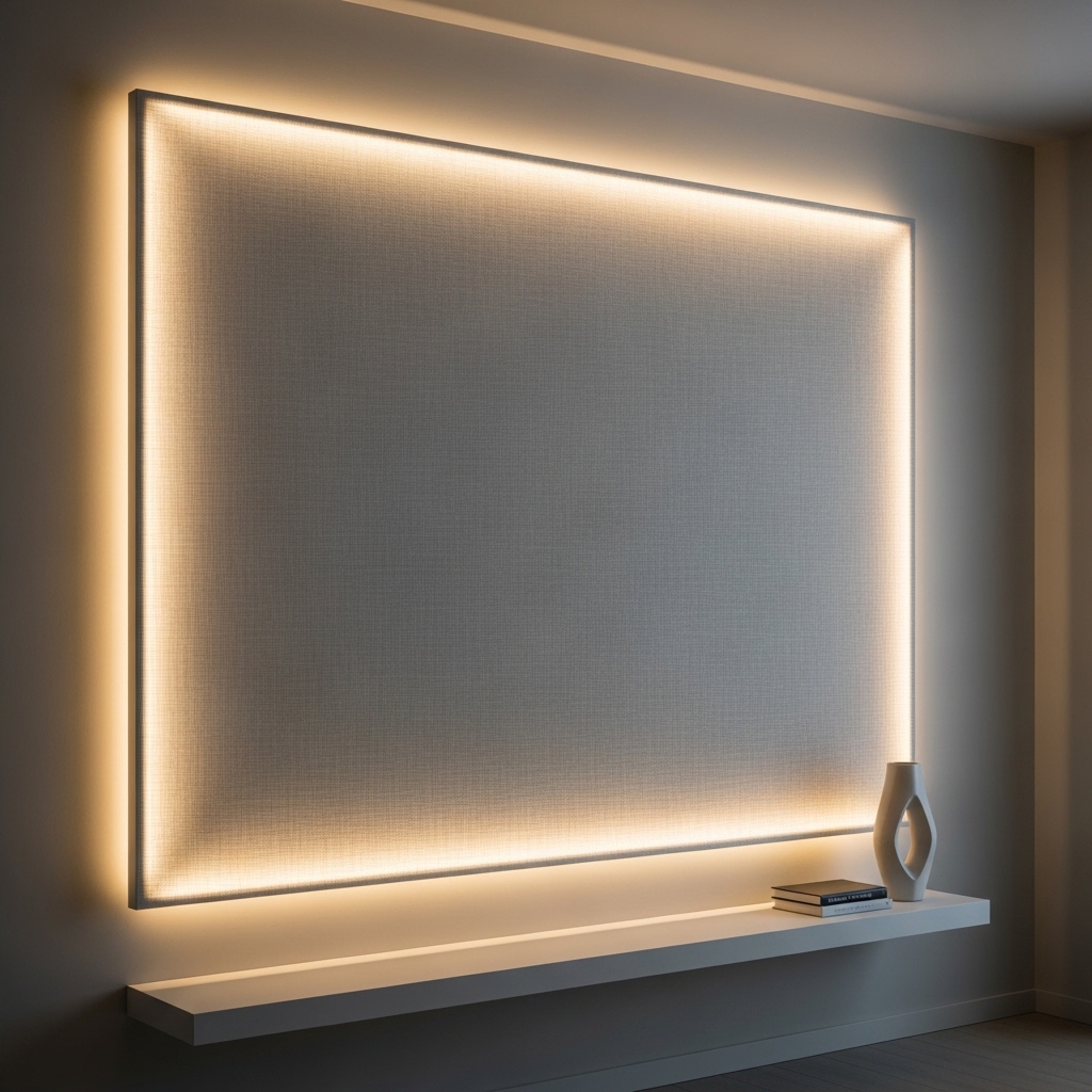
Ideal for: Bedrooms and lounge spaces.
Install fabric panels with hidden LED backlighting behind them to create a soft glowing effect. Use neutral fabrics like linen or suede textures.
This works because lighting behind soft materials diffuses glow evenly, creating warmth and calmness. It adds luxury without visual clutter. Harsh lighting reduces comfort.
Pro Tip: Use warm white LEDs for relaxation.
Mistake to Avoid: Don’t use bright or cool-toned LEDs.
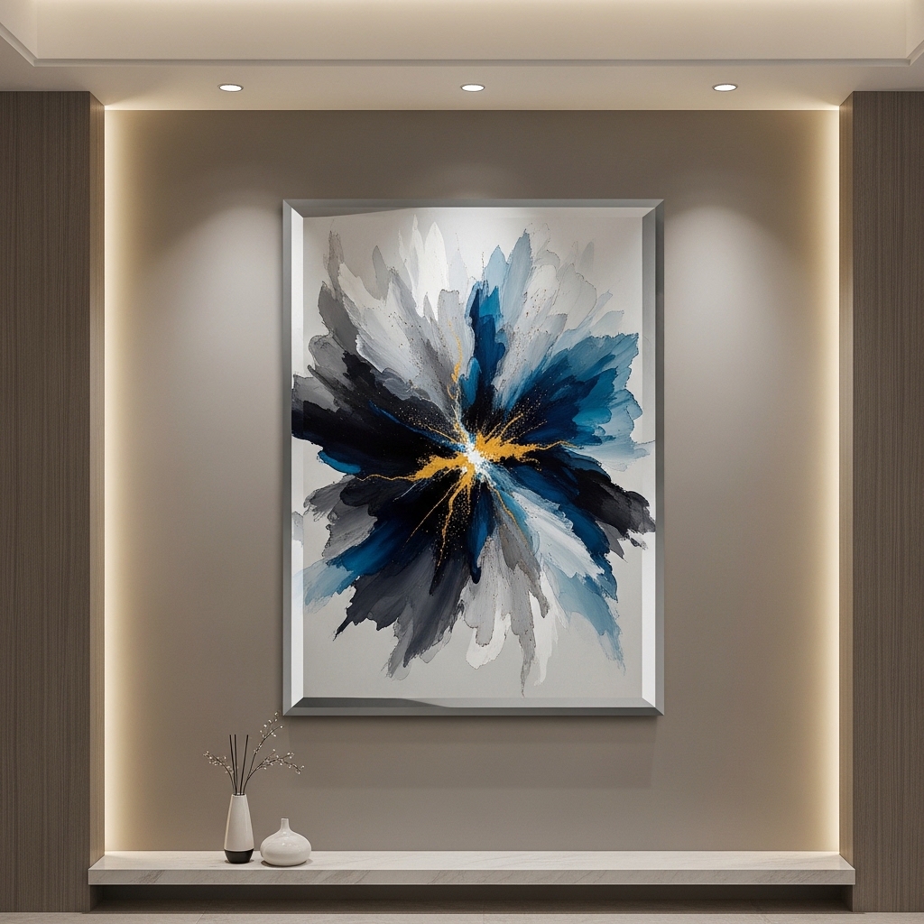
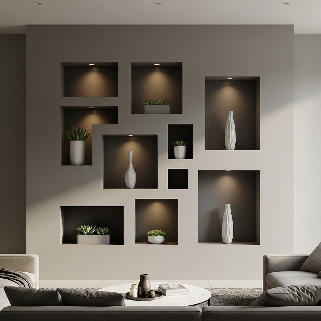
7. Recessed Art Niches Wall Design for Built-In Display Effect
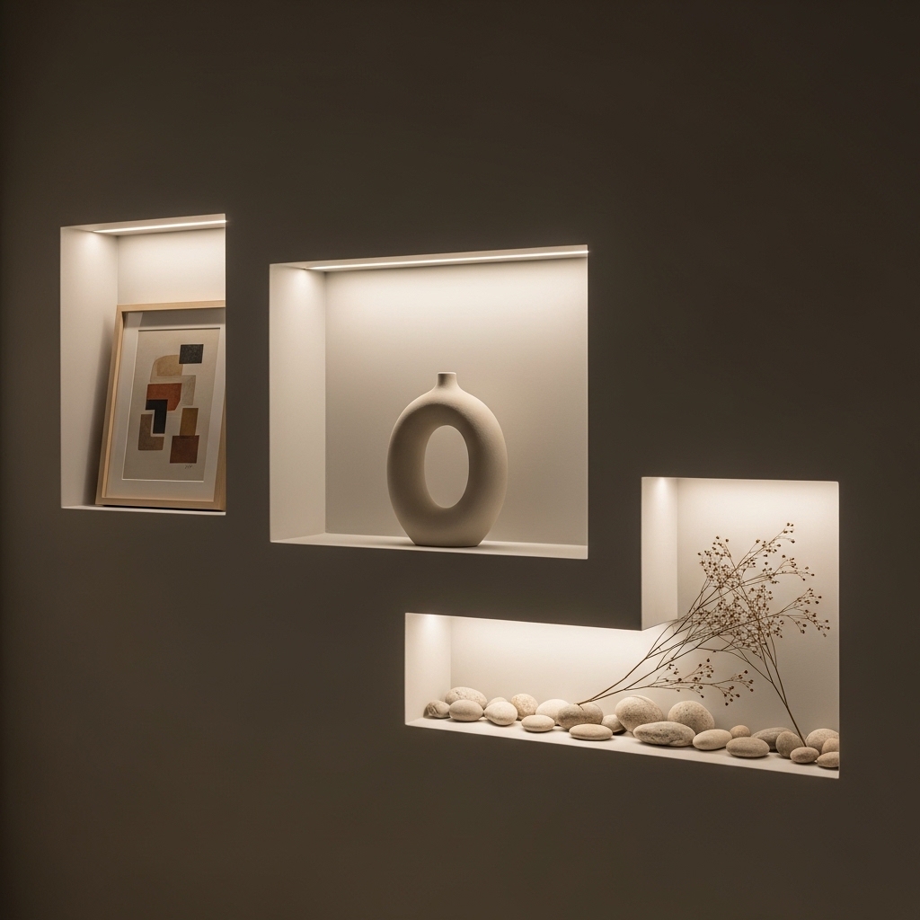
Ideal for: Custom or architectural interiors.
Create recessed wall sections specifically designed to display artwork or decor pieces. Add subtle lighting inside niches for emphasis.
This works because built-in depth eliminates the need for external frames or shelves, creating seamless integration. It feels intentional and high-end. Poor alignment reduces impact.
Pro Tip: Keep niche proportions symmetrical.
Mistake to Avoid: Don’t overcrowd niches.
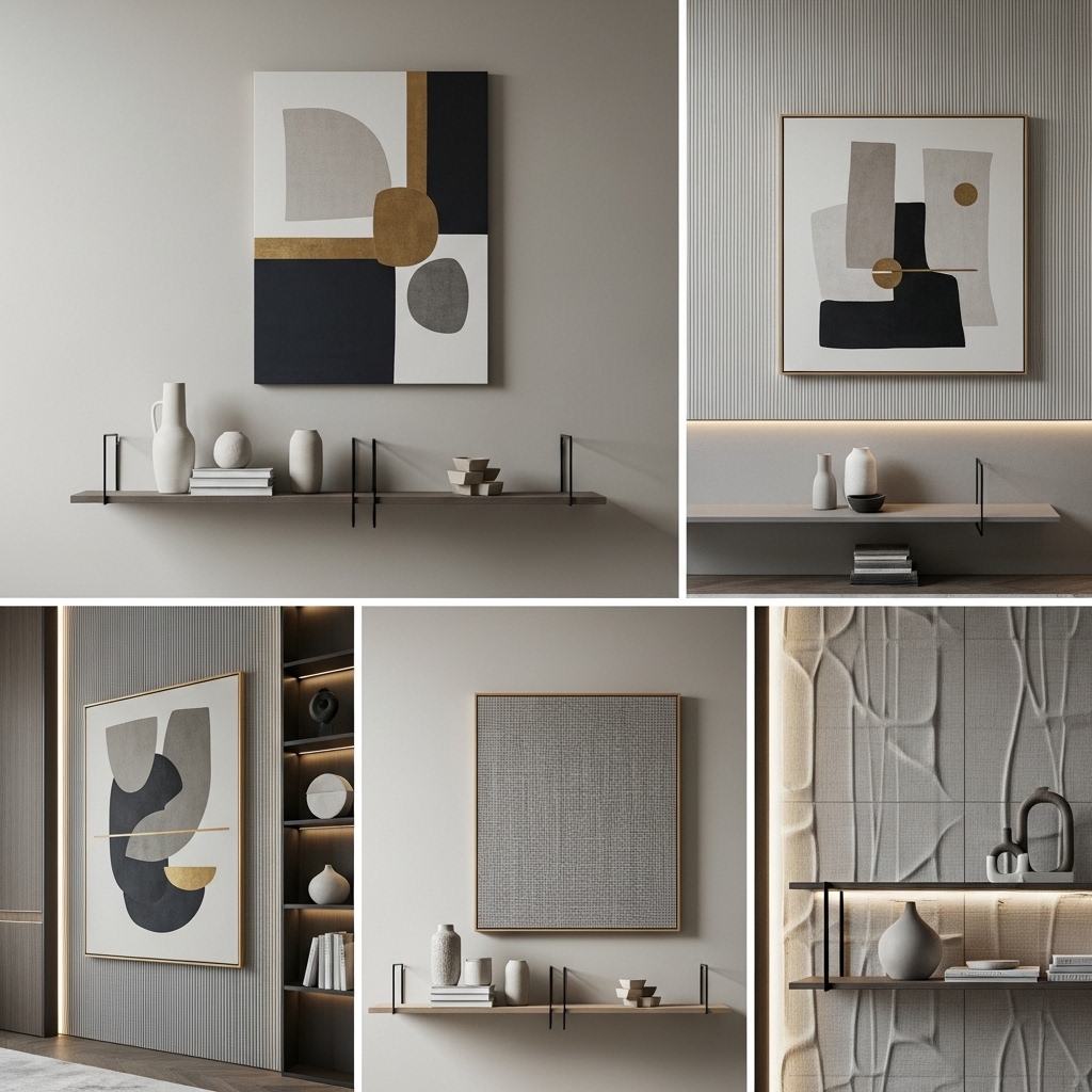
8. Modular Square Tile Art Grid System for Custom Layout Control
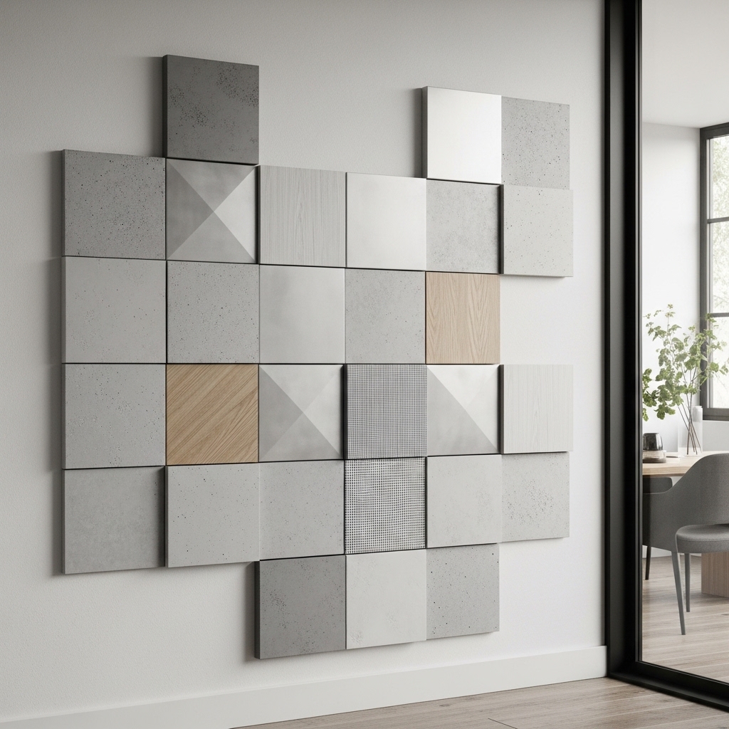
Ideal for: Contemporary and flexible interiors.
Use square art panels arranged in a modular grid system that can be rearranged. Keep spacing uniform.
This works because modular design allows customization and visual rhythm. It creates structured repetition that feels modern and controlled. Misalignment disrupts flow.
Pro Tip: Use magnetic or interchangeable mounting systems.
Mistake to Avoid: Don’t mix random tile sizes.
9. Single-Line Horizon Art Strip for Ultra-Minimal Modern Walls
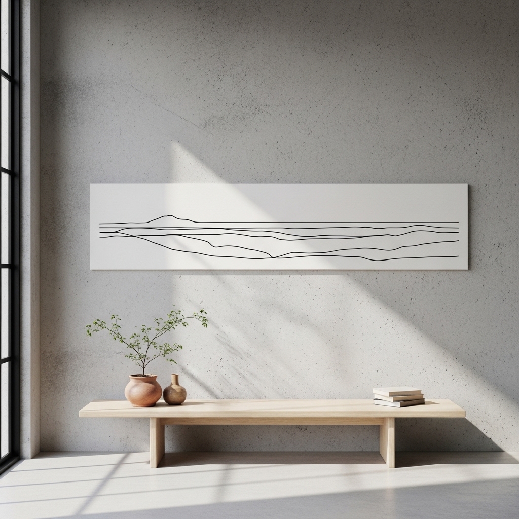
Ideal for: Minimalist apartments and clean interiors.
Install a long horizontal strip of continuous artwork or design element across the wall. Keep composition simple and uninterrupted.
This works because a single visual line creates calm structure and expands perceived width. It removes clutter while maintaining focus. Broken alignment reduces impact.
Pro Tip: Align strip with furniture height.
Mistake to Avoid: Don’t interrupt the line with decor breaks.
10. Tonal Layered Paint Block Composition for Contemporary Geometry
Ideal for: Modern creative interiors.
Use multiple paint blocks in slightly different tones of the same color family arranged in geometric sections.
This works because tonal variation creates depth without visual chaos. It adds structure while maintaining calmness. Too many colors reduce cohesion.
Pro Tip: Use soft transitions between blocks.
Mistake to Avoid: Don’t use unrelated color families.
11. Organic Curve Wall Painting Flow for Soft Modern Movement
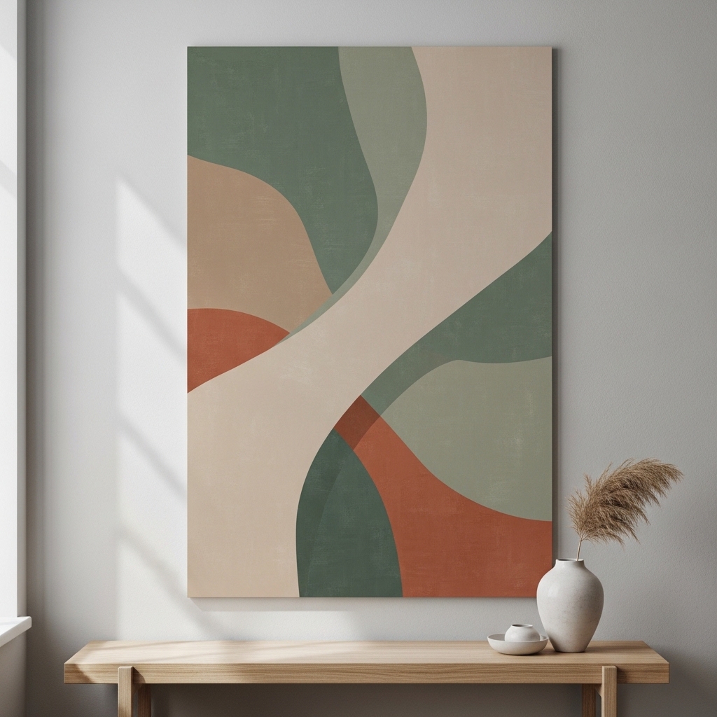
Ideal for: Bedrooms and soft aesthetic interiors.
Paint flowing curved shapes that move across the wall in natural forms. Avoid sharp edges and keep transitions smooth.
This works because curves soften rigid architecture and create movement. It adds emotional flow without decor items. Harsh lines break softness.
Pro Tip: Sketch curves before painting.
Mistake to Avoid: Don’t overcomplicate patterns.
12. Elevated Corner Wrap Wall Design for Spatial Expansion Effect
Ideal for: Small rooms needing visual expansion.
Extend wall design into corners and adjacent surfaces to blur boundaries.
This works because wrapping visuals around corners expands spatial perception. It reduces boxy room feel. Broken continuity reduces effect.
Pro Tip: Keep design consistent across surfaces.
Mistake to Avoid: Don’t mix unrelated patterns in corners.
13. Invisible Frame Edge Art Illusion for Seamless Wall Integration
Ideal for: Ultra-modern minimalist homes.
Use frameless artwork with edge-blended prints that merge into wall tones.
This works because removing frames reduces visual interruption and enhances continuity. It creates a seamless aesthetic. Poor contrast reduces visibility.
Pro Tip: Match wall tone with artwork edges.
Mistake to Avoid: Don’t use heavy frame borders.
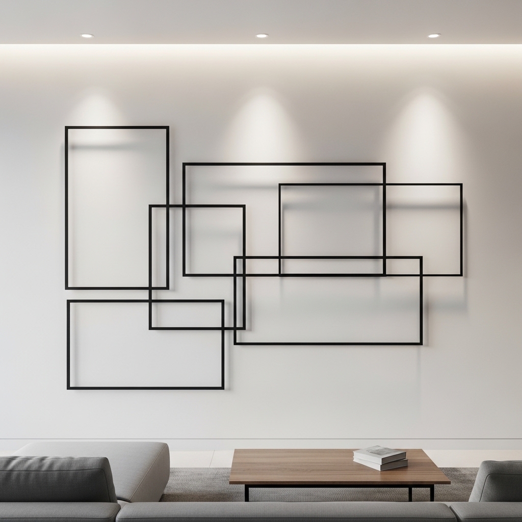
14. Linear Metal Wire Sculpture Wall Installation for Light Shadow Play
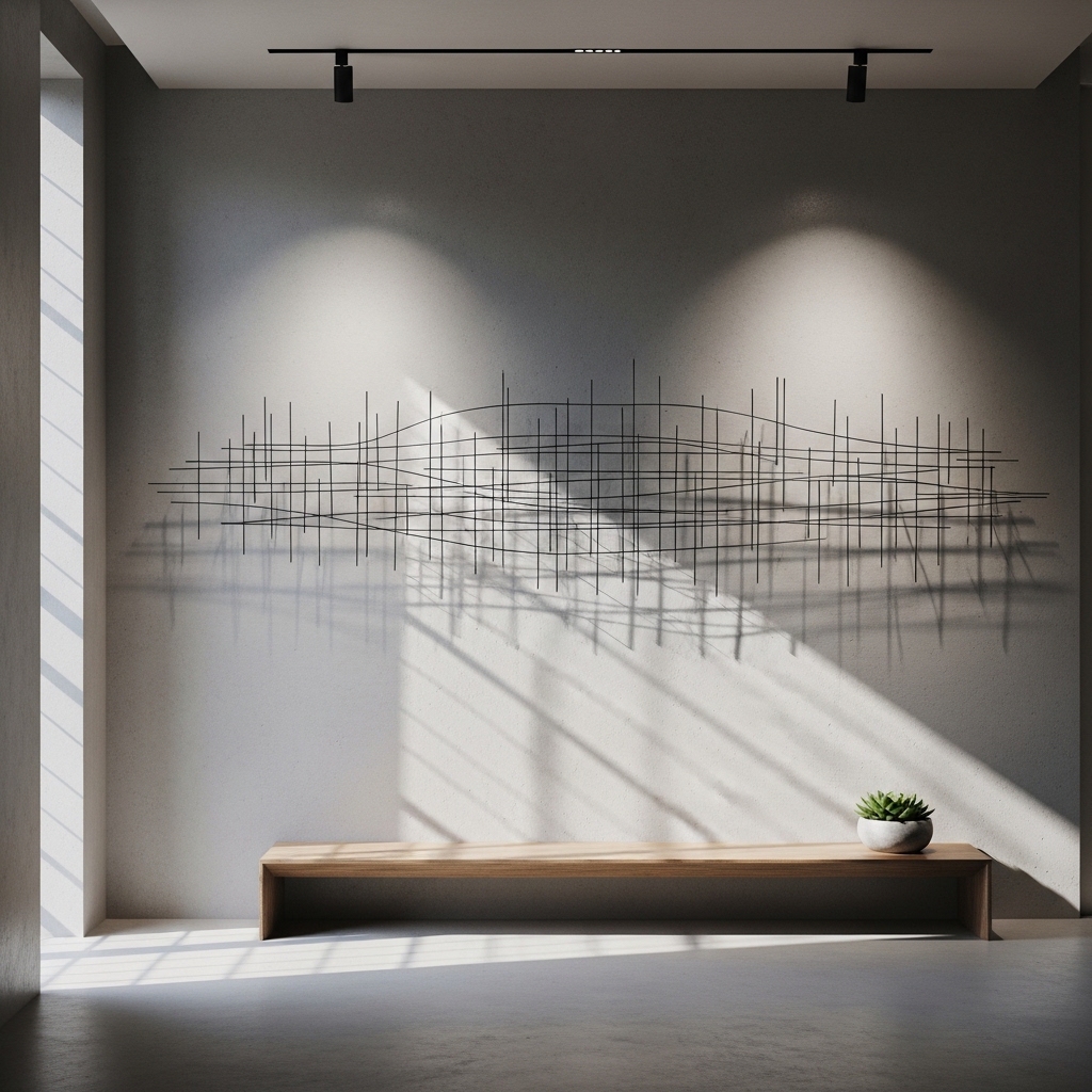
Ideal for: Industrial and modern interiors.
Install thin metal wire sculptures that cast shadows on walls.
This works because shadows create dynamic movement with lighting changes. It adds dimension without bulk. Overuse reduces clarity.
Pro Tip: Use directional lighting for best effect.
Mistake to Avoid: Don’t overcrowd wall with sculptures.
15. Soft Fabric Draped Wall Panel Accent for Acoustic Luxury Feel
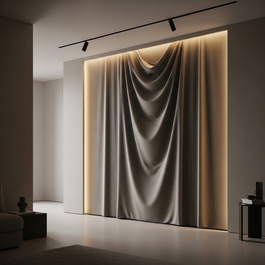
Ideal for: Bedrooms and quiet spaces.
Drape fabric panels in structured folds across wall surfaces.
This works because fabric softens acoustics and adds warmth. It introduces luxury without rigidity. Poor fabric choice reduces elegance.
Pro Tip: Use thick neutral fabrics.
Mistake to Avoid: Don’t use shiny or synthetic materials.
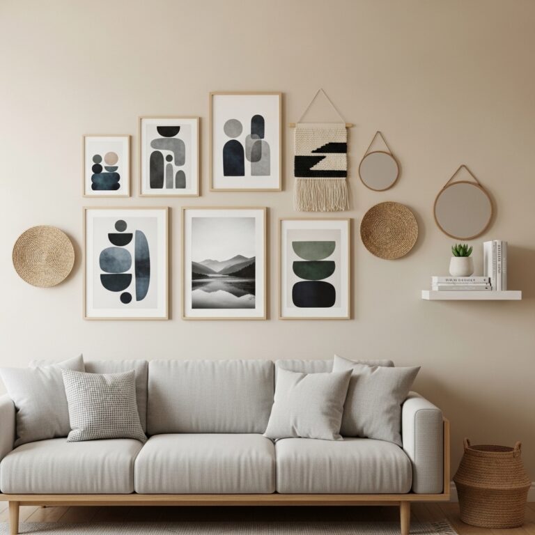
16. Multi-Height Offset Frame Composition for Dynamic Rhythm
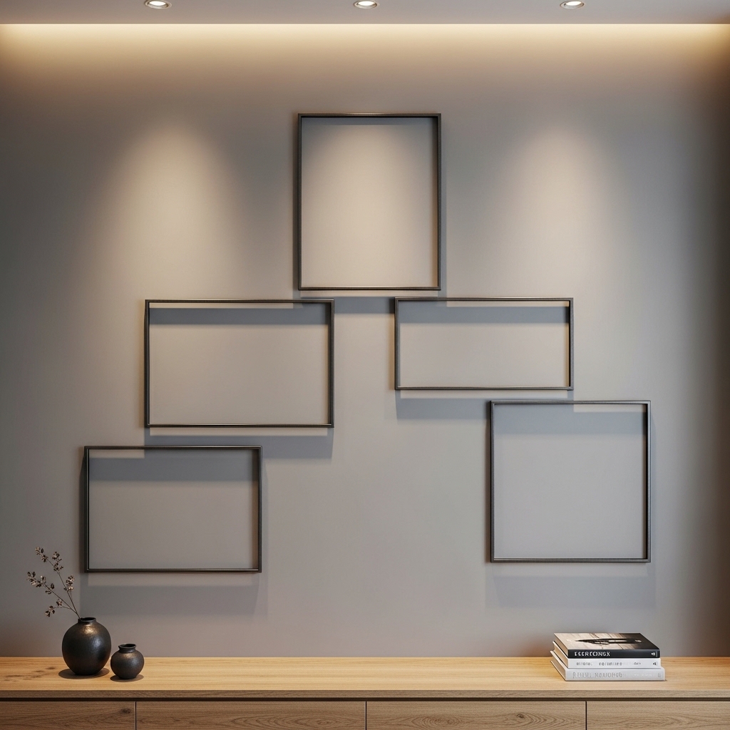
Ideal for: Creative living spaces.
Hang frames at varying heights in a controlled pattern.
This works because variation creates rhythm and movement while maintaining balance. Random placement reduces harmony.
Pro Tip: Maintain invisible grid alignment.
Mistake to Avoid: Don’t scatter frames randomly.
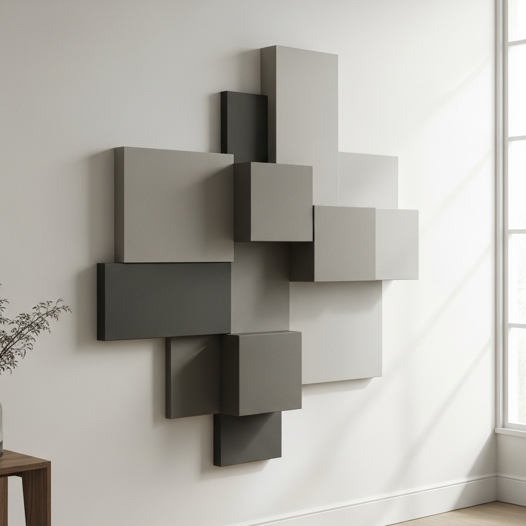
17. Architectural Cutout Wall Shapes for Built-In Design Impact
Ideal for: High-end custom interiors.
Create geometric cutouts within the wall itself for visual depth.
This works because structural design replaces surface decoration entirely. It feels integrated and premium. Poor proportions reduce impact.
Pro Tip: Use symmetry in cutouts.
Mistake to Avoid: Don’t overcomplicate shapes.
18. Monotone Texture Mapping Wall Finish for Subtle Depth Control
Ideal for: Minimal luxury interiors.
Apply a single-color textured finish with layered depth variation.
This works because texture replaces color contrast, creating subtle sophistication. Flat surfaces reduce interest.
Pro Tip: Use matte finishes only.
Mistake to Avoid: Don’t add multiple colors.
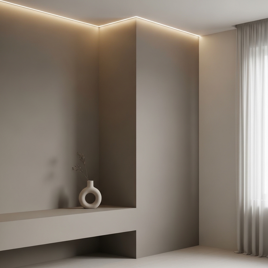
19. Ambient Halo Lighting Wall Outline Design for Modern Glow Effect
Ideal for: Bedrooms and media walls.
Install hidden lighting that outlines wall shapes or decor zones.
This works because halo lighting creates depth and mood without physical objects. Over-bright lighting reduces softness.
Pro Tip: Use dimmable LEDs.
Mistake to Avoid: Don’t use harsh neon lighting.
20. Negative Space Framing Wall Layout for Ultra-Clean Minimalism
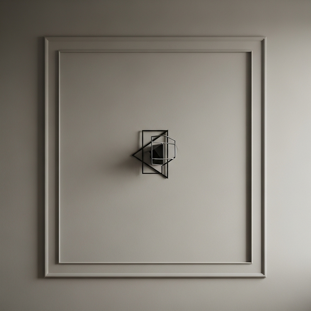
Ideal for: Minimalist and Scandinavian interiors.
Design walls with intentional empty spaces framed by minimal elements.
This works because negative space improves focus and reduces visual fatigue. Overfilling breaks balance.
Pro Tip: Let empty space become part of design.
Mistake to Avoid: Don’t over-decorate empty areas.
Conclusion
Modern wall decor is no longer about filling space—it is about controlling visual flow, creating depth, and designing intentional negative space. The most effective interiors are not the most decorated, but the most balanced.
When used correctly, these ideas transform walls into architectural elements that define mood, structure, and personality without unnecessary clutter.