20 Gallery Wall Ideas That Transform Blank Walls Into Curated, High-Impact Interiors
Gallery walls have become one of the most effective ways to personalize and elevate interior spaces without requiring major renovations or expensive furniture changes. Instead of leaving walls empty or relying on a single piece of decor, a gallery wall allows you to combine multiple visuals into one cohesive design statement.
What makes gallery walls powerful is their flexibility. They can be minimal or bold, symmetrical or freeform, modern or traditional—depending entirely on how they are composed. This makes them suitable for living rooms, bedrooms, hallways, staircases, and even compact apartments where wall space needs to be used strategically.
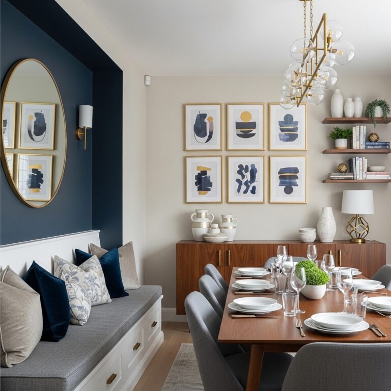
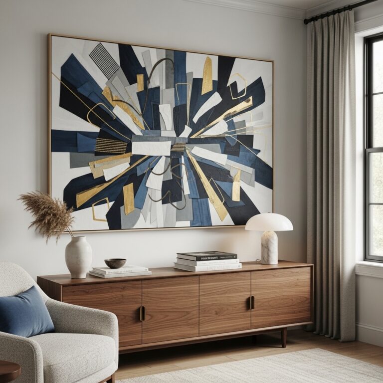
1. Oversized Centerpiece Gallery Wall for Strong Focal Impact
Start your gallery wall with one oversized artwork placed at the center and build smaller pieces around it. This creates a visual anchor that immediately draws attention and prevents the wall from feeling scattered. Use this approach above sofas, beds, or dining consoles where a strong focal point is needed. Keep spacing consistent so the large piece naturally leads the composition.
This works because the human eye always looks for a dominant visual anchor first. Without it, gallery walls can feel chaotic or unfinished. A central oversized piece gives structure and hierarchy to the entire arrangement, making even mixed frames feel intentional and balanced.
Pro Tip: Choose artwork with subtle tones so it blends with smaller pieces.
Mistake to Avoid: Don’t place the centerpiece off-center—it breaks composition balance.
2. Symmetrical Grid Gallery Wall for Clean Modern Homes
Arrange identical frames in a perfect grid with equal spacing and alignment. This works best in modern interiors, hallways, or offices where structure is important. Use matching frame sizes and consistent artwork styles for a polished look.
This works because symmetry creates order and visual calm, especially in minimalist or contemporary spaces. It eliminates randomness and helps the wall feel curated rather than collected over time.
Pro Tip: Use a level tool for perfect alignment.
Mistake to Avoid: Don’t mix frame sizes in a grid layout.
3. Organic Salon-Style Gallery Wall for Creative Expression
Create a free-flowing arrangement with different frame sizes and shapes placed organically. Start from a central point and build outward naturally. This is ideal for living rooms or creative spaces.
This works because asymmetry creates movement and personality, making the wall feel dynamic and lived-in. However, without balance, it can quickly look messy instead of artistic.
Pro Tip: Lay everything on the floor before hanging.
Mistake to Avoid: Don’t place frames without spacing consistency.
4. Black and White Photo Gallery Wall for Timeless Style
Use only black-and-white photography in uniform or mixed frames. Keep spacing consistent and align in a structured or semi-organized layout.
This works because monochrome tones remove visual noise and create emotional depth through simplicity. It keeps the wall elegant and timeless regardless of interior style.
Pro Tip: Use thin black or white frames for cohesion.
Mistake to Avoid: Don’t mix color photos with black-and-white.
5. Minimal Neutral Art Gallery Wall for Calm Interiors
Choose soft beige, gray, and muted tone artwork with minimal designs. Arrange in a simple grid or linear layout.
This works because neutral tones reduce visual tension and support a calm atmosphere, especially in bedrooms or minimalist homes.
Pro Tip: Stick to one tone family for harmony.
Mistake to Avoid: Don’t introduce bold colors.
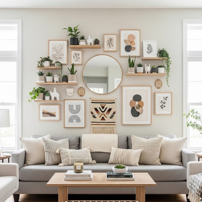
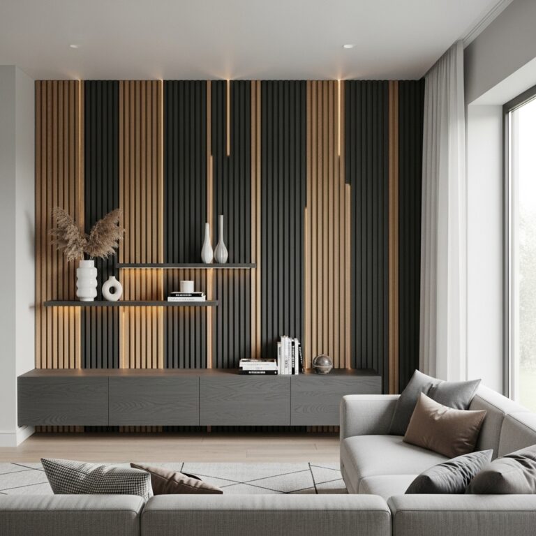
6. Floating Shelf Gallery Wall for Flexible Styling
Install floating shelves and lean frames instead of hanging them. Mix with small decor pieces like plants or candles.
This works because it allows easy updates without damaging walls, making it ideal for renters. It also adds layered depth.
Pro Tip: Mix vertical and horizontal frame placements.
Mistake to Avoid: Don’t overcrowd shelves.
7. Floor-to-Ceiling Gallery Wall for Dramatic Impact
Fill an entire wall from top to bottom with framed artwork in a structured layout.
This works because it maximizes visual impact and makes ceilings feel taller. It creates a gallery-like experience at home.
Pro Tip: Maintain consistent spacing vertically.
Mistake to Avoid: Don’t leave uneven gaps at top or bottom.
8. Staircase Gallery Wall for Flowing Movement
Arrange frames following the angle of a staircase. Start from the bottom and move upward diagonally.
This works because it follows natural movement lines in architecture, making transitions feel smooth and intentional.
Pro Tip: Use consistent frame spacing along the staircase.
Mistake to Avoid: Don’t ignore stair slope alignment.
9. Color-Themed Gallery Wall for Coordinated Design
Choose artwork based on a single color palette like earth tones, blues, or pastels.
This works because color repetition creates unity even when artwork styles differ. It keeps the wall visually controlled.
Pro Tip: Limit to 2–3 dominant colors.
Mistake to Avoid: Don’t mix conflicting palettes.
10. Mirror Integrated Gallery Wall for Light Expansion
Mix framed art with mirrors in a structured layout.
This works because mirrors reflect light and expand space visually while maintaining artistic appeal.
Pro Tip: Place mirrors strategically near light sources.
Mistake to Avoid: Don’t overuse reflective pieces.
11. Large Anchor Frame Gallery Wall for Structured Balance
Start with one large frame and build smaller frames around it.
This works because it creates hierarchy and prevents visual randomness.
Pro Tip: Keep anchor frame centered or slightly off-center intentionally.
Mistake to Avoid: Don’t mix unrelated sizes randomly.
12. Vertical Column Gallery Wall for Narrow Spaces
Arrange frames in a straight vertical line for tight or narrow walls.
This works because it elongates visual height and uses limited space efficiently.
Pro Tip: Keep frame widths consistent.
Mistake to Avoid: Don’t break vertical alignment.
13. Horizontal Linear Gallery Wall for Wide Walls
Place frames in a single horizontal line across a wall.
This works because it emphasizes width and balances long furniture like sofas.
Pro Tip: Align frames with furniture height.
Mistake to Avoid: Don’t vary spacing unevenly.
14. Mixed Media Gallery Wall for Texture Variety
Combine photos, art prints, fabric pieces, or small objects.
This works because texture variety creates depth and personality in the wall design.
Pro Tip: Maintain color consistency despite mixed materials.
Mistake to Avoid: Don’t overmix unrelated styles.
15. Minimal 3-Frame Gallery Wall for Small Spaces
Use only three carefully selected frames in a clean arrangement.
This works because simplicity prevents overcrowding in small rooms.
Pro Tip: Use large spacing between frames.
Mistake to Avoid: Don’t add extra pieces unnecessarily.
16. Dark Frame Contrast Gallery Wall for Definition
Use black or dark frames on light walls for strong contrast.
This works because contrast improves visibility and sharpens visual structure.
Pro Tip: Keep frame style uniform.
Mistake to Avoid: Don’t mix frame colors.
17. Nature-Inspired Gallery Wall for Calm Energy
Use botanical prints, landscapes, or earthy visuals.
This works because nature themes create relaxation and softness in interiors.
Pro Tip: Pair with real indoor plants.
Mistake to Avoid: Don’t use overly saturated colors.
18. Asymmetrical Balanced Gallery Wall for Modern Style
Create an uneven layout that still feels visually balanced.
This works because controlled asymmetry adds creativity without chaos.
Pro Tip: Balance visual weight, not symmetry.
Mistake to Avoid: Don’t cluster all frames on one side.
19. Personal Photo Memory Gallery Wall for Emotional Depth
Use personal photographs in coordinated frames and tones.
This works because emotional connection adds warmth and identity to space.
Pro Tip: Use consistent editing filters.
Mistake to Avoid: Don’t mix random photo styles.
20. Seasonal Rotation Gallery Wall for Dynamic Interiors
Keep a base layout and rotate artwork seasonally.
This works because it keeps interiors fresh without redesigning walls completely.
Pro Tip: Store prints safely for reuse.
Mistake to Avoid: Don’t change entire layout structure frequently.
Conclusion
Gallery walls work best when they are not random collections but intentional visual systems built around balance, spacing, and storytelling. Whether minimal, symmetrical, or expressive, the strongest gallery walls always maintain structure and clarity.
A well-designed gallery wall doesn’t just decorate a room—it defines its personality, improves visual flow, and creates a curated interior experience that feels complete and purposeful.