20 Wall Art Decor Ideas That Instantly Upgrade Blank Walls Into High-End Interior Statements
Wall art decor is one of the most powerful design tools for transforming empty walls into intentional, styled focal points. Instead of relying on furniture alone, wall art defines personality, improves balance, and creates emotional depth in any room.
When done correctly, wall art becomes more than decoration—it becomes a visual anchor that connects color, texture, and space flow across the entire interior. The following ideas focus on real application, not generic styling.
1. Oversized Gallery Canvas Statement for Architectural Impact
Ideal for: Large empty walls behind sofas, beds, or dining areas.
Use a single oversized canvas that spans most of the wall width while maintaining balance with surrounding furniture. The artwork should feel intentional, not randomly placed. Choose abstract, nature, or neutral designs depending on your interior palette.
This works because a large-scale piece automatically creates hierarchy in the room and removes visual fragmentation caused by multiple small items. It anchors the entire space and gives instant structure to blank walls.
Pro Tip: Keep colors slightly muted for long-term flexibility.
Mistake to Avoid: Don’t hang oversized art too high above furniture alignment.
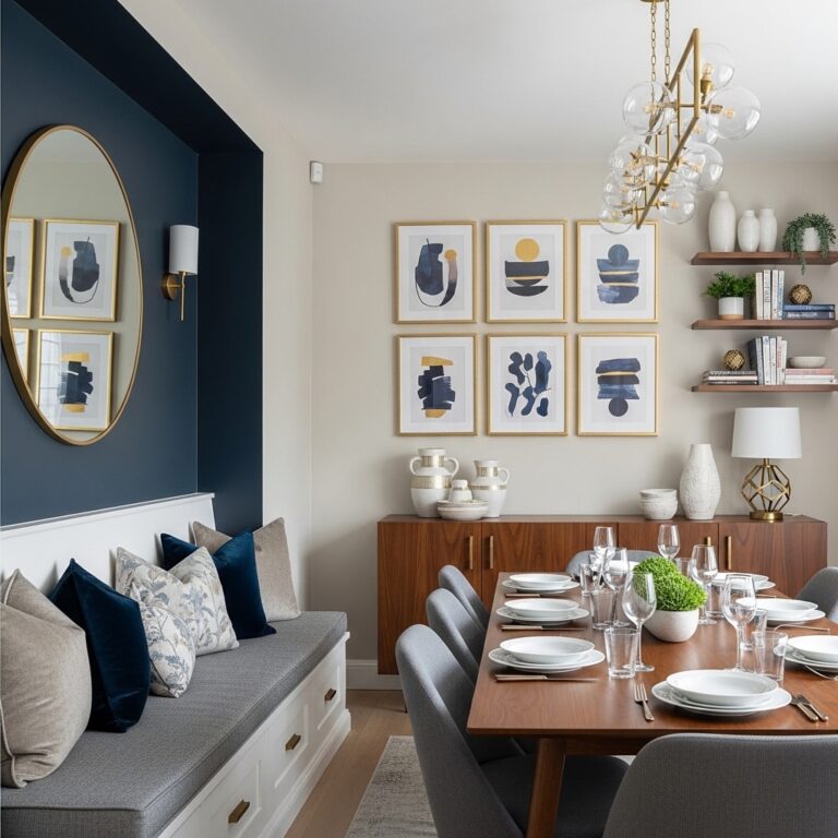
2. Architectural Frame Grid Wall Art for Structured Harmony
Ideal for: Modern living rooms and minimalist interiors.
Arrange multiple identical frames in a precise grid layout with equal spacing and uniform sizing. Keep artwork style consistent across all frames to maintain cohesion.
This works because structured repetition creates visual order and calmness, especially in modern interiors. It eliminates randomness and creates a curated gallery effect.
Pro Tip: Use laser alignment tools for perfect symmetry.
Mistake to Avoid: Don’t mix different frame sizes in grid layouts.
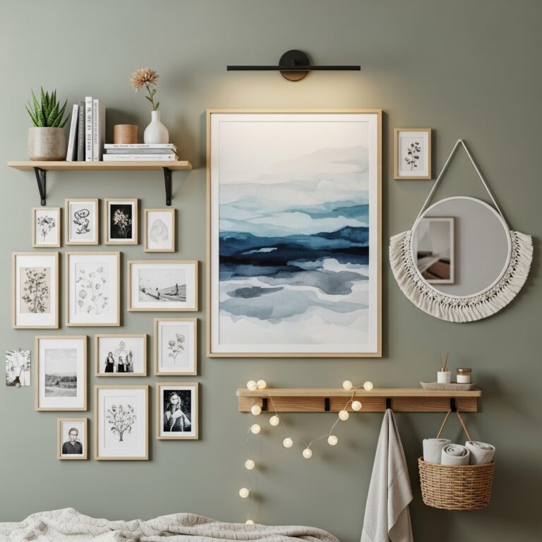
3. Floating Layered Frame Display for Depth Styling
Ideal for: Flexible and renter-friendly interiors.
Place framed artwork on floating shelves instead of hanging them. Layer different frame sizes slightly overlapping for a casual yet styled effect.
This works because layering adds depth and dimension while allowing easy updates without wall damage. It also introduces flexibility in styling rotation.
Pro Tip: Mix vertical and horizontal frame orientations.
Mistake to Avoid: Don’t overcrowd shelf surfaces.
4. Monochrome Visual Story Wall for Elegant Consistency
Ideal for: Bedrooms, hallways, and sophisticated interiors.
Use only black-and-white or single-tone artwork across the entire wall arrangement. Keep framing consistent for visual unity.
This works because limiting color removes visual noise and allows focus on composition and emotion. It creates timeless elegance that doesn’t rely on trends.
Pro Tip: Use matte black frames for cohesion.
Mistake to Avoid: Don’t introduce colored prints.
5. Organic Flow Art Arrangement for Creative Expression
Ideal for: Casual living rooms and artistic spaces.
Arrange frames in an asymmetrical, free-flowing layout starting from a central anchor point. Let the arrangement grow naturally outward.
This works because organic layouts mimic natural visual movement, creating personality and creativity. However, without balance, it can feel messy.
Pro Tip: Maintain invisible alignment lines for structure.
Mistake to Avoid: Don’t place frames randomly without spacing control.
6. Botanical-Inspired Art Wall for Natural Calmness
Ideal for: Bedrooms, kitchens, and relaxed interiors.
Use plant illustrations, leaf sketches, or nature-inspired prints in soft earthy tones. Group them in pairs or triptychs.
This works because nature visuals reduce stress and bring organic softness into structured interiors. It helps balance hard architectural lines.
Pro Tip: Pair with real indoor greenery.
Mistake to Avoid: Don’t use overly saturated green tones.
7. Typography-Focused Wall Art for Bold Messaging
Ideal for: Offices, entryways, or modern homes.
Use large typographic prints or motivational quotes with clean fonts. Keep backgrounds minimal for readability.
This works because text-based design communicates emotion and identity instantly while maintaining simplicity. Overuse can feel visually heavy.
Pro Tip: Stick to one font family.
Mistake to Avoid: Don’t overcrowd with multiple messages.
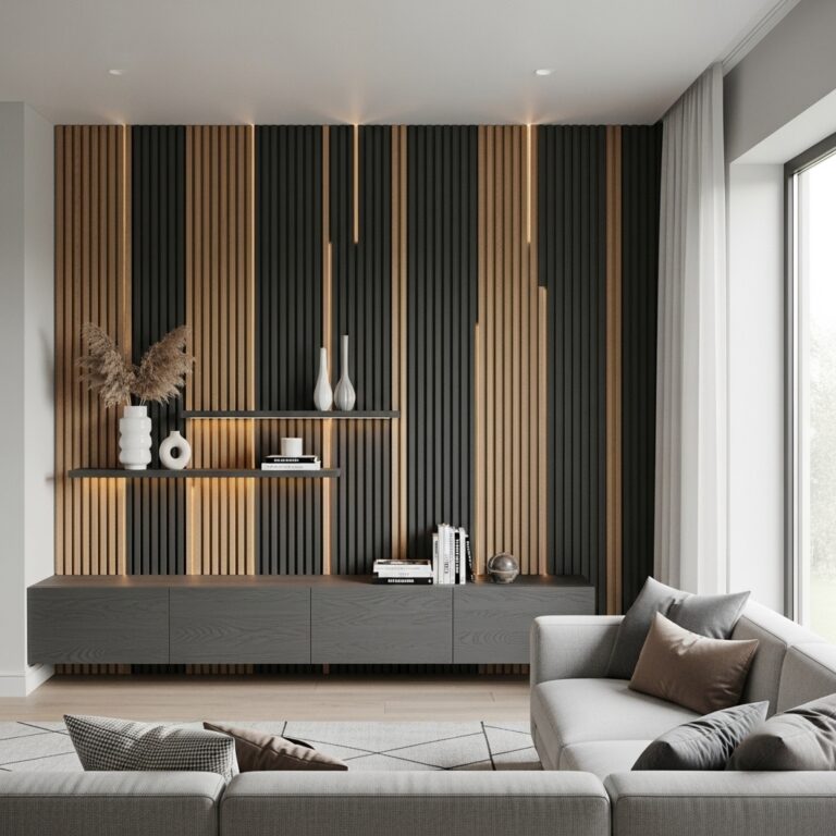
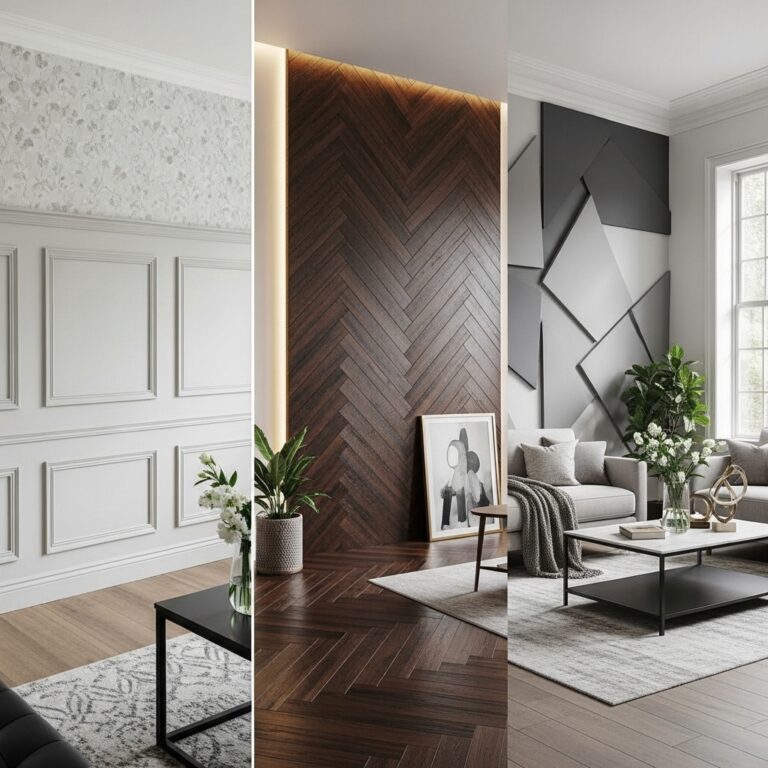
8. Mixed Material Wall Art Composition for Texture Depth
Ideal for: Luxury or contemporary interiors.
Combine framed prints with woven art, fabric panels, or metallic pieces. Maintain a controlled color palette for unity.
This works because mixed materials introduce tactile depth and visual richness that flat art cannot achieve alone.
Pro Tip: Balance textures evenly across the wall.
Mistake to Avoid: Don’t mix too many contrasting materials.
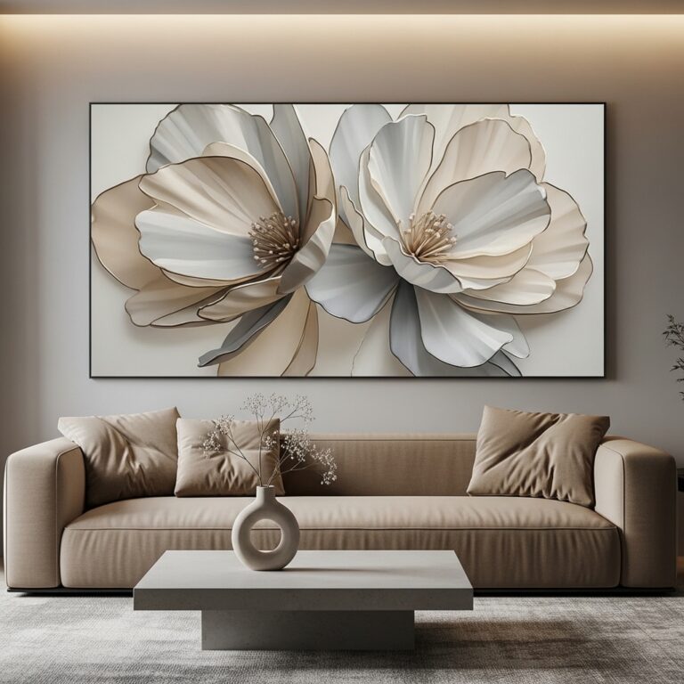
9. Oversized Diptych Wall Art for Wide Wall Coverage
Ideal for: Large horizontal wall spaces.
Use two large panels forming one continuous image or complementary artwork. Space them evenly for visual balance.
This works because splitting large visuals maintains impact while adapting to wide walls without overcrowding.
Pro Tip: Keep seam alignment precise.
Mistake to Avoid: Don’t use mismatched artwork styles.
10. Minimal Abstract Brush Art for Soft Modern Interiors
Ideal for: Contemporary and minimalist spaces.
Choose abstract brushstroke designs in muted tones and arrange them sparsely.
This works because abstraction allows interpretation while keeping interiors visually calm and uncluttered.
Pro Tip: Match one tone with furniture accents.
Mistake to Avoid: Don’t overlayer too many abstract pieces.
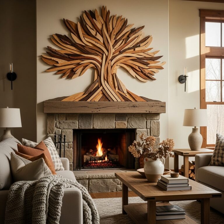
11. Sculptural Wall Art Installations for 3D Impact
Ideal for: High-end or statement interiors.
Use 3D wall sculptures or layered installations that project from the wall surface.
This works because dimensional art interacts with light and shadow, creating movement throughout the day.
Pro Tip: Use directional lighting to enhance depth.
Mistake to Avoid: Don’t overcrowd wall with multiple sculptures.
12. Linear Horizontal Art Flow for Sofa Alignment
Ideal for: Living rooms with long seating arrangements.
Arrange artwork in a straight horizontal line aligned with sofa length.
This works because it visually extends room width and creates a stable visual base above furniture.
Pro Tip: Align center frame with sofa midpoint.
Mistake to Avoid: Don’t vary frame height.
13. Vertical Column Art Stack for Narrow Spaces
Ideal for: Hallways or tight wall areas.
Stack frames vertically in a straight column with equal spacing.
This works because vertical alignment enhances perceived ceiling height and uses narrow walls effectively.
Pro Tip: Keep frame widths identical.
Mistake to Avoid: Don’t break vertical alignment spacing.
14. Color-Coordinated Art Wall for Visual Unity
Ideal for: Interiors with defined color palettes.
Choose artwork that follows a consistent color scheme like beige, blue, or earth tones.
This works because color repetition builds harmony even with different styles of art.
Pro Tip: Limit palette to 2–3 main tones.
Mistake to Avoid: Don’t introduce random contrasting colors.
15. Mirror Integrated Art Wall for Light Expansion
Ideal for: Small or dark rooms.
Combine framed art with mirrors in a structured arrangement.
This works because mirrors reflect light and expand perceived space while maintaining artistic balance.
Pro Tip: Place near natural light sources.
Mistake to Avoid: Don’t reflect cluttered areas.
16. Minimal 3-Piece Art Focus Wall for Clean Design
Ideal for: Small apartments or minimal interiors.
Use only three well-spaced frames in a balanced layout.
This works because simplicity reduces visual clutter and keeps focus strong.
Pro Tip: Use large negative space between frames.
Mistake to Avoid: Don’t add unnecessary pieces.
17. Vintage Art Revival Wall for Timeless Character
Ideal for: Classic or rustic interiors.
Use antique-style illustrations or retro posters in aged frames.
This works because vintage art adds depth, history, and personality to modern interiors.
Pro Tip: Use warm-toned frames.
Mistake to Avoid: Don’t mix modern prints randomly.
18. Floating Corner Art Expansion for Dead Spaces
Ideal for: Underused corners or awkward walls.
Extend artwork into corner spaces using angled arrangements or staggered frames.
This works because it activates unused zones and improves spatial flow.
Pro Tip: Use asymmetrical balance.
Mistake to Avoid: Don’t overcrowd corner walls.
19. Seasonal Rotating Art Display System for Dynamic Interiors
Ideal for: Homes that enjoy regular updates.
Keep a fixed frame layout but rotate artwork seasonally.
This works because it refreshes interiors without structural changes.
Pro Tip: Store prints safely for reuse.
Mistake to Avoid: Don’t change layout structure frequently.
20. Minimal Black Frame Contrast Wall for Sharp Definition
Ideal for: Modern and neutral interiors.
Use thin black frames with light or neutral artwork for contrast.
This works because contrast improves clarity and visual separation.
Pro Tip: Keep frame thickness uniform.
Mistake to Avoid: Don’t mix multiple frame colors.
Conclusion
Wall art decor works best when it is intentional, structured, and visually balanced rather than randomly placed. The strongest designs rely on consistency in spacing, theme, and proportion while allowing personality to come through naturally.
A well-designed wall doesn’t just fill space—it defines the identity of the room and enhances how the entire interior is experienced.