Best Wall Colors for Small Spaces | Light-Reflecting Paint Picks | Room-Expanding Color Strategies
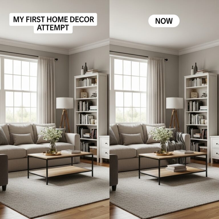
Small spaces need different colors than large rooms. The wrong color makes a small room feel like a cave. The right color makes it feel open and airy. Color affects perception more than any other design element.
Light colors reflect light. Dark colors absorb light. In a small room, reflected light is essential. The walls should recede, not advance. The ceiling should feel higher, not lower.
This article delivers the best wall colors for small spaces, backed by color science and real-world testing. Each recommendation includes specific brand names and color codes.
The Small Space Color Assessment
Before choosing a color, assess your room’s light. Light changes everything. A color that looks perfect in a south-facing room will look completely different in a north-facing room.
How Light Direction Affects Color
| Room Direction | Light Quality | Effect on Color | Best Color Strategy |
|---|---|---|---|
| North-facing | Cool, blue, dim | Colors look cooler, darker, more muted | Warm colors to balance |
| South-facing | Warm, yellow, bright | Colors look warmer, lighter, more vibrant | Cool colors to balance |
| East-facing | Bright morning, cool afternoon | Colors shift throughout the day | Most colors work |
| West-facing | Warm afternoon, dramatic evening | Colors look very warm in evening | Most colors work |
The Fixed Element Assessment
What colors are already in the room? Flooring. Furniture. Art. These cannot change. Your wall color must work with them.
- Warm oak floors: Choose warm wall colors (creamy whites, warm beiges, soft terracotta)
- Cool gray floors: Choose cool wall colors (pale blue-gray, true gray, soft sage)
- Beige sofa (warm undertones): Choose warm wall colors
- White sofa (cool undertones): Choose cool wall colors
Pro Tip: Take photos of your room at different times of day. The photos will reveal how light changes.
Mistake to Avoid: Do not choose paint color from a tiny swatch alone. Swatches are printed ink, not actual paint. Always test on walls.
The Best Wall Colors for Small Spaces
Color 1: Warm White
Pure white is too harsh. It feels cold and clinical. Warm white has yellow or beige undertones. It feels soft and inviting. It reflects maximum light.
| Brand | Color Name | Color Code | Undertone | Best For |
|---|---|---|---|---|
| Sherwin-Williams | Alabaster | SW 7008 | Creamy | North-facing rooms |
| Benjamin Moore | White Dove | OC-17 | Soft yellow | Any small room |
| Benjamin Moore | Simply White | OC-117 | Clean, slight warmth | South-facing rooms |
| Sherwin-Williams | Shoji White | SW 7042 | Warm, soft | Rooms with little natural light |
Why it works: Warm white reflects light without feeling cold. The walls recede. The room feels larger. The color works with any accent color.
How to use warm white:
- Paint all four walls the same warm white
- Paint the trim the same warm white
- Paint the ceiling the same warm white (50% strength)
Pro Tip: Paint the ceiling the same warm white at 50% strength. The lack of contrast makes the ceiling feel higher.
Mistake to Avoid: Do not use pure white in small rooms. Pure white feels cold and shows every mark.
Color 2: Pale Blue-Gray
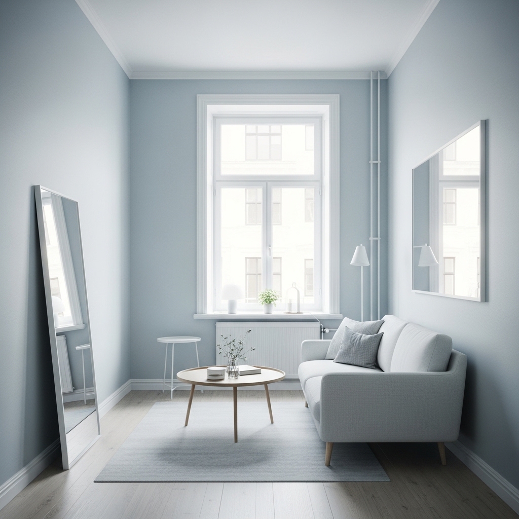
Blue-gray is calming. It feels like sky or water. It recedes visually, making walls feel farther away. It is an excellent choice for small rooms with warm light.
| Brand | Color Name | Color Code | Undertone | Best For |
|---|---|---|---|---|
| Benjamin Moore | Palladian Blue | HC-144 | Soft blue-green | South-facing rooms |
| Benjamin Moore | Quiet Moments | 1563 | Dusty blue | Any small room |
| Sherwin-Williams | Misty | SW 6232 | Pale blue-gray | North-facing rooms (with warm accents) |
| Farrow & Ball | Pigeon | No. 25 | Soft blue-gray | Rooms with good natural light |
Why it works: Blue-gray has cool undertones that recede. The walls feel farther away. The room feels larger. The color is calm and restful.
How to use pale blue-gray:
- Pair with warm wood tones (oak, walnut, teak)
- Pair with cream textiles (sofa, rug, curtains)
- Use white trim for contrast
Pro Tip: Pair pale blue-gray with warm wood tones and cream textiles. The warmth balances the cool blue.
Mistake to Avoid: Do not use a blue-gray that is too saturated. Dark blues make small rooms feel smaller.
Color 3: Soft Sage Green
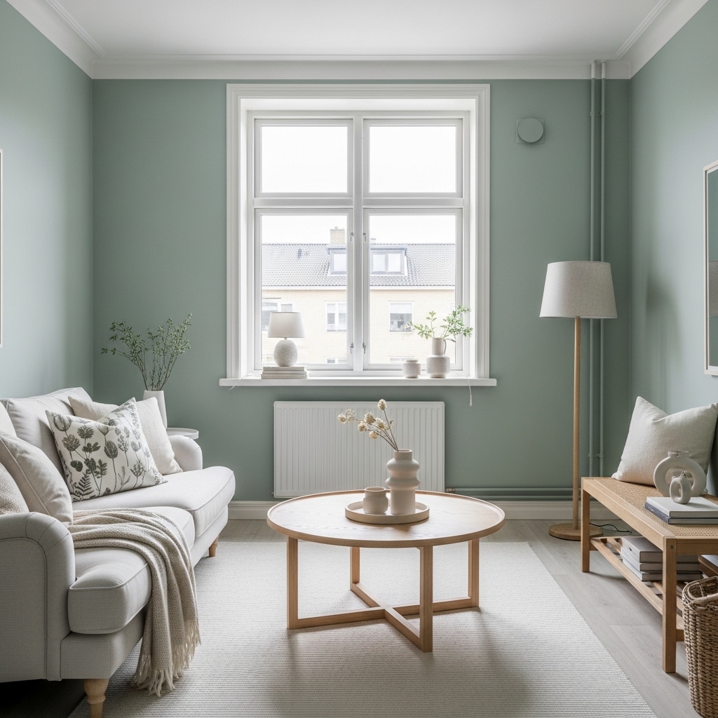
Sage green is earthy and calming. It works in any room. It pairs well with wood, white, and beige. It feels natural and grounded.
| Brand | Color Name | Color Code | Undertone | Best For |
|---|---|---|---|---|
| Benjamin Moore | Sage Green | 2138-40 | Soft, muted green | Any small room |
| Sherwin-Williams | Clary Sage | SW 6178 | Gray-green | North-facing rooms |
| Sherwin-Williams | Rainwashed | SW 6211 | Blue-green | South-facing rooms |
| Farrow & Ball | Green Smoke | No. 47 | Deep, muted sage | Rooms with abundant light |
Why it works: Sage green is a natural color. It does not compete with other elements. It feels calm without being boring. It adds color without overwhelming.
How to use soft sage green:
- Use on all four walls for a cohesive look
- Pair with cream, beige, or white trim
- Add natural wood accents (unfinished or light stain)
Pro Tip: Use sage green on walls and a lighter sage on trim. The monochromatic look is modern and spacious.
Mistake to Avoid: Do not use a bright green. Bright greens are overwhelming in small spaces. Use muted, soft greens only.
Color 4: Warm Beige or Greige
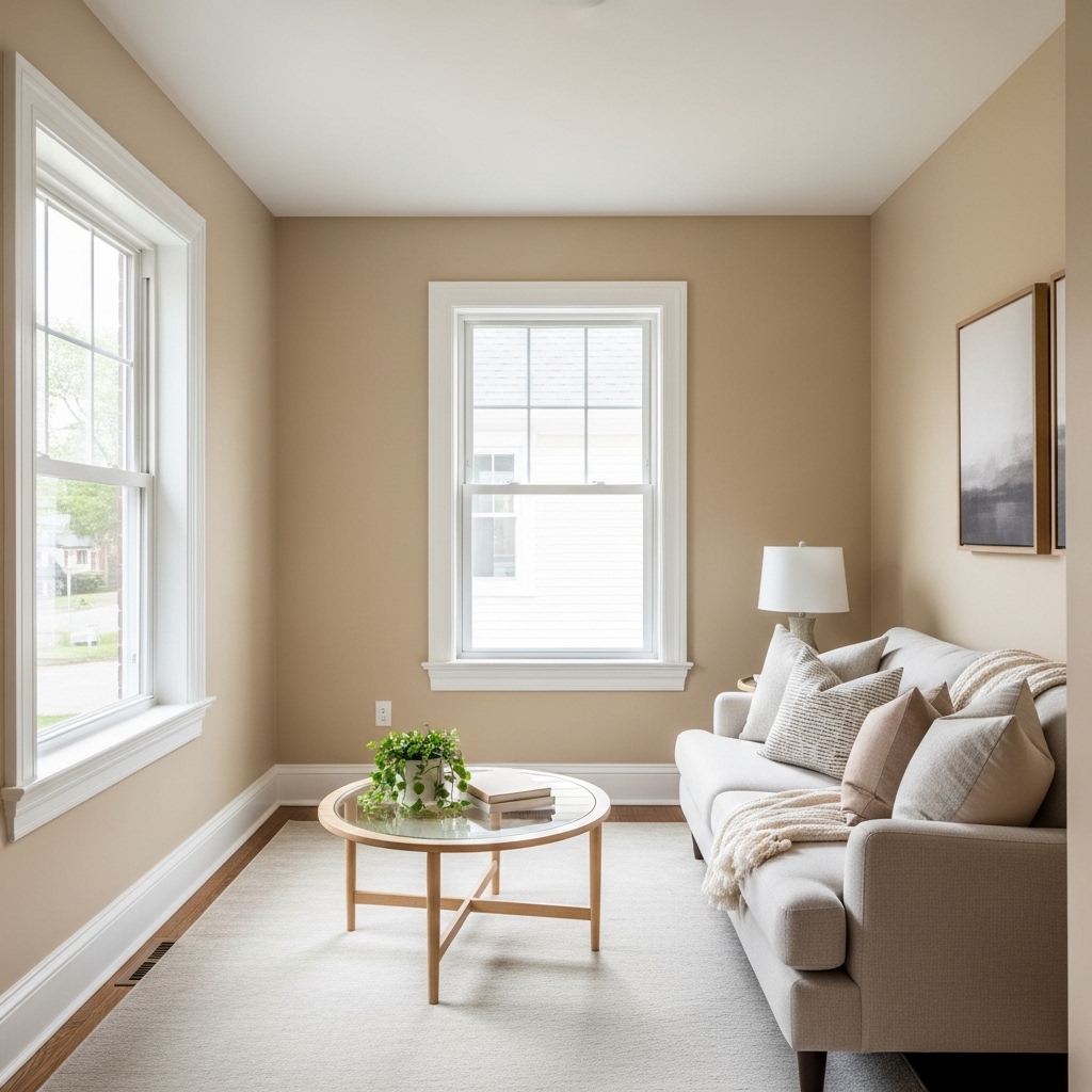
Beige is back. Not the yellow-beige of the 1990s. A warm, soft beige with gray undertones. Greige (gray + beige) is the most versatile neutral.
| Brand | Color Name | Color Code | Undertone | Best For |
|---|---|---|---|---|
| Benjamin Moore | Edgecomb Gray | HC-173 | Warm greige | Any small room |
| Sherwin-Williams | Accessible Beige | SW 7036 | Warm beige | South-facing rooms |
| Sherwin-Williams | Agreeable Gray | SW 7029 | Warm gray | Any small room |
| Benjamin Moore | Revere Pewter | HC-172 | Warm greige | Rooms with good natural light |
Why it works: Warm beige and greige are neutral without being boring. They reflect light. They pair with any accent color. They hide imperfections well.
How to use warm beige or greige:
- Use as a backdrop for colorful art and accessories
- Pair with white trim for contrast
- Use on walls, ceiling, and trim for a seamless look
Pro Tip: Use a warmer beige in north-facing rooms. The warmth balances the cool light.
Mistake to Avoid: Do not use a beige with pink undertones. Pink beiges look dated.
Color 5: Soft Blush or Terracotta (Accent Only)
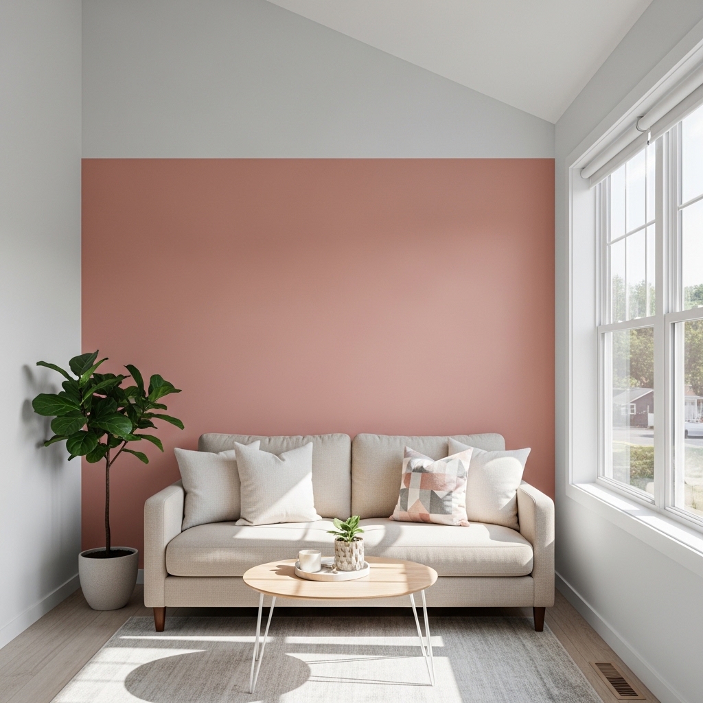
Blush and terracotta are warm and inviting. They work best as accent walls or in powder rooms. Use them sparingly in small spaces.
| Brand | Color Name | Color Code | Undertone | Best For |
|---|---|---|---|---|
| Benjamin Moore | First Light | 2102-70 | Soft pink | Accent wall |
| Sherwin-Williams | Cavern Clay | SW 7701 | Warm terracotta | South-facing rooms |
| Farrow & Ball | Setting Plaster | No. 232 | Dusty pink | Powder rooms |
| Benjamin Moore | Rosy Peach | 2089-40 | Soft coral | Accent wall |
Why it works: Soft blush adds warmth without being overwhelming. Terracotta feels earthy and grounded. Both add personality without dominating.
How to use blush or terracotta:
- Use on one wall only (accent wall)
- Pair with warm white on remaining walls
- Use natural wood and cream accents
Pro Tip: Use blush or terracotta on the wall opposite a window. The color will glow in natural light.
Mistake to Avoid: Do not use bright pink or orange. Bright versions of these colors are too intense for small spaces.
Colors to Avoid in Small Spaces
| Color | Why to Avoid | Better Alternative |
|---|---|---|
| Dark navy | Absorbs light, makes walls feel closer | Pale blue-gray |
| Charcoal gray | Too dark, creates cave-like atmosphere | Warm greige |
| Pure white | Cold, clinical, shows every mark | Warm white |
| Bright red | Overstimulating, aggressive | Soft terracotta (accent only) |
| Bright yellow | Harsh, can feel cheap | Warm beige |
Pro Tip: If you love a dark color, use it on furniture or an accent wall. Keep the other walls light.
Mistake to Avoid: Do not paint a small room dark colors. Dark colors absorb light and shrink spaces.
The Undertone Rule
Undertones are the most important and most overlooked aspect of color selection. Every color has an undertone. Two colors that look similar can clash because their undertones differ.
What Are Undertones?
A beige can have pink, yellow, or gray undertones. A gray can have blue, green, or purple undertones. A white can have blue, yellow, pink, or gray undertones.
How to Identify Undertones
| Method | How To Do It | What To Look For |
|---|---|---|
| Comparison method | Place two similar colors side by side | The difference reveals the undertone |
| White paper test | Hold a white piece of paper next to the color | The undertone becomes visible against white |
| Natural light test | Look at the color in natural light | Undertones are more visible than under store lighting |
The Undertone Rule for Small Spaces
Stick to one undertone family throughout the room. Warm undertones (yellow, beige, cream) with warm. Cool undertones (blue, gray, green) with cool.
| Fixed Element Undertone | Wall Color Undertone | Result |
|---|---|---|
| Warm oak floors | Warm (beige, cream, warm gray) | Harmonious |
| Cool gray floors | Cool (blue-gray, true gray) | Harmonious |
| Beige sofa (warm) | Warm | Harmonious |
| White sofa (cool) | Cool | Harmonious |
Pro Tip: If your fixed elements have mixed undertones, choose the most prominent one. Paint your walls to match that undertone.
Mistake to Avoid: Do not mix warm and cool undertones in a small room. The clash will make the room feel chaotic.
The Test Before You Paint
Testing is the most important step. Skipping testing leads to expensive mistakes and repainting. The sample pot method takes time but saves money.
The Sample Pot Method
- Buy sample pots of your top 3-5 colors ($5-10 each)
- Paint 2-foot by 2-foot squares on different walls
- Paint squares near fixed elements (floor, fireplace, furniture)
- Observe the squares for 3-5 days
- Look at the squares in morning, noon, evening, and under artificial light
- Eliminate colors that look wrong in any light
- Choose from the remaining colors
What to Look For at Different Times
| Time of Day | What to Observe |
|---|---|
| Morning | Does the color look too cool? Too washed out? |
| Midday | Does the color look too bright? Does it fade into the light? |
| Afternoon | Does the color look too warm? Too orange? |
| Evening (artificial light) | Does the color look muddy? Does it change completely? |
Pro Tip: Paint samples on white poster board. Move the poster board to different walls. This avoids painting directly on the wall.
Mistake to Avoid: Do not make a decision based on the sample pot alone. Live with the samples for several days.
Frequently Asked Questions
What is the best wall color for a very small room (under 80 square feet)?
Warm white. It reflects the most light. It makes the walls recede. The room feels larger. Alabaster by Sherwin-Williams or White Dove by Benjamin Moore are excellent choices.
Can I use dark colors in a small room?
Yes, but only as accents. A dark accent wall can add depth. Dark colors on all four walls will make the room feel like a cave. Use dark colors on furniture instead of walls.
What color makes a room feel larger?
Light colors reflect light. Reflected light makes rooms feel larger. Warm white, pale blue-gray, and soft sage green are excellent choices.
How do I choose a color if I cannot paint (rental)?
Use removable wallpaper on one wall. Use large art to add color. Use curtains, rugs, and pillows to bring in your palette. The walls can stay white while the room still has color.
Conclusion
Small spaces need specific colors. Light colors reflect light. Warm whites, pale blue-grays, soft sage greens, warm beiges, and greiges work best. Dark colors, pure white, and bright colors should be avoided.
Test before you paint. Observe samples for several days. Consider your light and your fixed elements. Stick to one undertone family throughout the room.
Start with one room today. Choose a warm white. Paint a sample. Live with it for a week. Small changes produce dramatic results.