How to Choose the Perfect Color Palette for Any Room: A Complete Guide to Confident Color Selection
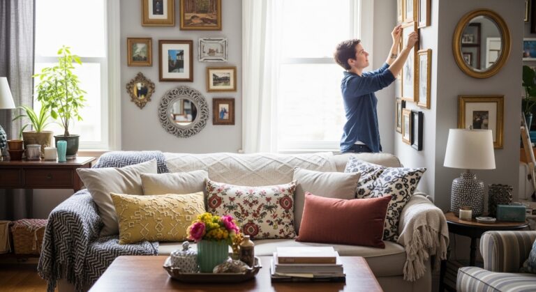
The paint chips were spread across the floor. Thirty different shades of blue. Twenty variations of gray. Ten nearly identical beiges. And complete paralysis about which one to choose.
Choosing colors for a room feels overwhelming. There are too many options. The fear of making a mistake is real. A wrong color choice means wasted money and a room that never feels right.
After years of color mistakes and repainting the same room multiple times, the process finally became clear. There is a logical system for choosing colors. It does not require a design degree. It does not require expensive consultants.
This guide walks through the exact step-by-step process used to choose color palettes for rooms of all sizes. Every decision. Every mistake avoided. Every lesson learned.
Before Starting: The Color Assessment
Before buying a single paint sample, the room needed an honest assessment. What were the non-negotiables? What colors already existed? What had to be worked around?
The Room Audit
Every room has fixed elements that cannot be changed. Flooring. Cabinets. Fireplace. Built-ins. Large furniture pieces. These elements contain colors that must be considered.
For the living room in this guide, the fixed elements were:
- Flooring: Warm oak hardwood with golden undertones
- Fireplace: Red brick with orange and brown variations
- Sofa: Light beige (already owned, staying in the room)
- Natural light: South-facing, abundant, warm light throughout the day
The Non-Negotiable Constraints
Every color palette must work with the fixed elements. Ignoring them leads to colors that clash and rooms that feel wrong.
Fixed Element Undertones
| Fixed Element | Color | Undertone | What It Means |
|---|---|---|---|
| Oak hardwood | Brown | Golden, warm | Avoid cool grays, choose warm neutrals |
| Brick fireplace | Red-orange | Warm, earthy | Complement with greens, blues, warm whites |
| Beige sofa | Beige | Warm, yellow-based | Stick with warm undertones throughout |
Personal Preferences
- Loved colors: Blue, green, cream, natural wood tones
- Disliked colors: Purple, orange, bright red, neon anything
- Mood desired: Calm, cozy, inviting (not energetic or formal)
Pro Tip: List your fixed elements and their undertones before looking at any paint colors. Keep the list on your phone for reference.
Mistake to Avoid: Do not choose paint colors in isolation. Every color must work with the fixed elements already in the room.
The Science of Color: Understanding Undertones
Color is not simple. Every color has an undertone. The undertone determines how the color interacts with other colors and with light.
What Are Undertones?
Undertones are the subtle hues beneath the main color. A beige can have pink undertones, yellow undertones, or gray undertones. A gray can have blue undertones, green undertones, or purple undertones.
| Main Color | Possible Undertones | Looks Good With | Avoid With |
|---|---|---|---|
| Beige | Pink, yellow, gray | Same undertone family | Opposite undertones |
| Gray | Blue, green, purple, warm | Same undertone family | Opposite undertones |
| White | Blue, yellow, pink, gray | Same undertone family | Opposite undertones |
| Blue | Green, purple, gray | Warm whites, wood tones | Cool grays, pink beiges |
How to Identify Undertones
The comparison method: Place two similar colors side by side. The differences reveal the undertones. A beige that looks pink next to a beige that looks yellow has pink undertones.
The white paper test: Hold a white piece of paper next to the color. The contrast reveals the undertone. A gray that looks blue next to white has blue undertones.
The natural light test: Look at the color in natural light at different times of day. Undertones become more visible in natural light than under store lighting.
Why Undertones Matter
Two beiges can clash even though they are both beige. One has pink undertones. The other has yellow undertones. Together, they look wrong.
Two grays can clash even though they are both gray. One has blue undertones. The other has green undertones. Together, they look muddy.
Pro Tip: Buy paint samples from the same brand and same color family. Undertones are more consistent within a single brand’s system.
Mistake to Avoid: Do not mix cool and warm undertones in the same room unless intentionally creating contrast. Most rooms look better with consistent undertones.
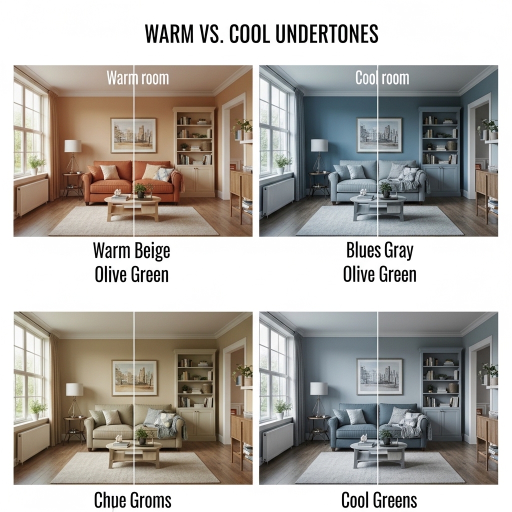
Step 1: Understand Your Light
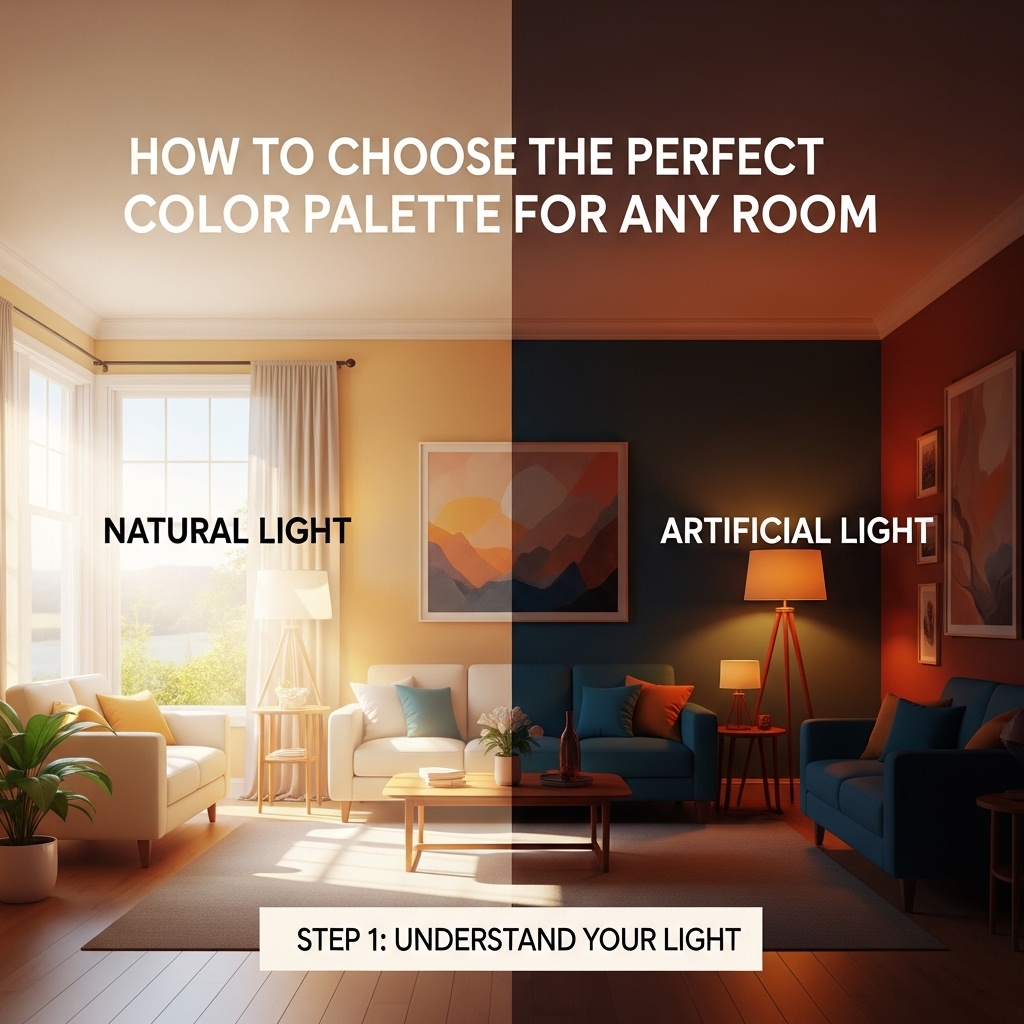
Light changes everything. A color that looks perfect in the store can look completely different on your wall. The same color looks different on a north-facing wall versus a south-facing wall.
How Light Direction Affects Color
| Room Direction | Light Quality | Effect on Color | Best Color Choices |
|---|---|---|---|
| North-facing | Cool, blue, gray | Colors look cooler, darker, more muted | Warm colors to balance (creamy whites, warm beiges, soft terracotta) |
| South-facing | Warm, yellow, bright | Colors look warmer, lighter, more vibrant | Cool colors to balance (true grays, blue-greens, crisp whites) |
| East-facing | Bright morning, cool afternoon | Colors shift throughout the day | Most colors work, avoid very dark colors |
| West-facing | Warm afternoon, dramatic evening | Colors look very warm in evening | Most colors work, avoid very bright colors |
The Light Test
Before choosing any colors, observe the room at different times of day.
- Morning (7-9 AM): Is the light bright or soft? Cool or warm?
- Midday (12-2 PM): Is the light harsh or diffused? Does it wash out colors?
- Afternoon (4-6 PM): Is the light golden or gray? Does it change the room dramatically?
- Evening (7-9 PM): How does artificial light change the colors?
The Room in This Guide
The room faced south. The light was warm and abundant throughout most of the day. Colors would look warmer and lighter than they appeared on paint chips.
This meant cool colors (true grays, blue-greens) would balance the warm light. Warm colors (yellow-based beiges, orange-toned creams) would look even warmer and potentially overwhelming.
Pro Tip: Take photos of the room at different times of day. Photos reveal color shifts that your eyes might miss.
Mistake to Avoid: Do not choose paint colors under store lighting. Store lighting is designed to make colors look good. It does not replicate your home’s light.
Step 2: Choose Your Color Strategy
There are several different color strategies. Each creates a different mood and works best for different room sizes and purposes.
The Three Main Color Strategies
| Strategy | Description | Best For | Mood |
|---|---|---|---|
| Monochromatic | Different shades of one color | Small rooms, calming spaces | Calm, serene, cohesive |
| Analogous | Colors next to each other on the color wheel | Medium rooms, harmonious spaces | Relaxed, natural, comfortable |
| Complementary | Colors opposite each other on the color wheel | Large rooms, energetic spaces | Dynamic, bold, exciting |
Monochromatic: One Color, Many Shades
Choose one color family. Use light, medium, and dark shades throughout the room.
Example monochromatic palette:
- Walls: Pale blue (lightest)
- Sofa: Medium blue (medium)
- Pillows and art: Navy blue (darkest)
Best for: Small rooms, bedrooms, bathrooms, spaces where calm is desired.
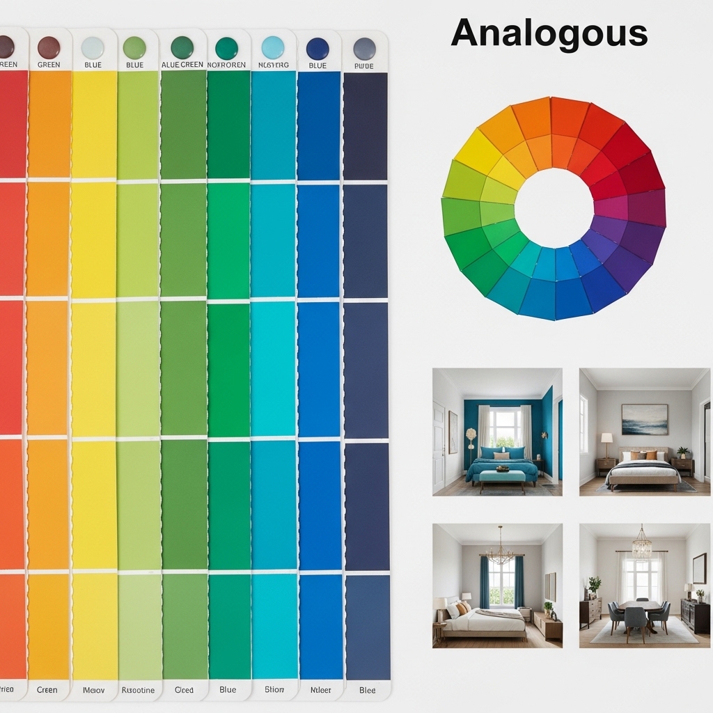
Analogous: Colors Next to Each Other
Choose three colors that sit next to each other on the color wheel. Blue, blue-green, and green. Or yellow, yellow-orange, and orange.
Example analogous palette:
- Walls: Pale blue
- Sofa: Blue-green (teal)
- Accents: Green (pillows, art, plants)
Best for: Living rooms, dining rooms, spaces where harmony is desired.
Complementary: Colors Opposite Each Other
Choose two colors that sit opposite each other on the color wheel. Blue and orange. Purple and yellow. Red and green.
Example complementary palette:
- Walls: Soft blue
- Accents: Terracotta (orange undertones) in pillows, art, accessories
Best for: Large rooms, playrooms, spaces where energy is desired.
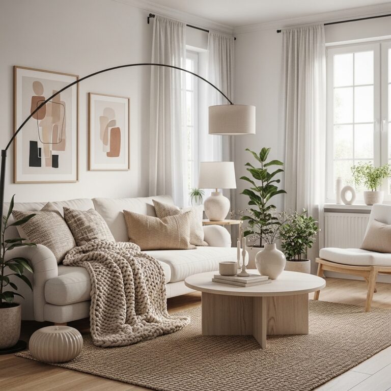
The Room in This Guide
The room was a living room with abundant natural light. The desired mood was calm and cozy but not boring. An analogous palette was chosen: blue, blue-green, and green.
- Walls: Pale blue with gray undertones
- Sofa: Light beige (neutral, works with blue)
- Accents: Teal (blue-green) and sage green
Pro Tip: Start with a color you love. Build the rest of the palette around that color. It is easier than starting from nothing.
Mistake to Avoid: Do not use more than three colors in a small room. More than three colors can feel chaotic and busy.
Step 3: Apply the 60-30-10 Rule
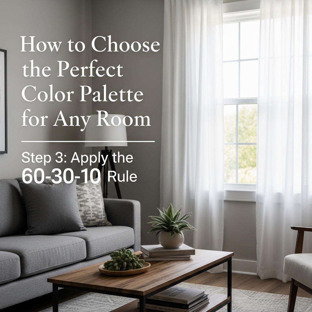
The 60-30-10 rule is a classic interior design principle. It creates balance and ensures no single color overwhelms the room.
The Rule Explained
| Percentage | Color Role | Where It Appears | Example |
|---|---|---|---|
| 60% | Dominant color | Walls, large furniture, rugs | Walls: pale blue |
| 30% | Secondary color | Sofa, curtains, accent wall | Sofa: beige, curtains: beige |
| 10% | Accent color | Pillows, art, accessories, plants | Pillows: teal and sage green |
Why the 60-30-10 Rule Works
The dominant color sets the overall mood. The secondary color adds depth and interest. The accent color provides a pop of energy and draws the eye.
Without the 60-30-10 rule, rooms can feel flat (too little contrast) or chaotic (too much contrast).
Applying the Rule to Any Room
Living room example:
- 60%: Walls painted pale blue, large beige rug
- 30%: Beige sofa, beige curtains
- 10%: Teal pillows, sage green plant, blue-green art
Bedroom example:
- 60%: Walls painted warm white, cream rug
- 30%: Wood headboard, beige bedding
- 10%: Blush pink pillows, green plant, gold lamp base
Home office example:
- 60%: Walls painted light gray, gray rug
- 30%: White desk, white shelves
- 10%: Mustard yellow chair, blue art, green plant
Pro Tip: Take a photo of your room and convert it to black and white. The contrast between the 60%, 30%, and 10% should be visible even without color.
Mistake to Avoid: Do not make the accent color too large. Ten percent is a pop. More than that can overwhelm the room.
Step 4: Select Your Paint Colors
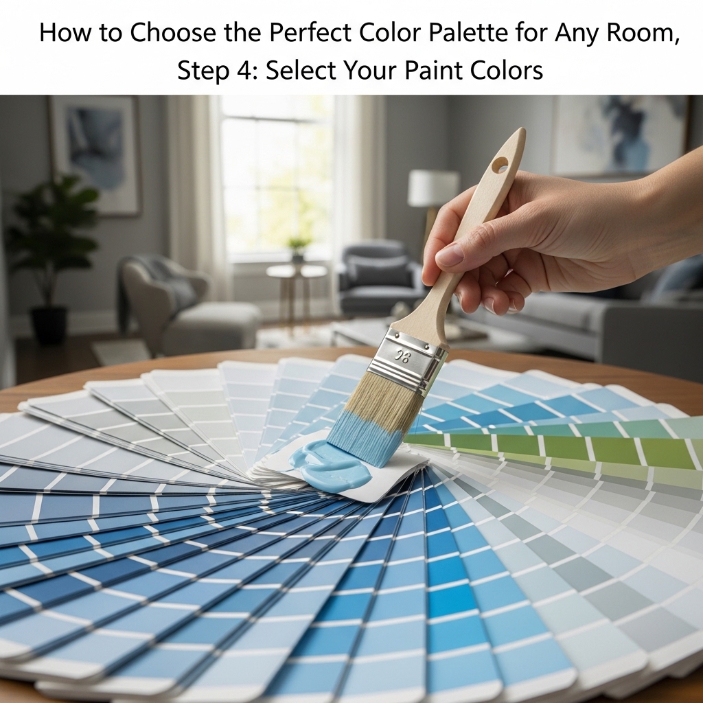
With the strategy and the 60-30-10 rule in place, it was time to select specific paint colors.
How to Choose Paint Colors
Start with the fixed elements. The oak floor had warm golden undertones. The brick fireplace had orange-red undertones. The beige sofa had warm yellow undertones.
All of these pointed toward warm undertones throughout the room. Cool grays would clash. Warm neutrals would harmonize.
Consider the light. The room faced south. Warm light would make colors look warmer. A pale blue with gray undertones was chosen. The gray undertones would balance the warm light.
The Paint Selection Process
- Narrow to 3-5 colors. Based on the strategy and undertones, selected five potential wall colors.
- Buy sample pots. Spent $25 on five sample pots.
- Paint large swatches. Painted 2-foot by 2-foot squares on different walls.
- Observe for 5 days. Looked at the swatches in morning, noon, evening, and under artificial light.
- Eliminate colors that fail. Three colors looked wrong in certain lights. They were eliminated.
- Choose the winner. The remaining two were both good. Chose the one that felt best in evening light (when the room is most used).
The Final Paint Choice
| Color | Brand | Undertone | Why It Worked |
|---|---|---|---|
| Walls | Pale blue-gray | Cool (blue-gray) | Balanced the warm south light, felt calm |
| Trim | Warm white | Warm (yellow-based) | Tied to the warm oak floors |
| Ceiling | Same as walls, 50% strength | Cool | Created seamless look, made ceiling feel higher |
Pro Tip: Buy the most expensive paint you can afford. Cheaper paint requires more coats and fades faster. Quality paint is worth the investment.
Mistake to Avoid: Do not choose paint color from a tiny swatch alone. Swatches are printed ink, not actual paint. Test on walls.
Step 5: Select Your Secondary Colors
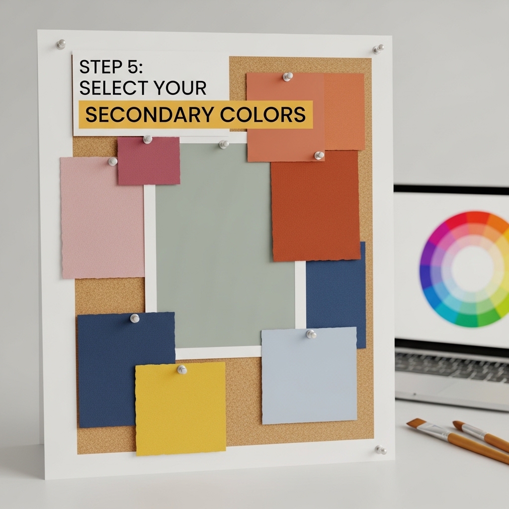
The secondary color appears on 30% of the room. In this room, the secondary color was already determined by existing furniture.
Working with Existing Furniture
The beige sofa was staying. It had warm yellow undertones. This dictated the secondary color.
- Sofa: Light beige (warm yellow undertones)
- Curtains: Same beige as the sofa (creates cohesion)
- Rug: Cream and beige with black geometric pattern (ties sofa to walls)
If You Are Starting from Scratch
If no furniture exists yet, choose the secondary color after the wall color. The secondary color can be a contrasting or complementary color.
Example secondary color options based on wall color:
| Wall Color | Secondary Color Options | Effect |
|---|---|---|
| Pale blue | Beige, warm gray, navy | Calm, classic |
| Warm white | Sage green, navy, terracotta | Fresh, natural |
| Light gray | Mustard yellow, blush pink, navy | Modern, energetic |
| Sage green | Cream, warm wood tones, rust | Earthy, cozy |
Pro Tip: Choose the secondary color for the largest piece of furniture (sofa or bed). It is easier to match smaller pieces to the large piece than the reverse.
Mistake to Avoid: Do not choose the secondary color without considering the fixed elements. The secondary color must work with the flooring and architecture.
Step 6: Select Your Accent Colors
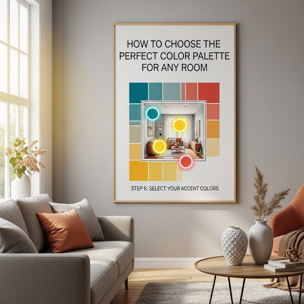
The accent color appears on 10% of the room. It is the pop. It draws the eye. It adds energy.
Choosing Accent Colors
The accent color can be pulled from the fixed elements, the wall color, or the secondary color. It can also be a completely contrasting color.
Accent color options for this room:
| Accent Color | Source | Effect |
|---|---|---|
| Teal (blue-green) | Analogous to wall color | Calm, cohesive, natural |
| Sage green | Analogous to wall color | Calm, natural, earthy |
| Navy | Darker version of wall color | Sophisticated, grounding |
| Terracotta | Complementary to wall color | Bold, warm, energetic |
The Final Accent Choices
Two accent colors were chosen. This is acceptable when the room is large enough and the accent colors are from the same color family.
- Teal (blue-green): Pillows, art, small vase
- Sage green: Plant pots, throw blanket, smaller pillows
Where to Put Accent Colors
| Item | Color | Why There |
|---|---|---|
| Pillows (2) | Teal | Adds color at eye level, easily changeable |
| Throw blanket | Sage green | Draped over sofa arm, adds texture and color |
| Art | Teal and sage | Ties the accent colors together |
| Plant pots | Sage green | Blends with plants, natural look |
| Small vase | Teal | Coffee table, small pop of color |
Pro Tip: Use the accent color in three different places around the room. Three repetitions create cohesion. One repetition looks accidental.
Mistake to Avoid: Do not use more than three accent colors. One accent color is clean. Two is interesting. Three is chaotic.
Step 7: Test Before Committing
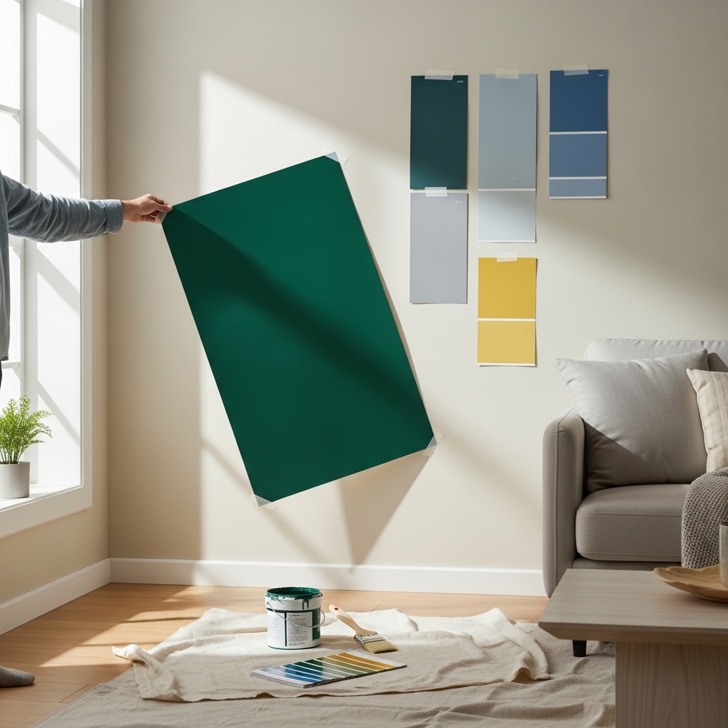
Testing is the most important step. Skipping testing leads to expensive mistakes and repainting.
The Sample Pot Method
- Buy sample pots of your top 3-5 colors
- Paint 2-foot by 2-foot squares on different walls
- Paint squares near fixed elements (floor, fireplace, cabinets)
- Observe the squares for 3-5 days
- Look at the squares in morning, noon, evening, and under artificial light
- Eliminate colors that look wrong in any light
- Choose from the remaining colors
What to Look For
| Time of Day | What to Observe |
|---|---|
| Morning | Does the color look too cool? Too washed out? |
| Midday | Does the color look too bright? Does it fade into the light? |
| Afternoon | Does the color look too warm? Too orange? |
| Evening (artificial light) | Does the color look muddy? Does it change completely? |
The Wall Placement Test
Paint samples on different walls. The same color looks different on a north wall versus a south wall. Paint samples near windows and in corners.
Pro Tip: Paint samples on white poster board. Move the poster board to different walls. This avoids painting directly on the wall and allows you to test multiple locations.
Mistake to Avoid: Do not make a decision based on the sample pot alone. Live with the samples for several days. The right color will become clear.
Step 8: Consider the Entire House Flow
Rooms do not exist in isolation. The color palette should flow from room to room. Abrupt color changes can feel jarring.
The Flow Rule
Adjacent rooms should have compatible colors. They do not need to match. They need to relate.
| Room | Color | Adjacent Room | Compatibility |
|---|---|---|---|
| Living room | Pale blue-gray | Dining room | Pale blue-gray with warm white trim |
| Dining room | Warm white | Kitchen | Warm white with sage green accents |
| Kitchen | Warm white and sage green | Hallway | Warm white with pale blue-gray accents |
How to Create Flow
- Use the same trim color throughout the house: This creates a visual thread that connects rooms.
- Repeat accent colors in adjacent rooms: A teal pillow in the living room and a teal vase in the dining room create flow.
- Use the same undertones throughout: Warm undertones in every room. Or cool undertones in every room. Do not mix.
The Room in This Guide
The living room connected to a dining room and a hallway. The dining room would be painted warm white. The hallway would be painted the same warm white.
The living room’s pale blue-gray worked with warm white. The blue-gray and warm white were compatible without matching.
Pro Tip: Buy all paint for the entire house at the same time. This ensures consistent color across rooms, even if you paint at different times.
Mistake to Avoid: Do not paint each room a completely different color without a unifying element. The house will feel disjointed.
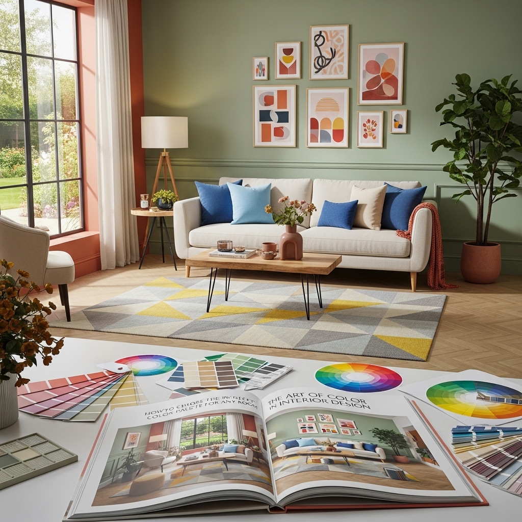
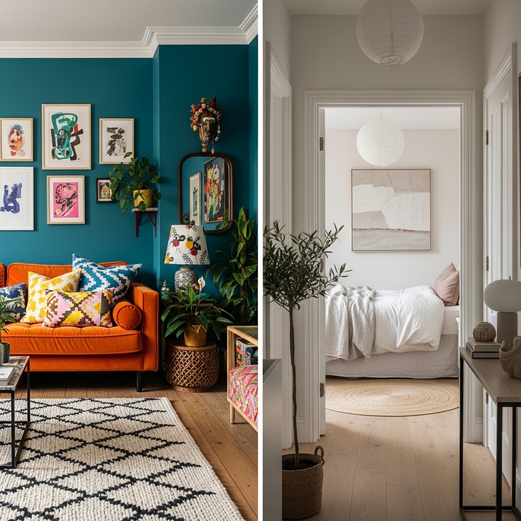
Common Color Palette Mistakes (And How to Fix Them)
Mistake 1: Choosing Colors That Are Too Bright
Bright colors feel energetic in the store. On a large wall, they can feel overwhelming.
The fix: Choose muted versions of bright colors. Instead of true blue, choose dusty blue. Instead of bright yellow, choose mustard. Instead of fire engine red, choose brick or terracotta.
Mistake 2: Choosing Colors That Are Too Dark
Dark colors feel dramatic in inspiration photos. In a room with limited natural light, they can feel like a cave.
The fix: Test dark colors on a large wall before committing. If the room feels dark, use the dark color as an accent instead of the main wall color.
Mistake 3: Forgetting About the Ceiling
White ceilings are standard. They are not always the best choice.
The fix: Paint the ceiling a lighter version of the wall color. This creates a seamless, enveloping look. Or paint the ceiling a warm white to add height.
Mistake 4: Ignoring Artificial Light
Colors look different under artificial light. Warm bulbs make colors look warmer. Cool bulbs make colors look cooler.
The fix: Test paint colors under the actual light bulbs you will use. Use the same color temperature bulbs throughout the room (2700K for warm light, 3000K for neutral).
Pro Tip: If you are unsure about a color, paint one wall as a test. Live with it for a month. If you still love it, paint the rest of the room.
Mistake to Avoid: Do not repaint the entire room before testing. Testing costs $25. Repainting costs $200 and days of work.
Sample Color Palettes for Every Room
Living Room: Calm and Cozy
| Color | Role | Where |
|---|---|---|
| Pale blue-gray (cool undertone) | 60% | Walls |
| Warm beige (warm undertone) | 30% | Sofa, curtains |
| Sage green and terracotta | 10% | Pillows, art, plants |
Best for: South-facing rooms, abundant natural light
Bedroom: Serene and Restful
| Color | Role | Where |
|---|---|---|
| Soft warm white (warm undertone) | 60% | Walls |
| Light beige (warm undertone) | 30% | Bedding, curtains |
| Dusty blue and blush pink | 10% | Pillows, art, lamp base |
Best for: Any light exposure, promotes sleep
Home Office: Focused and Energized
| Color | Role | Where |
|---|---|---|
| Light gray (cool undertone) | 60% | Walls |
| White (cool undertone) | 30% | Desk, shelves |
| Mustard yellow and navy | 10% | Chair, art, accessories |
Best for: North-facing rooms, promotes focus
Kitchen: Clean and Bright
| Color | Role | Where |
|---|---|---|
| Warm white (warm undertone) | 60% | Walls |
| Light wood (natural) | 30% | Cabinets, shelves |
| Sage green and black | 10% | Accessories, hardware, plants |
Best for: Any light exposure, feels clean and inviting
Bathroom: Spa-Like and Calming
| Color | Role | Where |
|---|---|---|
| Soft blue-green (cool undertone) | 60% | Walls |
| White (cool undertone) | 30% | Vanity, towels |
| Natural wood and cream | 10% | Accessories, mirror frame |
Best for: Rooms with little natural light, creates spa feel
Pro Tip: Save your paint colors in a note on your phone. Include brand, color name, and finish. You will need them for touch-ups.
Mistake to Avoid: Do not throw away leftover paint. Store it in a cool, dry place. Label the can with the room name.
Frequently Asked Questions
How many colors should be in a room?
Three is ideal. A dominant color (60%), a secondary color (30%), and an accent color (10%). More than three can feel chaotic. Less than three can feel flat.
Should the ceiling be white?
Not always. A white ceiling is standard. A ceiling painted a lighter version of the wall color creates a seamless, modern look. A dark ceiling can make a large room feel cozy.
How do I choose a color palette if I rent and cannot paint?
Use removable wallpaper on one wall. Use large area rugs to add color. Use curtains, pillows, throws, and art to bring in your palette. The walls can stay white while the room still has color.
What if I love two different color palettes?
Use one palette for the main living areas. Use the second palette for the bedroom or office. The two palettes do not need to match. They just need to flow. Use the same trim color throughout to create a thread.
How do I know if my colors will work together?
Collect paint swatches, fabric samples, and photos of your fixed elements. Lay them on a table together. Live with them for a week. The right combination will feel right. The wrong combination will feel wrong.
Conclusion
Choosing the perfect color palette is not about luck. It is about following a system.
Understand your light. Choose your color strategy. Apply the 60-30-10 rule. Select your paint colors. Select your secondary colors. Select your accent colors. Test before committing. Consider the entire house flow.
The room in this guide went from a blank box to a cohesive, calming space. The paint color was chosen with confidence. The secondary colors supported it. The accent colors brought it to life.
The Most Important Lesson
Color is not permanent. If you choose wrong, you can repaint. You can change pillows. You can swap art. Do not let fear of mistakes prevent you from making decisions.
Start with one room. Choose one color strategy. Buy sample pots. Test on walls.
Small steps lead to confident color choices. The perfect palette is within reach.
Take back your rooms starting today. Color by color. Room by room. Decision by decision.