Neutral Decor vs Colorful Decor: Which Style Wins? | Home Color Psychology | Choosing Your Perfect Palette
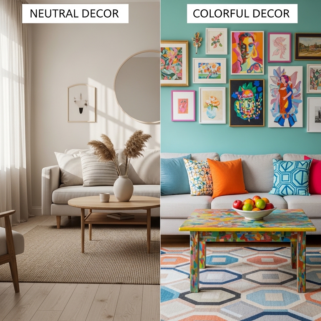
Neutral decor is safe. Colorful decor is bold. One feels calm and timeless. The other feels energetic and personal. Both are valid. Neither is objectively better.
The choice between neutral and colorful decor is deeply personal. It depends on your personality, your lifestyle, and the feeling you want to create in your home.
This article compares neutral and colorful decor. The psychology of each. The practical considerations. And guidance for choosing the right palette for your home.
The Psychology of Color
Color affects mood. This is not opinion. It is science. Different colors trigger different emotional responses.
How Neutrals Affect Mood
| Color | Psychological Effect |
|---|---|
| White | Clean, fresh, open, can feel cold |
| Beige | Warm, comfortable, safe, can feel boring |
| Gray | Calm, sophisticated, balanced, can feel depressing |
| Black | Dramatic, elegant, grounding, can feel heavy |
How Colors Affect Mood
| Color | Psychological Effect |
|---|---|
| Blue | Calming, trustworthy, productive, can feel cold |
| Green | Balanced, natural, restful, can feel institutional |
| Yellow | Energetic, optimistic, warm, can feel overwhelming |
| Red | Exciting, passionate, bold, can feel aggressive |
| Orange | Creative, friendly, warm, can feel childish |
| Purple | Luxurious, spiritual, creative, can feel artificial |
The Neutral vs. Colorful Spectrum
| Style | Mood | Best For |
|---|---|---|
| All neutral | Calm, serene, safe | Small rooms, bedrooms, bathrooms |
| Mostly neutral with color accents | Balanced, interesting | Living rooms, dining rooms |
| Mostly colorful | Energetic, bold, personal | Playrooms, creative spaces |
| All colorful | Vibrant, stimulating, unique | Statement rooms |
Pro Tip: Think about how you want to feel in each room. Calm in the bedroom. Energized in the home office. Welcoming in the living room. Choose colors accordingly.
Mistake to Avoid: Do not choose a color based on a trend. Choose colors based on how they make you feel.
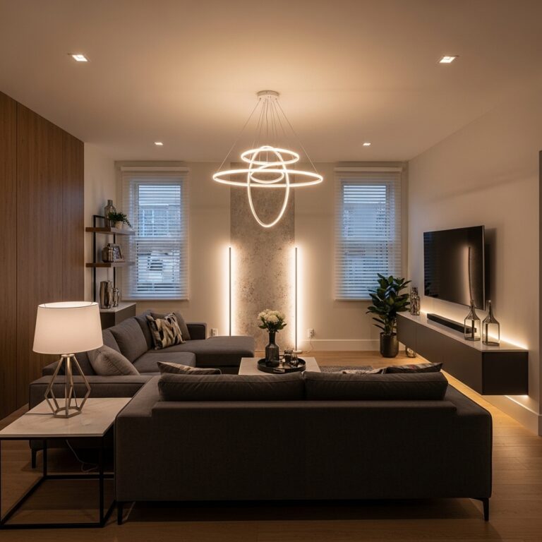
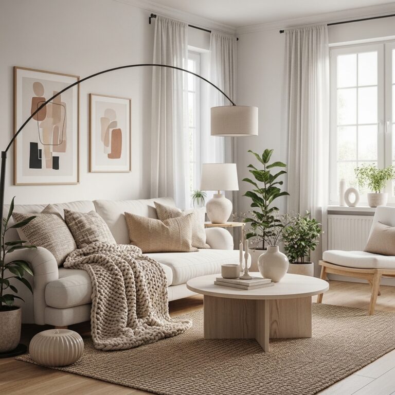
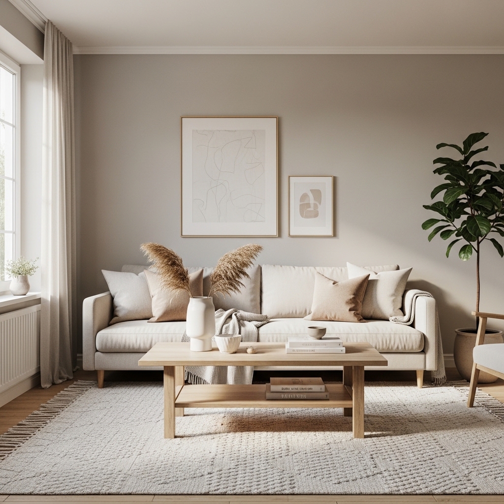
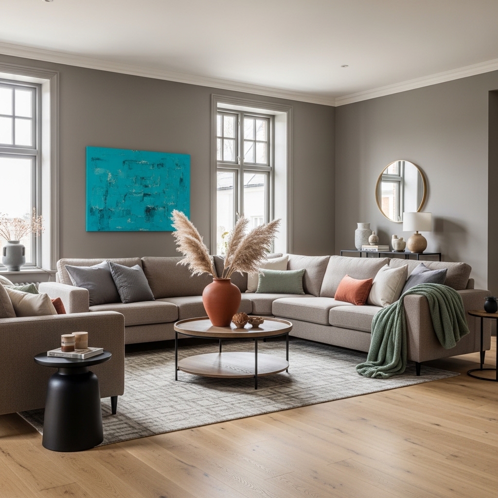
The Case for Neutral Decor
Neutral decor has significant advantages. It is popular for good reason.
Pro 1: Timeless
Neutral colors do not go out of style. A beige sofa bought ten years ago still looks current. A gray wall painted five years ago still feels fresh. Neutrals are a long-term investment.
Pro 2: Flexible
Change your accent pillows. Change your art. Change your throw blankets. The neutral base remains. The room looks completely different with minimal effort and cost.
Pro 3: Calming
Neutral spaces feel calm. The lack of bright colors reduces visual stimulation. After a long day, a neutral room feels like a retreat.
Pro 4: Makes Small Rooms Feel Larger
Light neutrals reflect light. Reflected light makes rooms feel larger. This is especially important in small apartments and bedrooms.
| Advantage | Why It Matters |
|---|---|
| Timeless | No need to redecorate |
| Flexible | Easy to update with accessories |
| Calming | Reduces visual stimulation |
| Expands space | Makes small rooms feel larger |
Pro Tip: If you choose neutral decor, vary the shades. All beige can feel flat. Layer cream, beige, and taupe. The variation adds depth.
Mistake to Avoid: Do not use all cool neutrals (gray, white, black) in a room with no natural light. The room will feel cold and depressing.
The Case for Colorful Decor
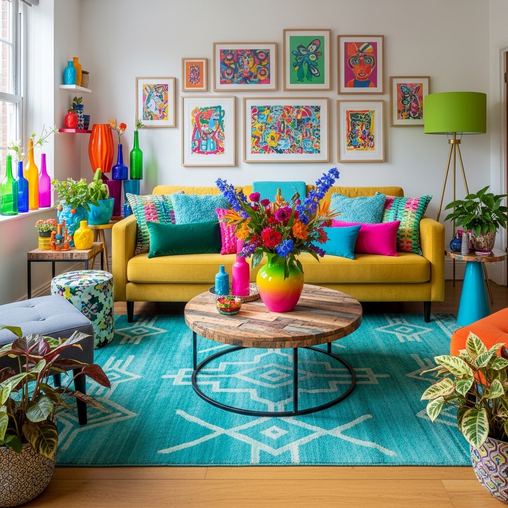
Colorful decor has passionate advocates. For the right person, it is the only choice.
Pro 1: Expresses Personality
A colorful home says something about the people who live there. It is bold. It is personal. It is impossible to mistake for a catalog.
Pro 2: Energizing
Bright colors wake up the brain. A yellow kitchen feels energetic in the morning. A red dining room feels exciting for dinner parties. Color adds energy to daily life.
Pro 3: Creates Focal Points
A colorful sofa draws the eye. A bright piece of art becomes a conversation starter. Color creates interest that neutrals cannot match.
Pro 4: Photographs Beautifully
Colorful rooms look amazing in photos. The vibrancy translates. The personality shines. A neutral room can look flat in photographs.
| Advantage | Why It Matters |
|---|---|
| Expresses personality | Your home, your style |
| Energizing | Wakes up the brain |
| Creates focal points | Draws the eye |
| Photographs beautifully | Looks vibrant in images |
Pro Tip: If you choose colorful decor, limit the number of colors. Three colors maximum. Too many colors look chaotic. A limited palette looks intentional.
Mistake to Avoid: Do not use high-intensity colors in every room. Bright red in the bedroom will disrupt sleep. Save bold colors for living areas.
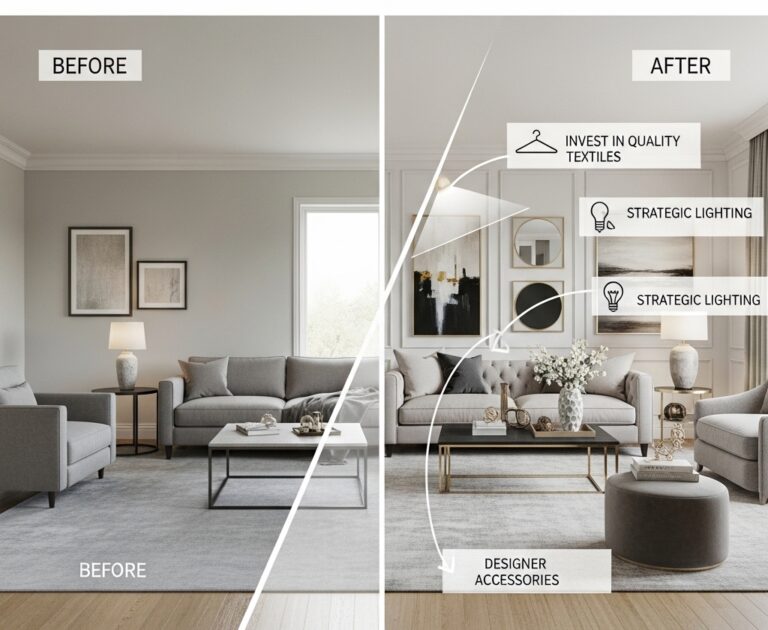
The Neutral with Color Accents Compromise
The most popular approach is a compromise. Neutral base. Colorful accents. This works for most people.
The 80/20 Rule
Eighty percent of the room should be neutral. Twenty percent should be color. The neutrals provide calm. The colors provide interest.
| Percentage | Element | Examples |
|---|---|---|
| 80% | Neutral base | Walls, large furniture, flooring, rugs |
| 20% | Color accents | Pillows, art, throws, accessories, plants |
Where to Add Color Accents
| Element | Why It Works |
|---|---|
| Pillows | Inexpensive, easy to change |
| Art | Large impact, personal |
| Throws | Adds texture and color |
| Plants | Natural color, adds life |
| Rugs | Anchors the room, adds pattern |
The 3-Color Accent Rule
Choose three colors for your accents. Repeat them throughout the room. The repetition creates cohesion.
| Accent Colors | Example |
|---|---|
| Blue, green, yellow | Blue pillows, green art, yellow throw |
| Terracotta, rust, cream | Terracotta vase, rust pillows, cream throw |
| Navy, blush, brass | Navy sofa, blush pillows, brass lamp |
Pro Tip: Use the 80/20 rule as a starting point. Adjust based on your preference. Some people prefer 70/30. Others prefer 90/10. There is no wrong answer.
Mistake to Avoid: Do not add color accents randomly. Repeat each color three times. Three blue items. Three green items. The repetition creates intentionality.
Room-by-Room Color Guide
Living Room
| Style | Palette | Why |
|---|---|---|
| Neutral | Cream, beige, taupe, white | Calm, welcoming, flexible |
| Colorful | Navy sofa, mustard pillows, green plant | Bold, energetic, personal |
| Compromise | Beige walls, colorful art and pillows | Balanced, interesting |
Bedroom
| Style | Palette | Why |
|---|---|---|
| Neutral | White, cream, light gray | Calm, restful, sleep-promoting |
| Colorful | Deep blue, blush pink, sage green | Cozy, personal, dramatic |
| Compromise | Neutral walls, colorful bedding | Calm but interesting |
Kitchen
| Style | Palette | Why |
|---|---|---|
| Neutral | White cabinets, beige walls, wood accents | Clean, timeless, bright |
| Colorful | Blue cabinets, brass hardware, colorful backsplash | Bold, personal, energetic |
| Compromise | White cabinets, colorful accessories | Clean but interesting |
Home Office
| Style | Palette | Why |
|---|---|---|
| Neutral | Gray, white, beige | Calm, focused, productive |
| Colorful | Yellow accents, green plant, blue chair | Energetic, creative, motivating |
| Compromise | Neutral walls, colorful desk accessories | Focused but inspiring |
Pro Tip: Use the room’s function to guide your color choice. Calm colors for bedrooms. Energetic colors for home offices. Welcoming colors for living rooms.
Mistake to Avoid: Do not use the same color palette in every room. Variety creates interest as you move through the home.
How to Choose the Right Style for You
The right style depends on your personality, your lifestyle, and your home.
Questions to Ask Yourself
| Question | Neutral Lean | Colorful Lean |
|---|---|---|
| How do you feel in bright spaces? | Overstimulated | Energized |
| How often do you want to redecorate? | Rarely | Often |
| Do you have many colorful possessions? | No | Yes |
| Is your home small or large? | Small | Large |
| Do you prefer calm or excitement? | Calm | Excitement |
The Honest Assessment
Look at your current wardrobe. Do you wear mostly neutrals? You will probably prefer neutral decor. Do you wear bright colors? You will probably prefer colorful decor.
Look at your current home. Are you drawn to neutral rooms in magazines? Or colorful rooms? Your instincts are telling you something.
Pro Tip: Start with a neutral base. Add color accents slowly. You can always add more color. Removing color is harder.
Mistake to Avoid: Do not paint a room a bright color without testing it first. Paint a large swatch. Live with it for a week. The color may feel different than you expected.
Frequently Asked Questions
Is neutral decor boring?
Neutral decor can be boring. It can also be stunning. The difference is texture and contrast. Layer different shades of beige. Add wood tones. Add texture through wool, linen, and leather. A well-done neutral room is anything but boring.
Is colorful decor childish?
Colorful decor can be childish. It can also be sophisticated. The difference is saturation and restraint. Use muted colors (sage green, dusty blue, terracotta) instead of bright primaries. Limit your palette to three colors. The result is sophisticated and personal.
Can I change my mind later?
Yes. Paint can be repainted. Pillows can be replaced. Art can be swapped. Your home should evolve with you. Do not be afraid to try a style. You can always change it.
Which style is more popular?
Neutral decor is currently more popular. But popularity should not drive your decision. Your home is for you. Choose what makes you happy.
Conclusion
Neutral decor is calm, timeless, and flexible. Colorful decor is bold, personal, and energetic. Neither is objectively better. The right choice depends on you.
Consider your personality. Consider your lifestyle. Consider your home’s architecture and light. Be honest about what makes you feel good.
Most people find happiness in a compromise. Neutral base. Colorful accents. The calm of neutrals. The personality of color.
Start with one room today. Choose a neutral wall color. Add colorful pillows. Add a colorful piece of art. Adjust until the balance feels right.