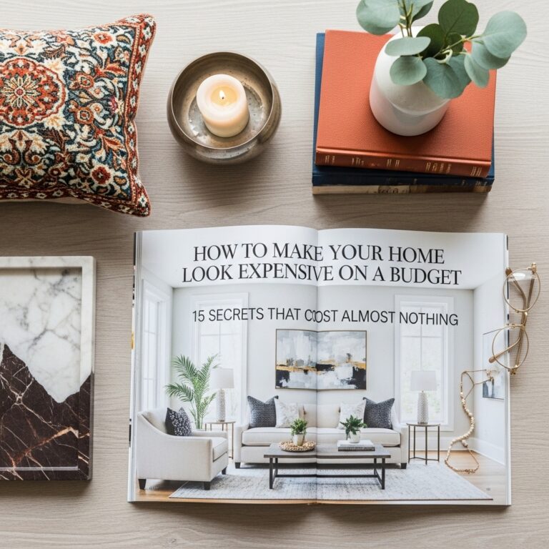
What Makes a Room Look Expensive (Simple Rules) Find Out Till 2030
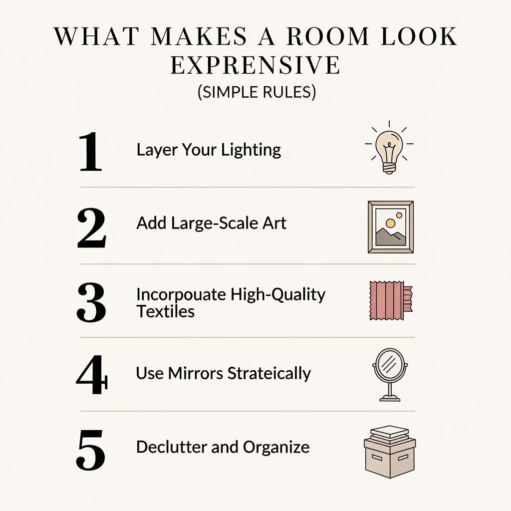
Expensive style is not about expensive furniture. It is about following simple rules that anyone can apply.
Some rooms look expensive despite having budget furniture. Other rooms look cheap despite having expensive pieces. The difference is not the price tag. The difference is the attention to detail.
This roundup shares the simple rules that make a room look expensive. No renovation required. No designer needed.
Comparison Table: Expensive vs. Cheap Room Features
| Feature | Expensive Room | Cheap Room |
|---|---|---|
| Curtains | Floor-length, hung high and wide | Too short, hung at window frame |
| Lighting | Layered, dimmers, warm bulbs | One overhead light, cool bulbs |
| Art | Proper height, appropriate scale | Too high, too small |
| Surfaces | Curated with negative space | Cluttered with items |
| Rugs | Properly sized for furniture | Too small, floating |
| Pillows | Plump, coordinated | Saggy, mismatched |
| Materials | Natural (wood, cotton, wool) | Synthetic (plastic, polyester) |
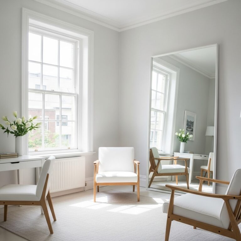
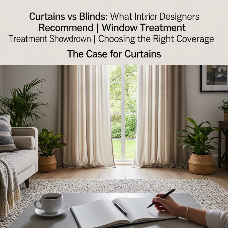
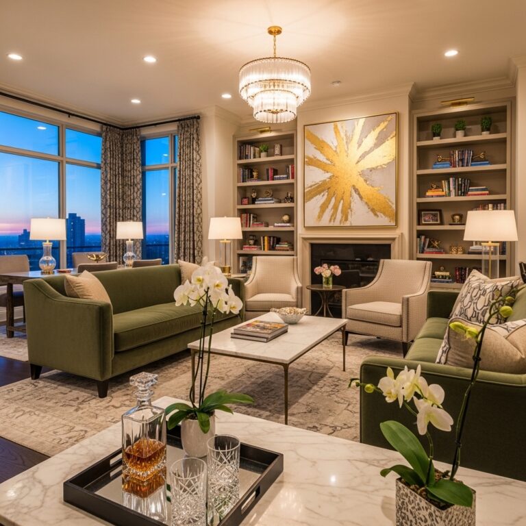
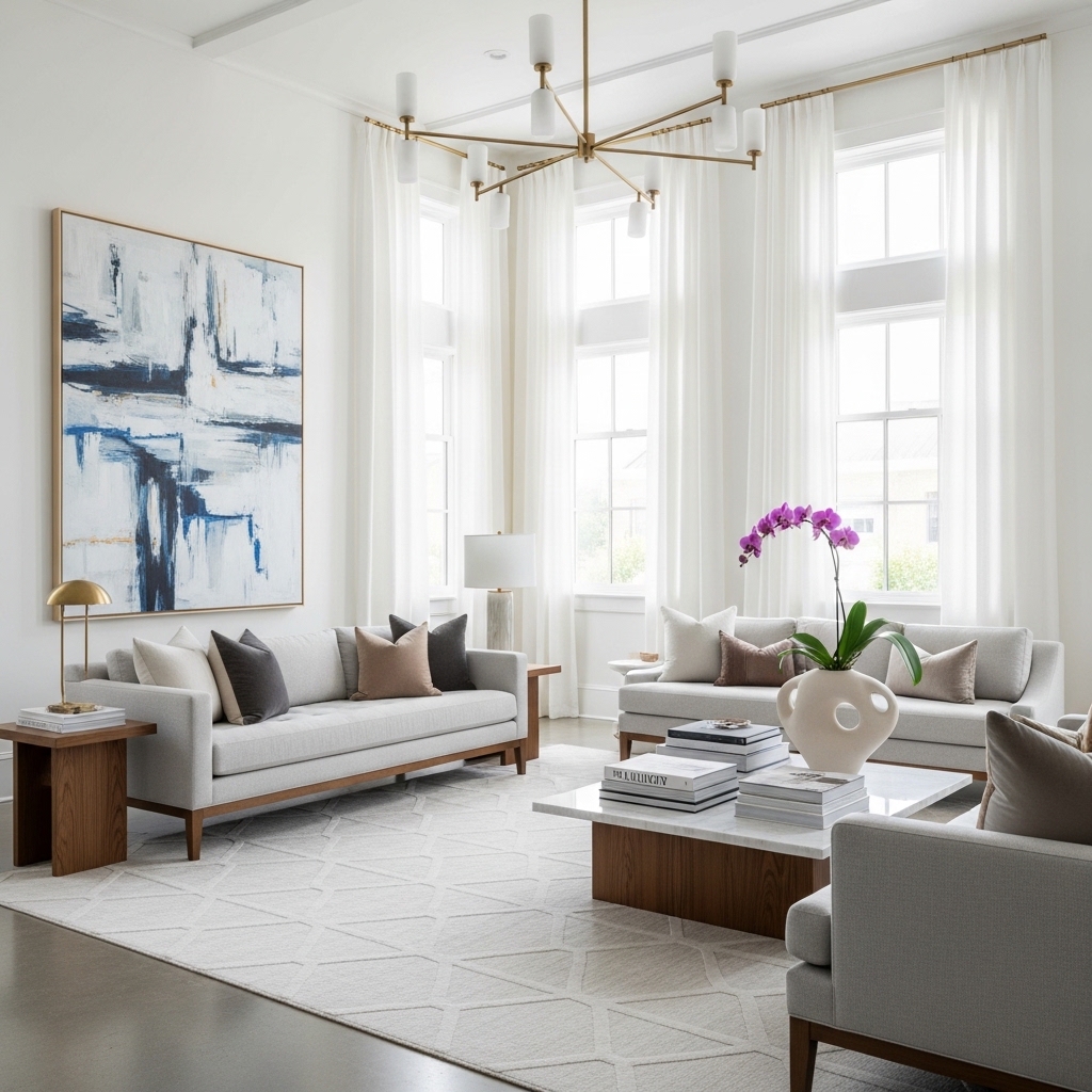
Rule 1: Hang Curtains Like a Designer
The most common mistake is hanging curtains too low and too narrow. This makes ceilings feel lower and windows feel smaller.
The Designer Curtain Formula
| Element | Cheap Installation | Expensive Installation |
|---|---|---|
| Rod height | 1-2 inches above frame | 4-6 inches below ceiling |
| Rod width | Same as window frame | 6-12 inches beyond frame on each side |
| Curtain length | Stops at window sill | Kisses the floor |
| Number of panels | One panel per window | Two panels per window |
Why This Works
High rods draw the eye upward. The ceiling feels taller. Wide rods allow curtains to stack completely off the window. No light is blocked. The window looks larger.
Pro Tip: Use curtain rings with clips. Rings slide easily. Clips make adjusting length simple.
Mistake to Avoid: Do not buy curtains that are too short. Curtains that hover above the floor look cheap and unfinished.
Rule 2: Layer Your Lighting
Single light sources create harsh shadows. Dark corners feel forgotten. The room feels flat.
The Designer Lighting Formula
| Light Layer | Height | Purpose | Example |
|---|---|---|---|
| Ambient | Ceiling | General illumination | Overhead fixture on dimmer |
| Task | Table or floor | Specific activities | Reading lamp |
| Accent | Wall or low | Mood and depth | Picture light, floor lamp in corner |
The Dimmer Rule
Every overhead light should be on a dimmer. Dimming changes the mood of a room instantly.
Pro Tip: Use warm white bulbs (2700K) throughout. Consistent color temperature creates cohesion.
Mistake to Avoid: Do not rely on ceiling lights alone. A room without lamps feels cold and unfinished.
Rule 3: Choose the Right Rug Size
A too-small rug is the fastest way to make a room look cheap. Visible floor around all four edges creates a frame that highlights the room’s limitations.
The Designer Rug Formula
| Room | Rug Size Rule |
|---|---|
| Living room | Front legs of sofa on rug, rug extends beyond coffee table |
| Bedroom | Extends 18-24 inches beyond all sides of bed |
| Dining room | Extends 24 inches beyond table on all sides |
The Rug Layering Trick
If you already own a too-small rug, layer it on top of a larger, neutral rug. The larger rug provides the correct scale. The smaller rug adds pattern.
Pro Tip: Use rug tape to keep large rugs flat. Curling corners look cheap and create tripping hazards.
Mistake to Avoid: Do not buy a rug that is too small because it is cheaper. A properly sized rug is worth the investment.
Rule 4: Curate Your Surfaces
Every item on a surface demands attention. Too many items demand too much attention. The eye has nowhere to rest.
The Designer Surface Formula
| Surface Size | Maximum Items | Example |
|---|---|---|
| Small (nightstand) | 3 items | Lamp, book, small tray |
| Medium (coffee table) | 3-4 items | Books, tray, candle, small vase |
| Large (dresser) | 5 items | Lamp, jewelry box, photo, vase, catch-all tray |
The Negative Space Rule
Leave empty space on every surface. Empty space is not wasted. Empty space gives the eye a place to rest.
Pro Tip: Remove everything. Add items back one at a time. Stop when the surface feels balanced.
Mistake to Avoid: Do not use surfaces as permanent storage. Surfaces are for display and daily items only.
Rule 5: Use Natural Materials
Plastic looks cheap. Natural materials look expensive.
The Designer Material Hierarchy
| Cheap Look | Expensive Look |
|---|---|
| Plastic | Wood, stone, ceramic |
| Polyester | Cotton, linen, wool |
| Faux leather | Real leather (vintage is affordable) |
| Laminate | Solid wood |
| Veneer | Real stone or ceramic tile |
Affordable Natural Material Sources
- Thrift stores (solid wood furniture, ceramic vases)
- Estate sales (wool blankets, linen curtains)
- Facebook Marketplace (real leather chairs)
- IKEA (natural fiber rugs, solid pine furniture)
Pro Tip: Mix materials. Wood with metal. Ceramic with linen. Mixed textures look collected and expensive.
Mistake to Avoid: Do not use matching synthetic materials throughout a room. Too much polyester looks cheap.
Rule 6: Add Something Black
Black anchors a room. It provides contrast. It makes other colors look richer.
The Designer Black Placement
| Item | Impact |
|---|---|
| Lamp base | Grounds the side table |
| Picture frame | Makes art pop |
| Book on coffee table | Adds contrast to lighter items |
| Throw pillow | Creates depth on sofa |
| Vase | Anchors shelf arrangement |
The Black Test
Remove all black from a room. The room feels washed out. Add back one black item. The room instantly has depth.
Pro Tip: Use matte black finishes. Glossy black reads as cheap. Matte black reads as intentional.
Mistake to Avoid: Do not overdo black. One or two black items per room is sufficient.
Rule 7: Fluff Your Pillows
Saggy pillows look cheap. Plump pillows look expensive.
The Designer Pillow Formula
| Pillow Type | Plumping Technique |
|---|---|
| Down or down alternative | Fluff by hand daily, rotate weekly |
| Polyester fill | Replace fill every 2 years |
| Old pillows | Add a second insert inside the cover |
The Insert Sizing Trick
Buy inserts that are 2 inches larger than the cover. A 20×20 cover needs a 22×22 insert. The extra fill creates a plump, expensive look.
Pro Tip: Use feather inserts for a luxe feel. Feathers hold their shape better than polyester.
Mistake to Avoid: Do not use pillows that are flat and saggy. Replace the fill or donate the pillow.
Rule 8: Hang Art at the Right Height
Art hung too high feels disconnected. Art hung too low feels cramped.
The Designer Art Formula
| Location | Art Placement Rule |
|---|---|
| On empty wall | Center of art at 57-60 inches from floor |
| Above sofa | Bottom of art 6-12 inches above sofa back |
| Above console | Bottom of art 6-12 inches above console |
The Gallery Wall Rule
For multiple pieces, treat them as one unit. The center of the cluster should be at 57-60 inches from the floor.
Pro Tip: Use painter’s tape to outline art placement before hammering nails. Adjust tape until the placement feels right.
Mistake to Avoid: Do not hang art based on standing eye level in an empty room. Art should relate to the furniture below it.
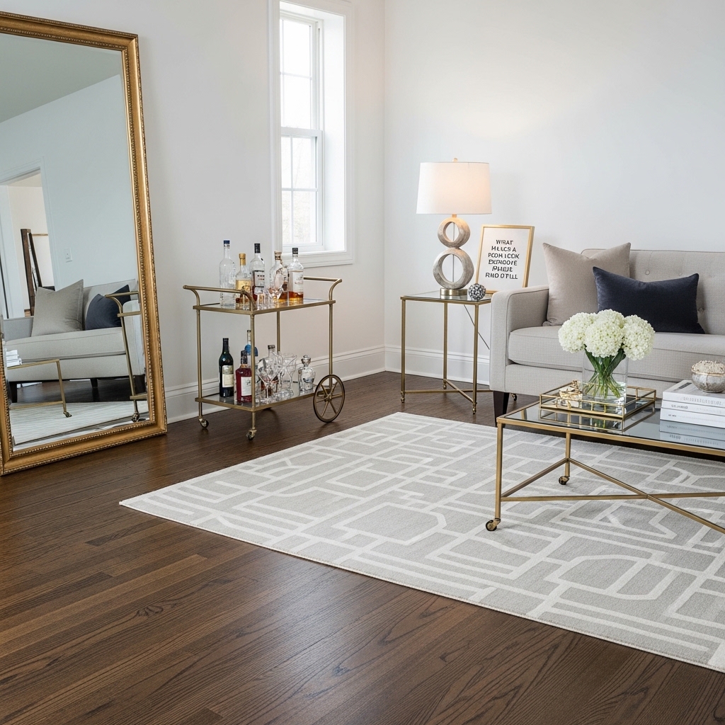
Rule 9: Add a Mirror
Mirrors reflect light and create depth. They are magic for small or dark rooms.
The Designer Mirror Formula
| Placement | Effect |
|---|---|
| Opposite window | Reflects outdoor light and view |
| Perpendicular to window | Bounces light deeper into room |
| Behind a lamp | Doubles the light source |
| On a dark wall | Adds reflected light to dark corner |
The Thrifted Mirror Trick
Large mirrors can be expensive. Thrift stores sell large mirrors for under twenty dollars. Spray paint updates an ugly frame.
Pro Tip: Lean a large mirror against the wall instead of hanging it. Leaning mirrors feel more casual and create a different reflection angle.
Mistake to Avoid: Do not place a mirror directly facing a cluttered area. The mirror will reflect and double the clutter.
Rule 10: Edit, Edit, Edit
The final rule is the most important. Editing.
The Designer Editing Checklist
| Question | If Yes | If No |
|---|---|---|
| Does this item serve a purpose? | Keep | Remove |
| Does this item bring joy? | Keep | Remove |
| Does this item fit the room’s scale? | Keep | Remove |
| Does this item work with the color scheme? | Keep | Remove |
The 24-Hour Rule
Remove everything from a surface. Live with the empty surface for 24 hours. Add back only what is missed.
Pro Tip: Take a photo of the room. Photos reveal clutter that eyes have learned to ignore.
Mistake to Avoid: Do not fill every empty space. Empty space is essential for an expensive look.
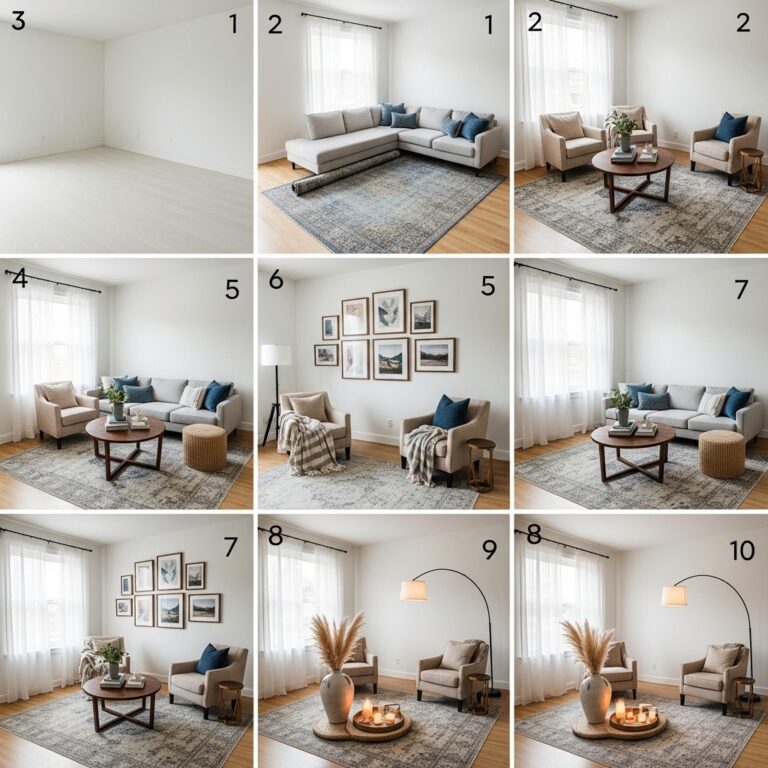
The 7-Day Room Transformation Plan
Day one: Hang curtains high and wide. Use the designer formula.
Day two: Layer lighting. Add a floor lamp. Change bulbs to warm white.
Day three: Choose the right rug size. Layer a too-small rug on a larger one.
Day four: Curate surfaces. Remove everything. Add back only what is needed.
Day five: Add something black. A lamp base. A frame. A pillow.
Day six: Fluff pillows. Add inserts. Replace old fill.
Day seven: Hang art at the correct height. Add a mirror. Edit again.
Conclusion
Expensive style is not about expensive furniture. It is about following simple rules.
Hang curtains high and wide. Layer your lighting. Choose the right rug size. Curate your surfaces. Use natural materials. Add something black. Fluff your pillows. Hang art at the right height. Add a mirror. Edit ruthlessly.
These rules cost little to nothing. Their impact is immediate and dramatic.
Start with one rule today. Hang curtains correctly. Layer a lamp. Add a black item.
Small changes add up to rooms that look expensive. No renovation required. No new furniture needed.
Take back your rooms starting today. Simple rules. Dramatic results. Expensive style is within reach.