How to Choose Colors for Your Living Room, Explore Chic & Trendy Color That Attracts Everyone
Color choice is the most agonizing decision in decorating. Too many options. Too much conflicting advice. Fear of making a mistake.
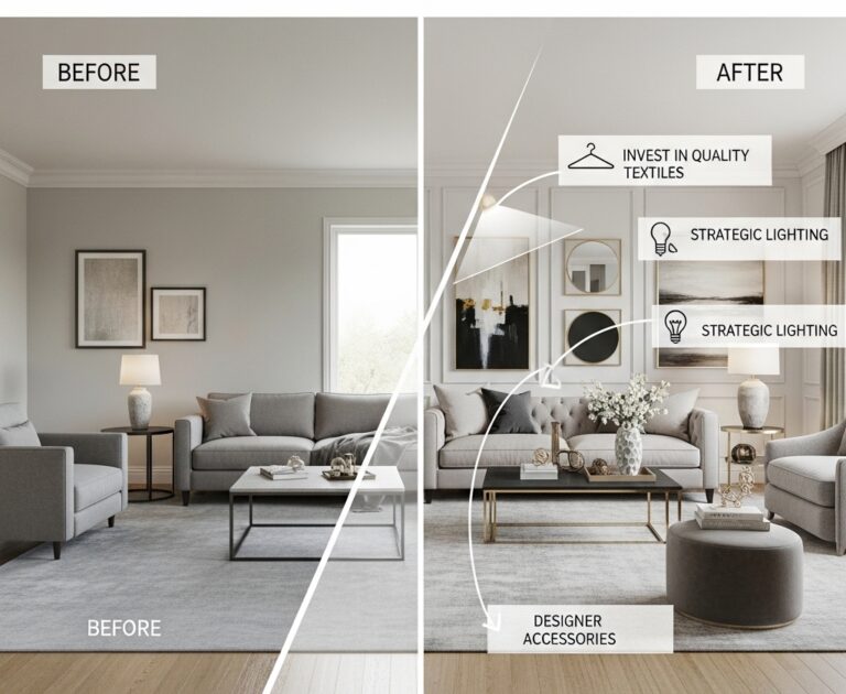
The wrong color makes a room feel cold, dark, or chaotic. The right color makes a room feel warm, inviting, and cohesive.
This roundup shares a simple system for choosing living room colors. No design degree required. No expensive consultants needed.
Comparison Table: Color Temperature by Room Direction
| Room Direction | Light Quality | Best Color Families | Colors to Avoid |
|---|---|---|---|
| North-facing | Cool, blue light | Warm (creamy whites, warm beiges, soft terracotta) | Cool (gray, blue, true white) |
| South-facing | Warm, yellow light | Cool (true grays, blue-greens, crisp whites) | Warm (yellow, orange, warm beige) |
| East-facing | Bright morning, cool afternoon | Most colors work | Very dark colors |
| West-facing | Warm afternoon, dramatic evening | Most colors work | Very bright, reflective colors |
Step 1: Understand Your Light
Light changes everything. A color that looks perfect in the store can look completely different on your wall.
The Light Test
| Time of Day | Light Quality | What to Observe |
|---|---|---|
| Morning | Cool, blue-toned | Does the color look cold? |
| Midday | Bright, neutral | Does the color look washed out? |
| Afternoon | Warm, yellow-toned (west) or fading (east) | Does the color look muddy? |
| Evening | Artificial light | Does the color look different under lamps? |
How to Test Paint Colors
- Buy sample pots of 3-5 colors
- Paint 2-foot by 2-foot squares on different walls
- Observe for 3-5 days (morning, noon, evening)
- Eliminate colors that look wrong in any light
- Choose from remaining colors
Pro Tip: Paint samples on white poster board. Move the poster board to different walls. This avoids painting directly on the wall.
Mistake to Avoid: Do not choose paint color from a tiny swatch alone. Swatches are printed ink, not actual paint.
Step 2: Choose a Dominant Color
The dominant color covers the largest surface area. Walls, large furniture, area rugs.
Dominant Color Options by Room Size
| Room Size | Dominant Color Strategy | Example |
|---|---|---|
| Small | Light, reflective color | Warm white, light beige, pale gray |
| Medium | Any color, keep it muted | Sage green, dusty blue, warm taupe |
| Large | Any color, can handle dark | Navy, charcoal, deep green |
The 60-30-10 Rule
| Percentage | Element | Example |
|---|---|---|
| 60% | Walls, large furniture, rugs | Walls: warm white |
| 30% | Upholstery, curtains, secondary furniture | Sofa: sage green |
| 10% | Pillows, art, accessories | Pillows: mustard yellow |
Pro Tip: Start with a rug or piece of art you love. Pull colors from that item for your palette.
Mistake to Avoid: Do not choose the paint color first. Choose larger, more expensive items first. Match paint to them.
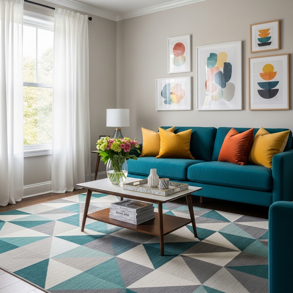
Step 3: Add a Secondary Color
The secondary color adds depth and interest. It appears on sofas, chairs, curtains, or an accent wall.
Secondary Color Pairings
| Dominant Color | Secondary Color Options | Effect |
|---|---|---|
| Warm white | Sage green, navy, terracotta | Calm, natural |
| Light beige | Olive green, rust, charcoal | Earthy, warm |
| Pale gray | Blush pink, mustard, teal | Modern, fresh |
| Soft blue | Cream, wood tones, navy | Coastal, relaxed |
The Accent Wall Consideration
An accent wall is one way to introduce a secondary color. It works best in rooms with good natural light.
| Room Light | Accent Wall Works? | Best Accent Color |
|---|---|---|
| Abundant natural light | Yes | Dark, bold colors |
| Limited natural light | No (use color elsewhere) | Light colors only |
| North-facing | Maybe (use warm accent) | Terracotta, warm beige |
| South-facing | Yes | Navy, charcoal, deep green |
Pro Tip: If unsure about an accent wall, use the secondary color on furniture instead. Furniture is easier to change than paint.
Mistake to Avoid: Do not use an accent wall in a room with no natural light. Dark accent walls will make the room feel like a cave.
Step 4: Add an Accent Color
The accent color provides pop and energy. It appears in small doses on pillows, art, vases, and accessories.
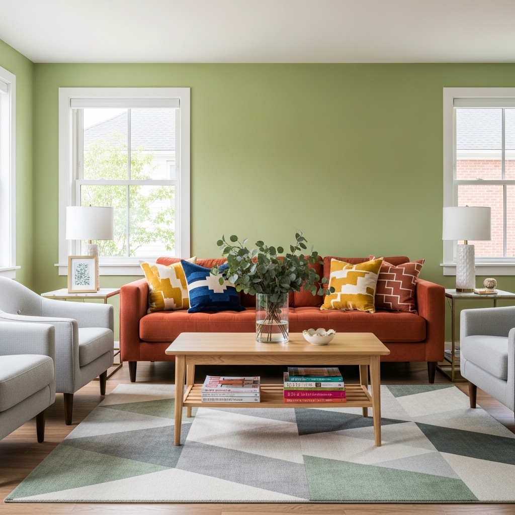
Accent Color Options by Mood
| Desired Mood | Accent Color Options |
|---|---|
| Energetic, lively | Mustard yellow, coral, bright teal |
| Calm, relaxing | Soft blue, lavender, pale pink |
| Warm, cozy | Terracotta, rust, warm orange |
| Sophisticated, elegant | Emerald green, deep plum, gold |
| Natural, grounded | Olive green, clay, brown |
Where to Add Accent Colors
| Item | Impact | Cost to Change |
|---|---|---|
| Throw pillows | High | Low |
| Art | High | Medium |
| Small vase or bowl | Medium | Low |
| Throw blanket | Medium | Low |
| Lamp shade | Medium | Low |
Pro Tip: Use the accent color in three different places around the room. Repetition creates cohesion.
Mistake to Avoid: Do not use more than three accent colors. One accent color is clean. Two is interesting. Three is chaotic.
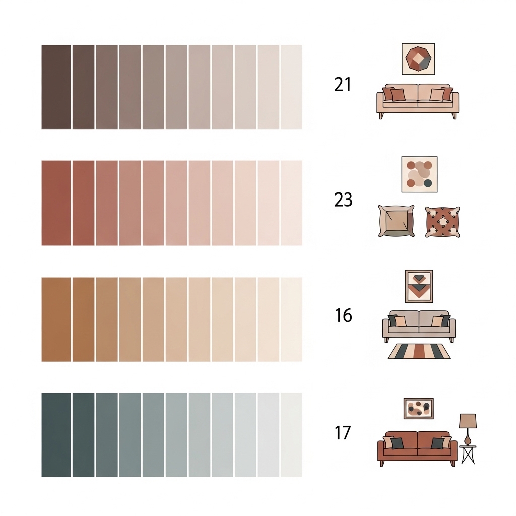
Popular Living Room Color Palettes
Palette 1: Calm and Natural
| Color | Role | Where to Use |
|---|---|---|
| Warm white | Dominant | Walls |
| Sage green | Secondary | Sofa or curtains |
| Natural wood | Secondary | Coffee table, shelves |
| Terracotta | Accent | Pillows, vase |
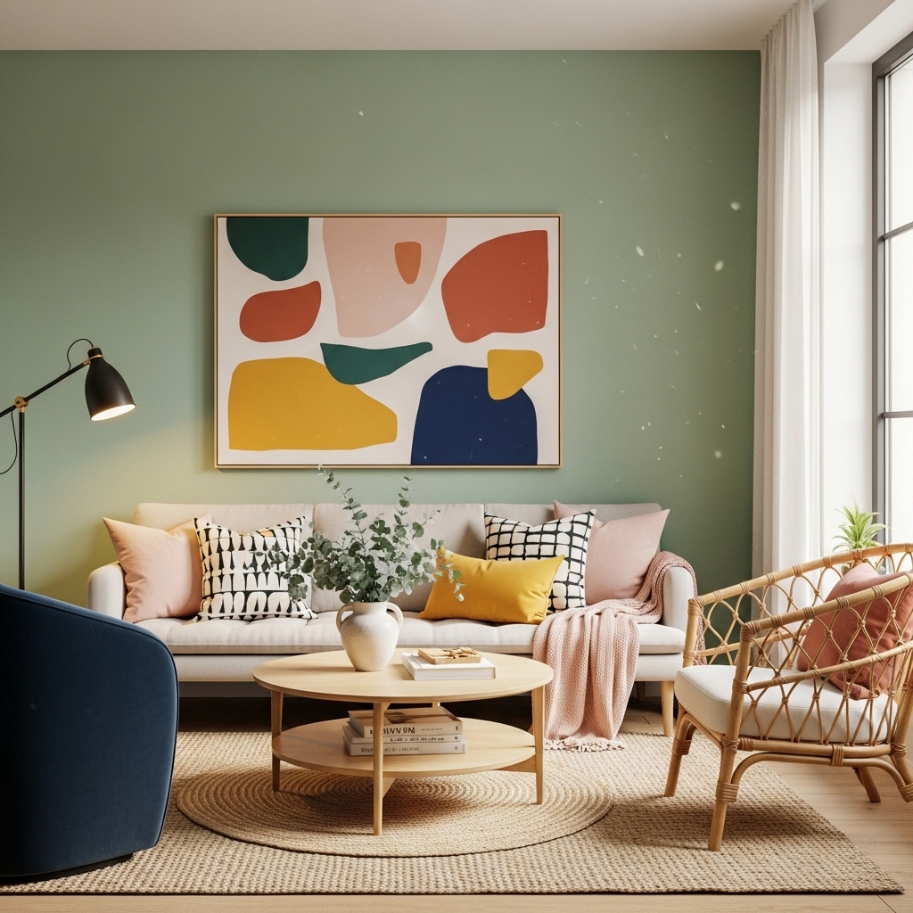
Palette 2: Modern and Fresh
| Color | Role | Where to Use |
|---|---|---|
| Pale gray | Dominant | Walls |
| Navy | Secondary | Sofa or accent wall |
| Blush pink | Accent | Pillows, art |
| Brass | Accent | Lamp, hardware |
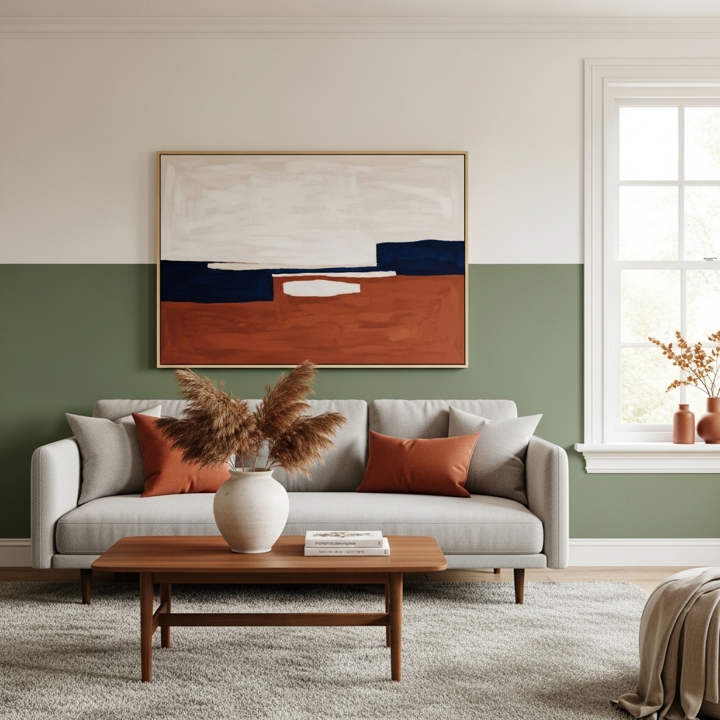
Palette 3: Warm and Cozy
| Color | Role | Where to Use |
|---|---|---|
| Light beige | Dominant | Walls |
| Rust or terracotta | Secondary | Sofa or curtains |
| Cream | Secondary | Rug |
| Olive green | Accent | Pillows, plant pots |
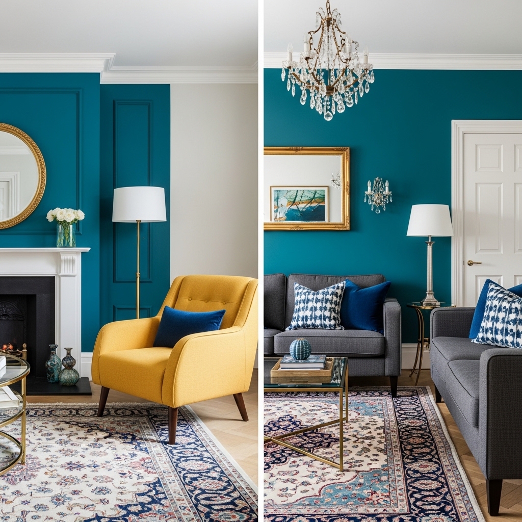
Palette 4: Bold and Dramatic
| Color | Role | Where to Use |
|---|---|---|
| Warm white | Dominant | Walls (to balance dark furniture) |
| Charcoal or navy | Secondary | Sofa or large rug |
| Brass or gold | Accent | Lamp, hardware, mirror frame |
| Mustard or emerald | Accent | Pillows, art |
Pro Tip: Test any palette by collecting paint swatches, fabric samples, and photos. Live with them for a week before buying.
Mistake to Avoid: Do not choose a palette based on a trend. Choose colors you love seeing every day.
Colors to Avoid in Living Rooms (And What to Use Instead)
| Color to Avoid | Why | Better Alternative |
|---|---|---|
| True white (pure) | Cold, clinical, shows every mark | Warm white or off-white |
| Bright red | Overstimulating, aggressive | Terracotta, rust, or burgundy |
| Neon colors | Overwhelming, dates quickly | Muted versions of the same hue |
| All gray | Depressing, flat | Gray with warm or cool undertones |
| Dark brown | Heavy, cave-like | Dark brown with lighter accents |
The Paint Finish Guide
| Finish | Sheen Level | Best For | Why |
|---|---|---|---|
| Flat | No shine | Ceilings, adult bedrooms | Hides imperfections |
| Matte | Low shine | Living rooms, dining rooms | Soft look, hides minor flaws |
| Eggshell | Soft sheen | Living rooms, hallways | Durable, washable |
| Satin | Medium sheen | Kitchens, bathrooms, kids’ rooms | Very durable, easy to clean |
| Semi-gloss | High sheen | Trim, doors, cabinets | Highlights details, durable |
Pro Tip: Use flat or matte on walls. Use satin or semi-gloss on trim. The contrast between finishes looks expensive.
Mistake to Avoid: Do not use high-gloss paint on imperfect walls. Glossy finishes highlight every bump and crack.
The 5-Step Living Room Color Selection Process
Step 1: Observe your room’s light for 3-5 days. Note how light changes from morning to evening.
Step 2: Choose a dominant color based on room size and light. Buy sample pots.
Step 3: Paint large swatches. Live with them for several days. Eliminate colors that do not work.
Step 4: Choose a secondary color for sofa, curtains, or accent wall. Use the 60-30-10 rule.
Step 5: Add an accent color through pillows, art, and accessories. Repeat the color three times.
Conclusion
Choosing living room colors does not have to be agonizing. Understand your light. Choose a dominant color. Add a secondary color. Add an accent color.
Test before committing. Paint swatches on walls. Live with them for days. Observe at different times.
The 60-30-10 rule provides a framework. 60% dominant. 30% secondary. 10% accent.
Start with one room. One color palette. One step at a time.
The right colors make a room feel like home. Take back your living room starting today.